-
Notifications
You must be signed in to change notification settings - Fork 7
Home
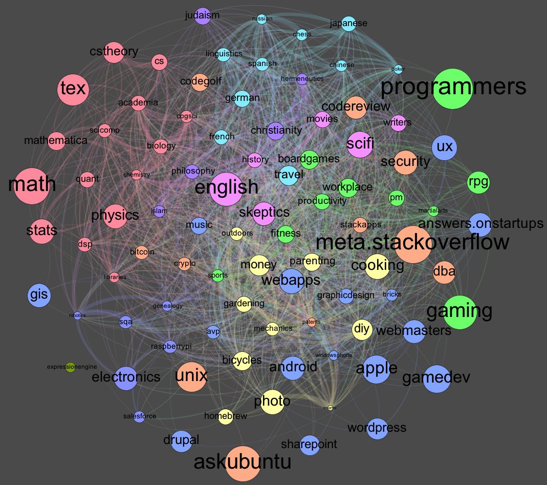
Below there are some graph maps made from co-occurrence of tags at StackExchange sites.
Started as an entry at StackExchange visualization competition at Kaggle.
Code is here. The recipe to make similar graphs is in the README file. If you cannot redo anything, just write an e-mail to me.
See also: TagOverflow - dynamic, interactive graphs of Stack Exchange.
An example graph for StackOverflow (I really recommend to see the actual hi res jpg file):
It isn't little.
Even tough they make only 0.6% of the total tag count, 90% of questions have at least one of them.
Moreover, for more tags the graph looks cluttered, and the resulting Top Tens may not show typical features of the Stack Overflow.
But if you still don't like the idea of using 256 tags you are not a programmer, are you?
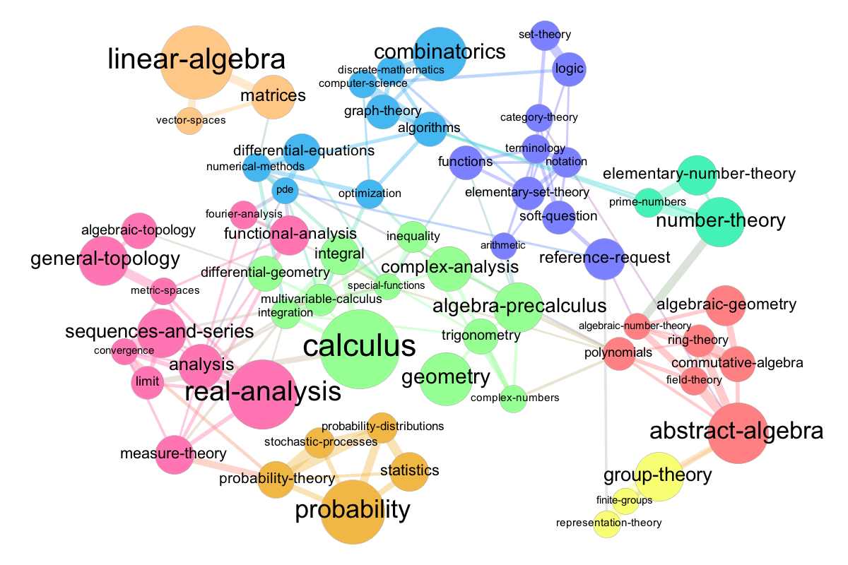
It is a graph, where:
- nodes are tags (their size reflects their popularity),
- edges are frequent co-occurrences of them. More precisely, an edge between two tags (tag1 and tag2) is drawn if their observed to expected ratio is greater or equal to 4.
Colors mark different communities in tags, as detected by a community detection algorithm found in Gephi, in which it was created.
See also the related thread at meta.stackoverflow.com - especially take a look at an interpretation of clusters.
Or for Physics.SE:

Or Math.SE (and related thread is here):
Or for Stats.SE a.k.a. CrossValidated:

OR for Photo.SE:


