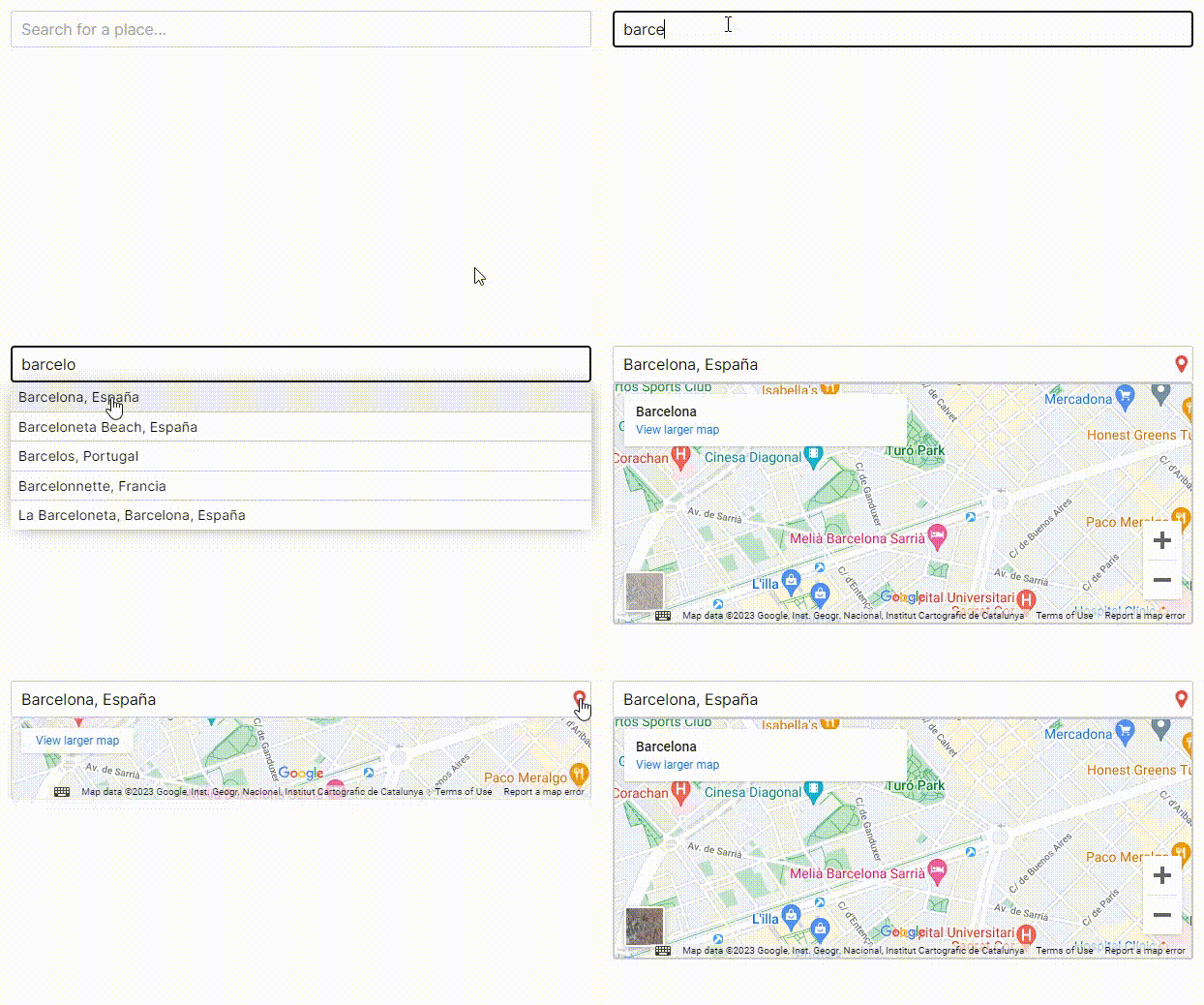
Component used as a field in a form to autocomplete a place, using the Google Maps API.
The place can be a city, a country, a street, or even an establishment.
https://react-places-autocomplete-demo.up.railway.app
- Map with the selected place
- Limit the type of places you want to retrieve
- Fully customizable
To use this component, you will need a Google API key. Here is more information on how to obtain it: https://developers.google.com/maps/documentation/javascript/get-api-key
You will also need to enable these two APIs:
- Places API
- Maps JavaScript API
Exposing your API key in the front-end code of your application can pose significant security risks. Unauthorized access to your API key may lead to unauthorized usage.
Is highly recommended to store it in a separate configuration file, such as the .env file.
Additionally, we strongly recommend that you restrict the usage of your API key using the available configuration options. https://developers.google.com/maps/api-security-best-practices#restrict_apikey
npm install @tasiodev/react-places-autocompleteimport { useState } from 'react'
import PlacesPicker from '@tasiodev/react-places-autocomplete'
function App() {
const [value, setValue] = useState(null)
return <PlacesPicker
gMapsKey='*******************'
placeId={value}
onChange={setValue}
/>
}| Parameter | Type | Description |
|---|---|---|
gMapsKey |
string |
Required. Your API key |
placeId |
string |
Id used to load an initial or stored place |
onChange |
func |
Event triggered when user select a place or when user starts typing to search a place |
onSelectPlace |
func |
Event triggered when user select a place |
placeholder |
string |
Placeholder for input |
searchTypes |
array[string] |
Limit the place types return in a search. See: https://developers.google.com/maps/documentation/places/web-service/supported_types |
language |
string |
ISO code for map and results language. Default: "en" |
disableMap |
bool |
Boolean to disable place Map. Default: false |
mapExpanded |
bool |
If true, the map is always visible. Default: false |
disabled |
bool |
Boolean to disable input |
customStyles |
object |
Object to override styles of each element. See definitions |
{
    container: { backgroundColor: 'black' },
    fieldInput: { color: 'red' },
    searchResultsContainer: { marginTop: 12 },
    searchResult: { padding: 6 },
    gmapContainer: { padding: 8, height: 400 },
}