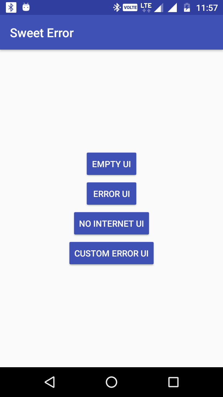
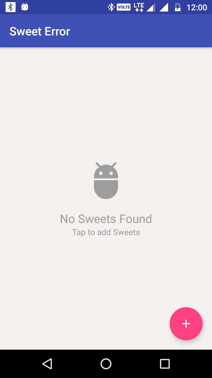
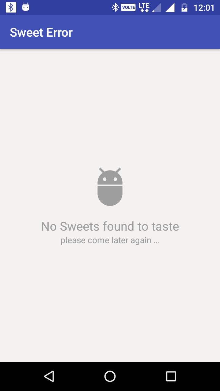
A Simple android library to handle every type of sweet errors.
 |
 |
 |
 |
 |
 |
In order to use the library
1. Gradle dependency
- Add the following to your project level
build.gradle:
allprojects {
	repositories {
		jcenter() or mavenCentral() or maven { url 'https://jitpack.io' } // whatever you use
	}
}- Add this to your app
build.gradle:
dependencies {
    // NOTE: please use latest released version on jitpack
	implementation 'com.github.therajanmaurya:sweet-error:1.0.9'
}
2. Usage
- Add the Sweet-Error xml layout in the parent view of your project xml layout.
<?xml version="1.0" encoding="utf-8"?>
<androidx.coordinatorlayout.widget.CoordinatorLayout
    android:id="@+id/clSweet"
    xmlns:android="http://schemas.android.com/apk/res/android"
    android:layout_height="match_parent"
    android:layout_width="match_parent">

    <LinearLayout
        android:id="@+id/llSweet"
        android:layout_height="match_parent"
        android:layout_width="match_parent"
        android:orientation="vertical">

        ....................................

    </LinearLayout>

    <include
        layout="@layout/layout_sweet_exception_handler"
        android:id="@+id/layoutError"
        android:visibility="gone"/>

</androidx.coordinatorlayout.widget.CoordinatorLayout>
- Initialize the SweetUIErrorHandler in your Activity and use it.
class SweetErrorInActivity : AppCompatActivity() {

   private lateinit var sweetUIErrorHandler: SweetUIErrorHandler

   override fun onCreate(savedInstanceState: Bundle?) {
         super.onCreate(savedInstanceState)
         setContentView(R.layout.activity_sweet_error)

        val layoutError = findViewById(R.id.layoutError)
        val llSweet = findViewById(R.id.llSweet) // It can be any child of your xml like RelativeLayout, RecyclerView etc, as we defined in above xml.

        sweetUIErrorHandler = SweetUIErrorHandler(this, findViewById(android.R.id.content))

        // Now you are all set. Whatever error UI you want to show according to condition like

        # Empty UI (1.1)
        // Need to pass the feature(s) name that is empty and icon image of the feature that you want to show and if
        // you have feature of addition then pass the feature name and your child view that you want hide and
        // layoutError UI to visible. It will handle everything.
         sweetUIErrorHandler.showSweetEmptyUI(getString(R.string.sweets),
                        getString(R.string.sweet), R.drawable.ic_adb_black_24dp,
                        llSweet, layoutError)


		# Empty UI (1.2)
		// Need to pass the feature(s) name that is empty and icon image of the feature that you want to show
		// and your child view that you want hide and layoutError UI to visible. It will handle everything.
		// See 2nd screenshot above as an example
		 sweetUIErrorHandler.showSweetEmptyUI(getString(R.string.sweets), R.drawable.ic_adb_black_24dp,
				llSweet, layoutError)


		# Error UI (1.1)
		// Need to pass the feature name in which error occured and
		// your child view that you want hide and layoutError UI to visible. It will handle everything.
		sweetUIErrorHandler.showSweetErrorUI(getString(R.string.sweets), llSweet, layoutError)


		# Error UI (1.2)
		// Need to pass the feature name in which error occured and image that you want to show like
		// bad internet connection image etc.
		// your child view that you want hide and layoutError UI to visible. It will handle everything.
		sweetUIErrorHandler.showSweetErrorUI(getString(R.string.sweets), R.drawable.ic_no_network llSweet, layoutError)


		// Use this button click to refresh UI if any error occured or any Network issue occured.
		val btnTryAgain = findViewById<Button>(R.id.btnTryAgain)


		# No Network I UI (1.1)
		// Need to pass your child view that you want hide and layoutError UI to visible. It will handle everything.
		// It will look like above 4th screenshot.
		sweetUIErrorHandler.showSweetNoInternetUI(llSweet, layoutError)


		# Custom Error UI (1.1)
		// Need to pass Image that will show up at the top of title and
		// the title text that will show bottom to the image and subtext that will show in bottom of title text.
		// and your child view that you want hide and layoutError UI to visible. It will handle everything.
		 sweetUIErrorHandler.showSweetCustomErrorUI(getString(R.string.no_sweets_found),
				getString(R.string.come_later_again), R.drawable.ic_adb_black_24dp,
				llSweet, layoutError)


		# Custom Error UI (1.2)
		// Need to pass Image that will show up at the top of title and subtitle of error message.
		// the title text that will show bottom to the image and there will be no subtext, only image and error text.
		// and your child view that you want hide and layoutError UI to visible. It will handle everything.
		 sweetUIErrorHandler.showSweetCustomErrorUI(getString(R.string.no_sweets_found), R.drawable.ic_adb_black_24dp,
				llSweet, layoutError)
   	 }
}- Initialize the SweetUIErrorHandler in your Fragment and use it.
class SweetErrorInFragment : Fragment {

    private lateinit var rootView: View
    private lateinit var sweetUIErrorHandler: SweetUIErrorHandler

    companion object {
         fun newInstance() = SweetErrorInFragment().apply {
             arguments = Bundle()
         }
    }

    override fun onCreateView(inflater: LayoutInflater, container: ViewGroup?, savedInstanceState: Bundle?): View? {
           return inflater.inflate(R.layout.fragment_sweet, container, false)
    }

    override fun onViewCreated(view: View, savedInstanceState: Bundle?) {
       val layoutError = rootView.findViewById(R.id.layout_error)
       val llSweet = rootView.findViewById(R.id.ll_sweet) // It can be any child of your xml like Relativelayout, RecyclerView etc, as we defined in above xml.

       sweetUIErrorHandler = SweetUIErrorHandler(activity!!, view)

       // Now you are all set. Whatever error UI you want to show according to condition like
       // you can use rest of things as we are using in above activity.

       // Use this button click to refresh UI if any error occured or any Network issue occured.
       val btnTryAgain = view.findViewById<Button>(R.id.btnTryAgain)

       return rootView;
    }
}<resources>
<!-- Base application theme. -->
<style name="AppTheme" parent="Theme.AppCompat.Light.DarkActionBar"> // whatever parent style you use.
<!-- Customize your theme here. -->
<!-- Whatever theme have here. -->
<item name="colorPrimary">@color/colorPrimary</item>
<item name="colorPrimaryDark">@color/colorPrimaryDark</item>
<item name="colorAccent">@color/colorAccent</item>
** Add this styles to your base project style and you are all set.**
<item name="colorButtonNormal">@color/colorPrimary</item>
<item name="android:buttonStyle">@style/AppTheme.Button</item>
<item name="buttonStyle">@style/AppTheme.Button</item>
</style>
<style name="AppTheme.Button" parent="Widget.AppCompat.Button">
<item name="android:textColor">@android:color/white</item>
<item name="android:textColorPrimary">@android:color/white</item>
</style>
</resources>Self developing projects
Copyright 2019 Rajan Maurya

Licensed under the Apache License, Version 2.0 (the "License");
you may not use this file except in compliance with the License.
You may obtain a copy of the License at

   http://www.apache.org/licenses/LICENSE-2.0

Unless required by applicable law or agreed to in writing, software
distributed under the License is distributed on an "AS IS" BASIS,
WITHOUT WARRANTIES OR CONDITIONS OF ANY KIND, either express or implied.
See the License for the specific language governing permissions and
limitations under the License.

