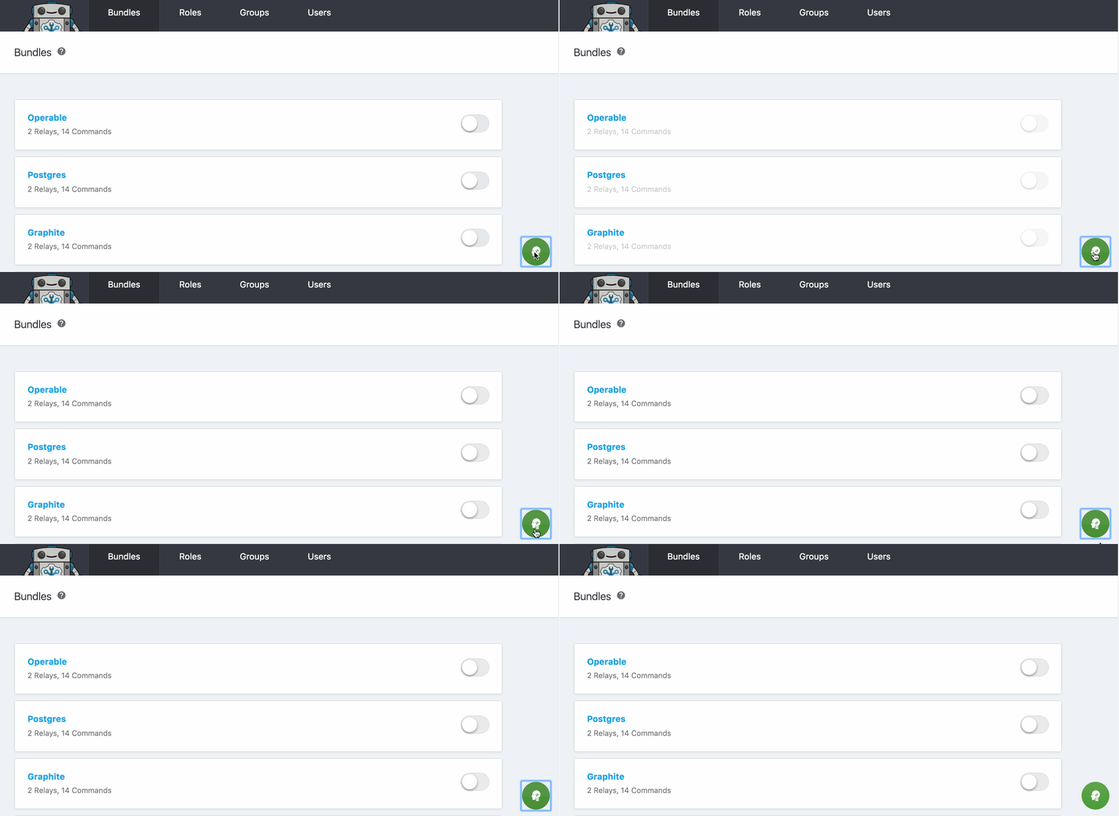
Dummy makes it clear what elements on the page are "dummy" info (i.e. still need to be implemented on the backend) by making them visibly different from other elements on the page. This makes it easy to tell what still needs to be done in development.
In your main application styling page, add a script for dummy and a link to it's stylesheet.
<script src="https://thoughtbot.github.io/dummy/toggle-dummy.js">
</script>
<link rel="stylesheet" type="text/css"
href="https://thoughtbot.github.io/dummy/toggle-dummy.css">
You will need to add the dummy class to any elements in your UI that
aren't complete on the backend.
The default behavior is to reduce the opacity of dummy elements in your UI when
dummy is active. You can also overwrite this behavior by modifying the styling
for the .dummy.is-active elements in your application. For example:
//dummy.scss

.dummy {
  &.is-active{
    background-color: red;
  }
}See the CONTRIBUTING document. Thank you, contributors!
Dummy is Copyright (c) 2016 thoughtbot, inc. It is free software, and may be redistributed under the terms specified in the LICENSE file.
Dummy is maintained and funded by thoughtbot, inc. The names and logos for thoughtbot are trademarks of thoughtbot, inc.
We love open source software! See our other projects or hire us to help build your product.

