-
-
Notifications
You must be signed in to change notification settings - Fork 255
New issue
Have a question about this project? Sign up for a free GitHub account to open an issue and contact its maintainers and the community.
By clicking “Sign up for GitHub”, you agree to our terms of service and privacy statement. We’ll occasionally send you account related emails.
Already on GitHub? Sign in to your account
Add a success dialog variant #1841
Conversation
Automated comment from CodeApprove ➜⏳ @jotaen4tinypilot please review this Pull Request |
There was a problem hiding this comment.
Choose a reason for hiding this comment
The reason will be displayed to describe this comment to others. Learn more.
Automated comment from CodeApprove ➜
In: Discussion
Shall we add the success variant to the style guide as well (like in the original PR)? I think it would be cool, just so that we can review the full set of dialog styles at a glance.
In: app/templates/custom-elements/overlay-panel.html:
> Line 98
            ({ detail: canBeClosed }) => {
Heads-up, the canBeClosed attribute is an object that we’d need to destructure (→ { canBeClosed }). Otherwise, we’d pass the entire object (e.g., { canBeClosed: true }) to toggleAttribute(), which will always evaluate to true in that context, thus making the X button always appear when this event is processed.
I personally prefer to not use object destructuring in JS for that reason usually, because I find it slightly harder to read, and – considering that JS is weakly typed – more prone to subtle mistakes.
In: app/templates/custom-elements/overlay-panel.html:
> Line 119
          this.setAttribute("variant", "default");
I think this would break the overlay instances that have a fixed variant attribute set, such as the error dialog, because it now always overwrites the attribute upon showing:
Maybe we need to store the original attribute values in the class (e.g., in the connectedCallback), and then restore the attributes from their initial values? (Like, creating a this._initialAttributes object in the connectedCallback or so.)
In: app/templates/custom-elements/overlay-panel.html:
> Line 120
          this.toggleAttribute("show-close-button", false);
Wouldn’t the default need to be true here? Otherwise, I think we’d take away the X button from all dialogs that don’t explicitly adjust the X button via the _statesWithoutDialogClose technique (such as the <about-dialog>, the <paste-dialog>, or the <error-dialog>). I think the base assumption is that all dialogs should have the X button, unless turned off specifically.
👀 @jdeanwallace it's your turn please take a look
There was a problem hiding this comment.
Choose a reason for hiding this comment
The reason will be displayed to describe this comment to others. Learn more.
Automated comment from CodeApprove ➜
Sorry for all the bugs, I might have been too trigger happy before requesting a review 😅
Updated demo video:
Screen Recording 2024-08-15 at 14.52.23.mov
In: Discussion
Oh yes, I forgot about that. Done.
In: app/templates/custom-elements/overlay-panel.html:
Good catch! Ah okay, I've dropped destructuring throughout.
In: app/templates/custom-elements/overlay-panel.html:
Thanks! Done.
In: app/templates/custom-elements/overlay-panel.html:
You're right! Fixed.
👀 @jotaen4tinypilot it's your turn please take a look
There was a problem hiding this comment.
Choose a reason for hiding this comment
The reason will be displayed to describe this comment to others. Learn more.
Automated comment from CodeApprove ➜
In: Discussion
No worries! Awesome that we have a new dialog variant for success states now, I think it makes the UI a little “richer”!
👀 @jdeanwallace it's your turn please take a look


Resolves #1639
Based on a PR review discussion, this PR adds an event (i.e.,
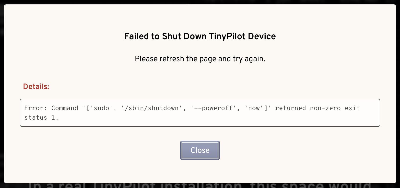
DialogVariantChangedEvent) that allows us to change the dialog's visual variant style in order to make it more engaging for the user.For example, we can now change the dialog variant when a successful state is reached: