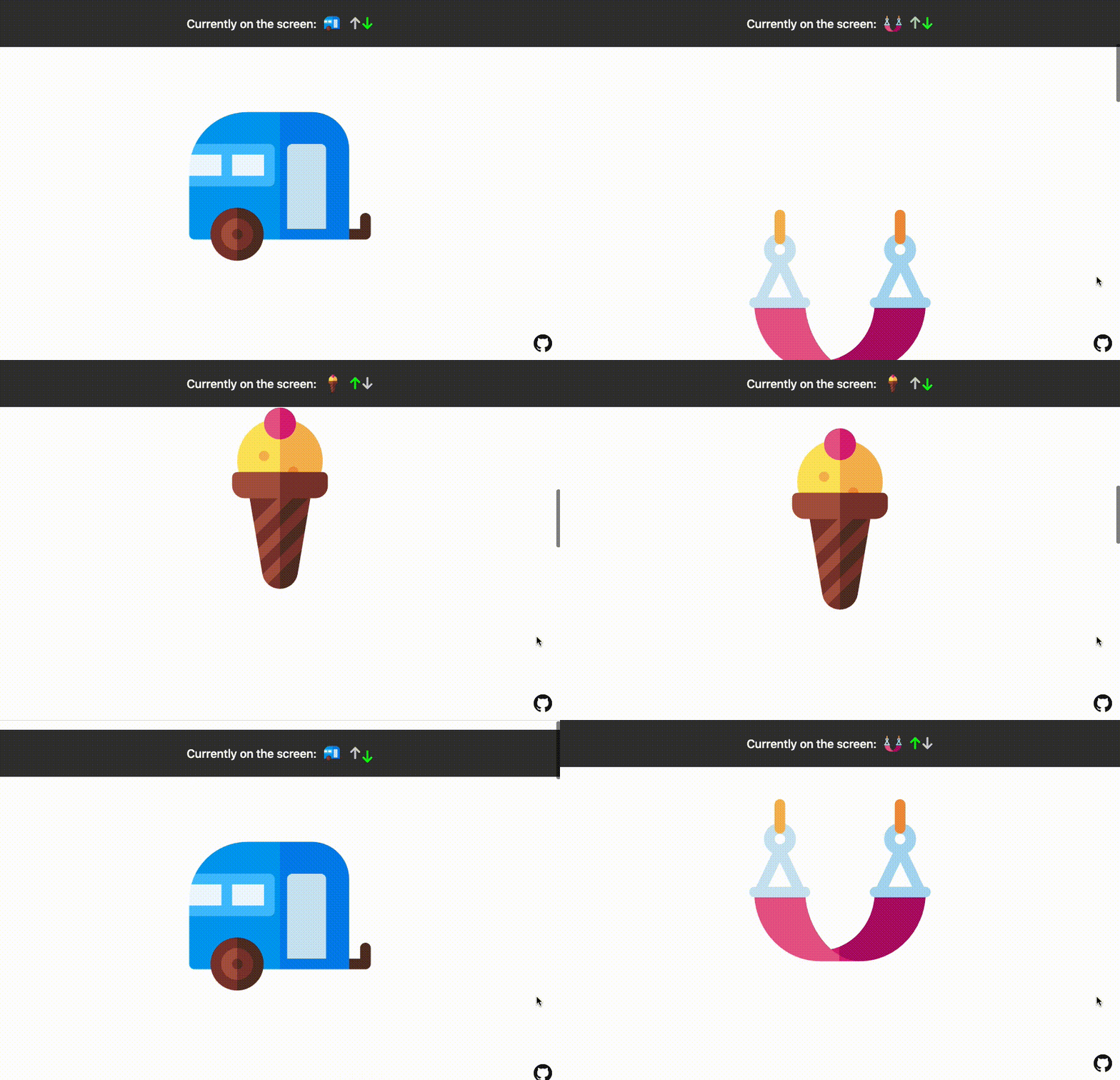
A Svelte action that monitors an element enters or leaves the viewport/parent element. Performant and efficient thanks to using Intersection Observer under the hood. Can be used in multiple projects including lazy loading images, infinite scrolling, playing/pausing the video when in the viewport, tracking user behaviour firing link pre-fetching and animations and many many more.
🔥 Check it out live here
- 👓️ Watch for any element that enters or leaves the viewport (or another wrapper/parent element).
- 🏎️ Thanks to using Intersection Observer, Svelte Inview is blazing fast and doesn't block the main thread.
- 📦️ Tiny, yet powerful (just ~2kb). No external dependencies (well, apart from Svelte).
- 🎛️ Use it in several different scenarios such as lazy loading images, infinite scrolling, playing/pausing the video when in the viewport, firing link pre-fetching, animations and many many more.
- 🐥 Easy to use API.
↕️ Detects the scrolling direction.
The only thing you need is Svelte itself.
Svelte Inview is distributed via npm.
$ yarn add svelte-inview
# or
$ npm install --save svelte-inview
⚠️ Modern browsers have the full support of Intersection Observer, but if you need to support ones like IE you can use this simple polyfill. Just install it and import it in your project.
This is the most basic use case for svelte-inview. Just add the action to the element you want to track - use:inview. You can also pass other configuration props. You can see if the element is visible by checking the inView or from the inside of the callback method - on:inview_change.
<script lang="ts">
  import { inview } from 'svelte-inview';

  let isInView: boolean;
  const options = {};
</script>

  <div
    use:inview={options}
    on:inview_change={(event) => {
      const { inView, entry, scrollDirection, observer, node} = event.detail;
      isInView = inView;
    }}
    on:inview_enter={(event) => {
      const { inView, entry, scrollDirection, observer, node} = event.detail;
      isInView = inView;
    }}
    on:inview_leave={(event) => {
      const { inView, entry, scrollDirection, observer, node} = event.detail;
      isInView = inView;
    }}
    on:inview_init={(event) => {
      const { observer, node } = event.detail;
}}>{isInView ? 'Hey I am in the viewport' : 'Bye, Bye'}</div>Svelte Inview lets you easily lazy load images. For a better UX we can pass a rootMargin="50px" props, so the image will be loaded when scroll is 50px before the viewport. After it appears in the viewport, you don't want to observe it anymore, hence the unobserveOnEnter props set to true.
<script lang="ts">
  import { inview } from 'svelte-inview';
  import type { ObserverEventDetails, Options } from 'svelte-inview';

  let isInView;
  const options: Options = {
    rootMargin: '50px',
    unobserveOnEnter: true,
  };

  const handleChange = ({ detail }: CustomEvent<ObserverEventDetails>) =>
    (isInView = detail.inView);
</script>

<div use:inview="{options}" on:inview_change="{handleChange}">
  {#if isInView}
  <img src="path/to/image.jpg" />
  {:else}
  <div class="placeholder" />
  {/if}
</div>You can play/pause a video when it's in/out of the viewport. Simply pass correct methods in on:inview_enter and on:inview_leave callbacks.
<script lang="ts">
  import { inview } from 'svelte-inview';
  import type { ObserverEventDetails } from 'svelte-inview';

  let isInView: boolean;
  let videoRef: HTMLElement;
</script>

  <div
    use:inview
    on:inview_enter={() => videoRef.play()}
    on:inview_leave={() => videoRef.pause()}
  >
    <video width="500" controls bind:this={videoRef}>
      <source src="path/to/video.mp4" type="video/mp4" />
    </video>
</div>You can also add some cool animations when an element enters the viewport. To make sure the animation won't fire too soon you can pass a negative value to rootMargin. When inView is true, add an animation class to your target. Additionally, you can detect the scroll direction to make the animations even cooler!
<script lang="ts">
  import { inview } from 'svelte-inview';
  import type { ObserverEventDetails, ScrollDirection, Options } from 'svelte-inview';

  let isInView: boolean;
  let scrollDirection: ScrollDirection;
  const options: Options = {
    rootMargin: '-50px',
    unobserveOnEnter: true,
  };

  const handleChange = ({ detail }: CustomEvent<ObserverEventDetails>) => {
    isInView = detail.inView;
    scrollDirection = detail.scrollDirection.vertical;
  };
</script>

  <div use:inview={options} on:inview_change={handleChange}>
    <div
      class:animate={isInView}
      class:animateFromBottom={scrollDirection === 'down'}
      class:animateFromTop={scrollDirection === 'up'}>
      Animate me!
    </div>
</div>Version 4 introduces new names for events. Before they were 'change' | 'leave' | 'enter' | 'init'. In version 4 they're changed to 'inview_change' | 'inview_leave' | 'inview_enter' | 'inview_init'.
This change was needed to satisfy Typescript, as the package was messing up the default types coming from svelte typings. To ensure backward compatibility, the original events names will still work for some time, but they won't be properly recognized by Typescript. To sum up, this will still work, but TS won't be happy about it:
on:change={(event) => {
  const { inView, entry, scrollDirection, observer, node} = event.detail;
  isInView = inView;
}}
To make sure it works properly and satisfy TS you'll need to change it to this:
on:inview_change={(event) => {
  const { inView, entry, scrollDirection, observer, node} = event.detail;
  isInView = inView;
}}
Version 2 was returning observe and unobserve methods on the events. In version 3 they were removed, and the observer and node are being returned instead. So if you used those methods before like this:
event.detail.observe(node);You'll need to change it to:
event.detail.observer.observe(node);Version 1 was using an Inview component. In version 2 that was changed to action - API is easier to consume, plus the obsolete wrapper is not longer needed. If you still want to use the component, check the documentation for version 1.
| Name | Type | Default | Description | Required |
|---|---|---|---|---|
| options.root | HTMLElement |
window |
The element that is used as the viewport for checking visibility of the target. Must be the ancestor of the target. | false |
| options.rootMargin | string |
0px |
Margin around the root element. Values similar to the CSS margin property, e.g. "10px 20px 30px 40px". Can also be a percentage. See more. | false |
| options.threshold | number or number[] |
0 |
Either a single number or an array of numbers which indicate at what percentage of the target's visibility the observer's callback should be executed. If you only want to detect when visibility passes the 50% mark, you can use a value of 0.5. If you want the callback to run every time visibility passes another 25%, you would specify the array [0, 0.25, 0.5, 0.75, 1]. The default is 0 (meaning as soon as even one pixel is visible, the callback will be run) | false |
| options.unobserveOnEnter | boolean |
false |
If true, target element stops being observed after the first time it appears in the viewport. Can be used when you want to fire the callback only once. | false |
| on:inview_change | function |
- | Event fired every time the target element meets the specified threshold. Receives event object as an argument. Inside of event.detail you can find all the arguments specified here. |
false |
| on:inview_enter | function |
- | Event fired every time the target element enters the viewport. Receives event object as an argument. Inside of event.detail you can find all the arguments specified here . |
false |
| on:inview_leave | function |
- | Event fired every time the target element leaves the viewport. Receives event object as an argument. Inside of event.detail you can find all the arguments specified here . |
false |
| on:inview_init | function |
- | Event fired on action initialization, before the observer starts observing the element. Receives lifecycle arguments specified here | false |
| Name | Type | Description |
|---|---|---|
| inView | boolean |
Visibility state of the target element. If it's true, target passed at least the value of the threshold props. |
| entry | IntersectionObserverEntry |
Intersection Observer entry object generated every time when IO callback is fired. |
| scrollDirection.vertical | up or down |
Vertical scrolling direction. |
| scrollDirection.horizontal | left or right |
Horizontal scrolling direction. |
| node | HTMLElement |
Element that is being observed |
| observer | IntersectionObserver |
Intersection Observer instance for the observed element. Among others, it allows to "turn off" the observer at the very beginning. |
| Name | Type | Description |
|---|---|---|
| node | HTMLElement |
Element that is being observed |
| observer | IntersectionObserver |
Intersection Observer instance for the observed element. Among others, it allows to "turn off" the observer at the very beginning. |
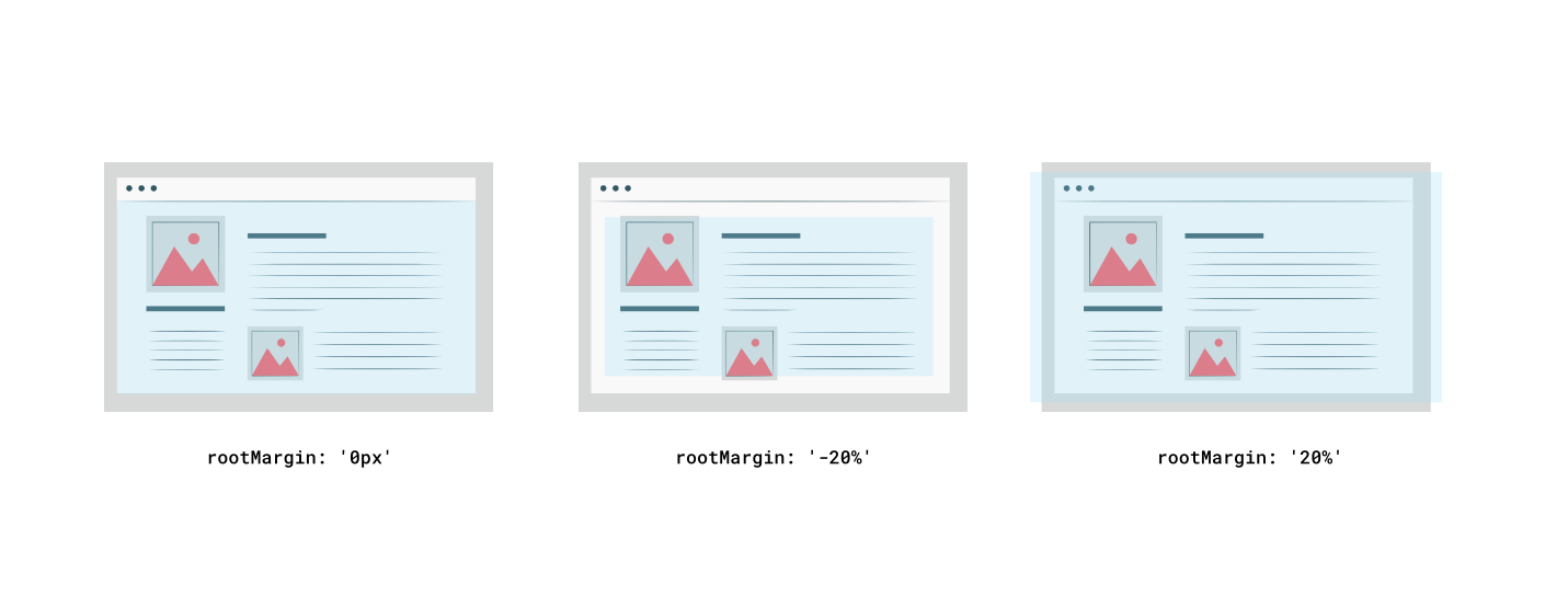
If you want to increase or decrease the area of the root, just pass the rootMargin. On the image below you can see the blue area being the root. It means that every time, the target element will enter or leave that area (or meet the specified threshold), a callback will be fired.
Distributed under the MIT License. See LICENSE for more information.
Maciek Grzybek - @grzybek_maciek - maciekgrzybek1@gmail.com - www.maciekgrzybek.dev


