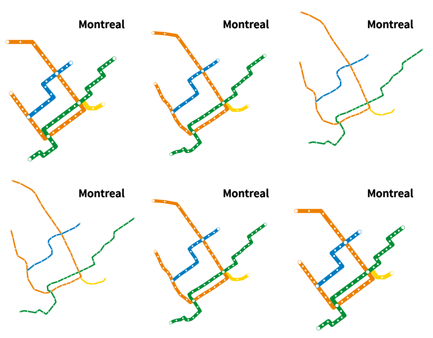
Python script for animating subway map distances vs. geographic distances
Generates a gif image comparing Montreal metro map to its real geography. Inspired by Reddit post "Berlin Subway Map compared to it's real geography" https://www.reddit.com/r/dataisbeautiful/comments/6baefh/berlin_subway_map_compared_to_its_real_geography/
Project at https://github.com/will8211/montreal
Shared at https://www.reddit.com/r/dataisbeautiful/comments/6c8ukp/montreal_metro_map_distances_vs_geographic/ and http://imgur.com/a/TuRT8
Depends on pycairo and imageio modules Also depends on gifsicle Font ('Falling Sky') available at http://www.fontspace.com/kineticplasma-fonts/falling-sky
~WM
