
Angular directive for Knob component using d3.js v4 without jQuery dependencies
- very easy to implement
- without jQuery dependencies
- powered by d3.js v4
- configurable minimum, maximum values and step
- animated
- great ability to configure
- configurable scale
- touch, click and drag events implemented
- Angular 10+
- D3.js V4
- @types/d3-selection@^1.1.0
- lodash-es@4.17.10
- Chrome, Firefox, Safari, Opera, IE9+
You can also use bower to install the component:
Note: from v1.0.2, we are publishing to GitHub Packages https://github.com/xmlking/ngx-knob/packages/213430
See Configuring npm for use with GitHub Packages
-
To install from GitHub Packages, you’ll need to create a personal access token in Github. Give it read and write access for packages. If your account has access to the organisation, then it will have access to its packages.
-
After creating a token, run this:
npm login --registry=https://npm.pkg.github.com
Your username will be your github user name, and your password will be the token. After that, you should be able to install your package!
- Add to project's
.npmrc
@xmlking/ngx-knob:registry=https://npm.pkg.github.com
Now you can install this package via:
npm install @xmlking/ngx-knob --saveadd following overrides to package.json
  "overrides": {
    "d3-selection": "1.4.2"
}import { KnobModule } from "@xmlking/ngx-knob";
@NgModule({
declarations: [
AppComponent
],
imports: [KnobModule]
bootstrap: [AppComponent]
})
<ngx-knob [value]="value" [options]="knOptions"></ngx-knob>import { Component, OnInit } from '@angular/core';
import { KnobOptions } from "@xmlking/ngx-knob";
@Component({
selector: 'app-root',
templateUrl: './app.component.html',
styleUrls: ['./app.component.css']
})
export class AppComponent{
knOptions = {
readOnly: true,
size: 140,
unit: '%',
textColor: '#000000',
fontSize: '32',
fontWeigth: '700',
fontFamily: 'Roboto',
valueformat: 'percent',
value: 0,
max: 100,
trackWidth: 19,
barWidth: 20,
trackColor: '#D8D8D8',
barColor: '#FF6F17',
subText: {
enabled: true,
fontFamily: 'Verdana',
font: '14',
fontWeight: 'bold',
text: 'Overall',
color: '#000000',
offset: 7
},
}
value = 45;
}
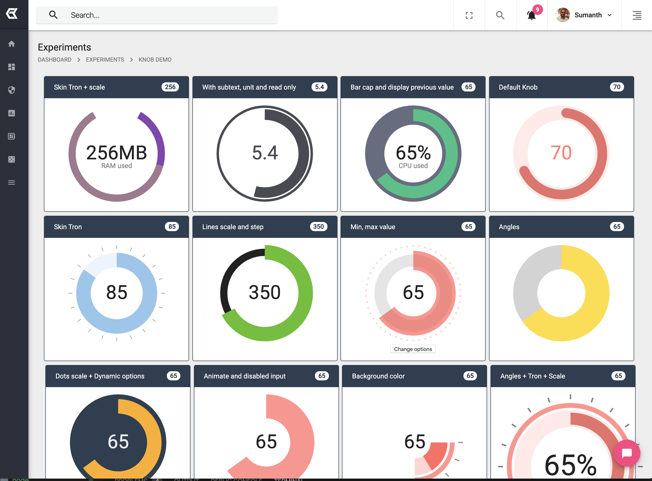
Options
| Property | Type | Default | Description |
|---|---|---|---|
| animate | object | { enabled: true, duration: 1000, ease: 'bounce' } | Duration in milliseconds, Ease: linear, bounce, sin, cubic, quad, exp, circle |
| size | integer | 200 | Size of knob in px. It will always be a square |
| startAngle | integer | 0 | Start angle in degrees |
| endAngle | integer | 360 | End angle in degrees |
| unit | string | '' | Unit values |
| displayInput | boolean | true | Display input value (true or false) |
| inputFormatter | function | function(value){ return value; } | Formats the input value before appending the unit and displaying it to the DOM |
| readOnly | boolean | false | Disabled change value (true or false) |
| trackWidth | integer | 50 | Width track bar in px |
| barWidth | integer | 50 | Width bar value in px |
| trackColor | string | 'rgba(0,0,0,0)' | Color track bar |
| barColor | string | 'rgba(255,0,0,.5)' | Color bar value |
| prevBarColor | string | 'rgba(0,0,0,0)' | Color bar previous value |
| textColor | string | '#222' | Text color |
| barCap | integer | 0 | Defines how the ending of the bar line looks like in radius |
| trackCap | integer | 0 | Defines how the ending of the track line looks like in radius |
| fontSize | string | 'auto' | Font size in px. auto: automatic change |
| subText | object | { enabled: false, text: '', fontFamily: 'Arial', fontWeight: 'normal', color: 'gray', font: 'auto', offset: 0 } | Subtext options |
| bgColor | string | '' | Background color |
| bgFull | string | false | Paints the background of the whole circle ignoring startAngle and endAngle |
| scale | object | { enabled: false, type: 'lines', color: 'gray', width: 4, quantity: 20, height: 10, spaceWidth: 15 } | Scale options, type: lines or dots |
| step | integer | 1 | Step change, min 0.1 |
| displayPrevious | boolean | false | Display previous value (true or false) |
| min | integer | 0 | Min value (start value), only integer |
| max | integer | 100 | Max value (end value), only integer |
| dynamicOptions | boolean | false | Dynamic change options (true or false) |
# how to create lib project.
ng new ngx-knob
ng generate library knob --prefix=ngx
ng generate component knob --project=knob --inline-style --inline-template --export --flat --dry-run# bump version in `projects/knob/package.json`
ng build knob --configuration productionng servewe are publishing to GitHub Packages https://github.com/xmlking/ngx-knob/packages/213430
cp README.md dist/knob
cd dist/knob
# publish to github registry
npm publish --access public
# publish to npm registry (depreciated)
npm publish --access public --@xmlking:registry=https://registry.npmjs.org/