-
Notifications
You must be signed in to change notification settings - Fork 2.7k
New issue
Have a question about this project? Sign up for a free GitHub account to open an issue and contact its maintainers and the community.
By clicking “Sign up for GitHub”, you agree to our terms of service and privacy statement. We’ll occasionally send you account related emails.
Already on GitHub? Sign in to your account
upgrade-interactive row colours are incorrect #3815
upgrade-interactive row colours are incorrect #3815
Comments
|
Hi @jesstelford - Can you provide a package.json or a small test repo/gist so we can reliably reproduce this. |
|
I'm observing similar color/definition inconsistencies for my project at https://github.com/lirantal/dockly so you can easily reproduce using it's |
|
I created a small repository with |
|
You know, last time I was in the
That doesn't seem to do anything to check the parts of the versions. |
|
Was able to reproduce with the following: I think this is quite broken. I also think the legend should be as follows:
Thoughts? |
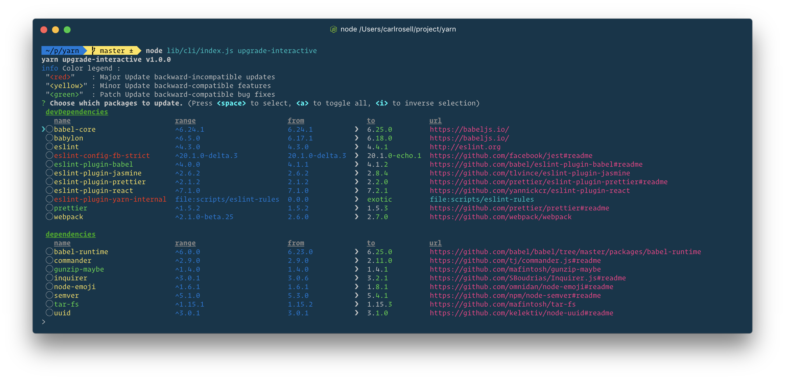
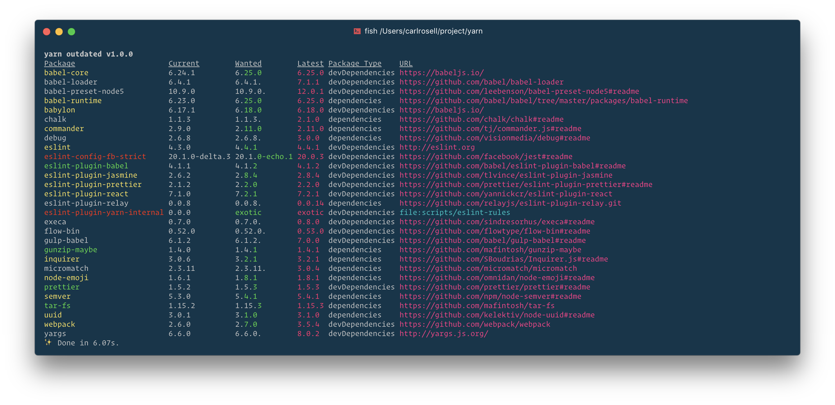
…eractive commands (#4183) **Summary** This will fix #3815 by implementing a solution mentioned here #3815 (comment). As the `outdated`-command displayed pretty much the same data I changed the colors of that command as well. New output:   **Test plan** I did not create any new tests as this is only a visual change and was not tested before. But if we decide to move the new "helper files" to a utils folder I can write a few tests to test the output.


Bug report
Current behaviour:
Reproduction steps:
Have a repo with various out of date packages, and run
yarn upgrade-interactiveto see the incorrect colours applied to the rows.Expected behaviour:
@domain-group/eslint-config-domain,@domain-group/fe-brary&@domain-group/fe-buildshould be neither red nor yellow - they have a major version bump with API incompatible changes.babel-coreshould be yellow as it is a minor update.Environment:
The text was updated successfully, but these errors were encountered: