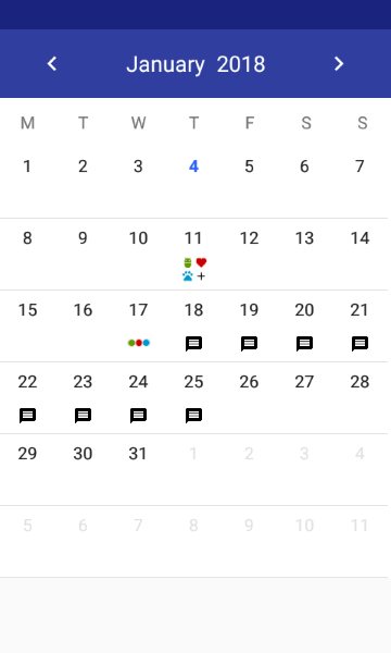
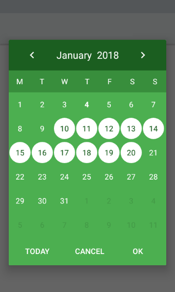
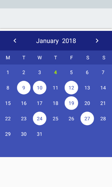
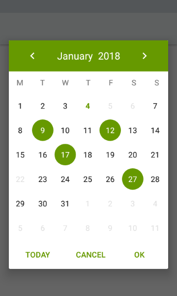
Material-Calendar-View is a simple and customizable calendar widget for Android based on Material Design. The widget has two funcionalities: a date picker to select dates (available as an XML widget and a dialog) and a classic calendar. The date picker can work either as a single day picker, many days picker or range picker.


- Material Design
- Single date picker
- Many dates picker
- Range picker
- Events icons
- Fully colors customization
Make sure you are using the newest com.android.support:appcompat-v7.
Make sure you are using Java 8 in your project. If not, add below code to build.gradle file:
android {
    compileOptions {
        sourceCompatibility JavaVersion.VERSION_1_8
        targetCompatibility JavaVersion.VERSION_1_8
    }
}
Make sure you have defined the jcenter() repository in project's build.gradle file:
allprojects {
    repositories {
        jcenter()
    }
}
Add the dependency to module's build.gradle file:
dependencies {
    compile 'com.applandeo:material-calendar-view:1.5.1'
}
To your XML layout file add:
<com.applandeo.materialcalendarview.CalendarView
    android:id="@+id/calendarView"
    android:layout_width="match_parent"
android:layout_height="match_parent" />List<EventDay> events = new ArrayList<>();
Calendar calendar = Calendar.getInstance();
events.add(new EventDay(calendar, R.drawable.sample_icon));
//or
events.add(new EventDay(calendar, new Drawable()));
CalendarView calendarView = (CalendarView) findViewById(R.id.calendarView);
calendarView.setEvents(events);You can use our utils method to create Drawable with text
CalendarUtils.getDrawableText(Context context, String text, Typeface typeface, int color, int size);Take a look at sample_three_icons.xml and adjust it to your project
calendarView.setOnDayClickListener(new OnDayClickListener() {
    @Override
    public void onDayClick(EventDay eventDay) {
        Calendar clickedDayCalendar = eventDay.getCalendar();
    }
});If you want to get all selected days, especially if you use multi date or range picker you should use the following code:
List<Calendar> selectedDates = calendarView.getSelectedDates();...or if you want to get the first selected day, for example in case of using single date picker, you can use:
Calendar selectedDate = calendarView.getFirstSelectedDate();Calendar calendar = Calendar.getInstance();
calendar.set(2019, 7, 5);
calendarView.setDate(calendar);Calendar min = Calendar.getInstance();
Calendar max = Calendar.getInstance();
calendarView.setMinimumDate(min);
calendarView.setMaximumDate(max);List<Calendar> calendars = new ArrayList<>();
calendarView.setDisabledDays(calendars);List<Calendar> calendars = new ArrayList<>();
calendarView.setSelectedDates(calendars);- Don't pass more than one calendar object to method above if your calendar type is
CalendarView.ONE_DAY_PICKER. - If your calendar type is
CalendarView.RANGE_PICKERyou have to pass full dates range. To get it you can use our utils methodCalendarUtils.getDatesRange(Calendar firstDay, Calendar lastDay).
calendarView.setOnPreviousPageChangeListener(new OnCalendarPageChangeListener() {
    @Override
    public void onChange() {
        ...
    }
});

calendarView.setOnForwardPageChangeListener(new OnCalendarPageChangeListener() {
    @Override
    public void onChange() {
        ...
    }
});If you want to use calendar in the picker mode, you have to use the following tags:
app:type="one_day_picker"app:type="many_days_picker"app:type="range_picker"
If you want to display event icons in the picker mode, add:
app:eventsEnabled="true"
- Header color:
app:headerColor="[color]" - Header label color:
app:headerLabelColor="[color]" - Previous button image resource:
app:previousButtonSrc="[drawable]" - Forward button image resource:
app:forwardButtonSrc="[drawable]" - Abbreviations bar color:
app:abbreviationsBarColor="[color]" - Abbreviations labels color:
app:abbreviationsLabelsColor="[color]" - Calendar pages color:
app:pagesColor="[color]" - Selection color in picker mode:
app:selectionColor="[color]" - Selection label color in picker mode:
app:selectionLabelColor="[color]" - Days labels color:
app:daysLabelsColor="[color]" - Color of visible days labels from previous and next month page:
app:anotherMonthsDaysLabelsColor="[color]" - Disabled days labels color:
app:disabledDaysLabelsColor="[color]" - Today label color:
app:todayLabelColor="[color]"
...or in code:
CalendarView calendarView = (CalendarView) findViewById(R.id.calendarView);
calendarView.setHeaderColor([color]);
calendarView.setHeaderLabelColor([color]);
calendarView.setForwardButtonImage([drawable]);
calendarView.setPreviousButtonImage([drawable]);If you want to disable the swipe gesture to change the month, you have to use the following tag:
app:swipeEnabled="false"
...or in code:
calendarView.setSwipeEnabled(false);If you want to disable the edit selected dates, you have to use the following in code:
calendarView.setIsEditable(false);To translate months names, abbreviations of days, "TODAY", "OK" and "CANCEL" buttons, just add below tags to your strings.xml file:
<string name="material_calendar_monday">M</string>
<string name="material_calendar_tuesday">T</string>
<string name="material_calendar_wednesday">W</string>
<string name="material_calendar_thursday">T</string>
<string name="material_calendar_friday">F</string>
<string name="material_calendar_saturday">S</string>
<string name="material_calendar_sunday">S</string>

<array name="material_calendar_months_array">
    <item>January</item>
    <item>February</item>
    <item>March</item>
    <item>April</item>
    <item>May</item>
    <item>June</item>
    <item>July</item>
    <item>August</item>
    <item>September</item>
    <item>October</item>
    <item>November</item>
    <item>December</item>
</array>

<string name="material_calendar_today_button">Today</string>
<string name="material_calendar_positive_button">OK</string>
<string name="material_calendar_negative_button">Cancel</string>DatePickerBuilder builder = new DatePickerBuilder(this, listener)
.pickerType(CalendarView.ONE_DAY_PICKER);
DatePicker datePicker = builder.build();
datePicker.show();To use another picker type replace CalendarView.ONE_DAY_PICKER with CalendarView.MANY_DAYS_PICKER or CalendarView.RANGE_PICKER.
private OnSelectDateListener listener = new OnSelectDateListener() {
    @Override
    public void onSelect(List<Calendar> calendars) {
        ...
    }
};new DatePickerBuilder(this, listener)
.date(Calendar.getInstance()) // Initial date as Calendar object
.minimumDate(Calendar.getInstance()) // Minimum available date
.maximumDate(Calendar.getInstance()) // Maximum available date
.disabledDays(List<Calendar>) /// List of disabled days
.headerColor(R.color.color) // Color of the dialog header
.headerLabelColor(R.color.color) // Color of the header label
.previousButtonSrc(R.drawable.drawable) // Custom drawable of the previous arrow
.forwardButtonSrc(R.drawable.drawable) // Custom drawable of the forward arrow
.previousPageChangeListener(new OnCalendarPageChangeListener(){}) // Listener called when scroll to the previous page
.forwardPageChangeListener(new OnCalendarPageChangeListener(){}) // Listener called when scroll to the next page
.abbreviationsBarColor(R.color.color) // Color of bar with day symbols
.abbreviationsLabelsColor(R.color.color) // Color of symbol labels
.pagesColor(R.color.sampleLighter) // Color of the calendar background
.selectionColor(R.color.color) // Color of the selection circle
.selectionLabelColor(R.color.color) // Color of the label in the circle
.daysLabelsColor(R.color.color) // Color of days numbers
.anotherMonthsDaysLabelsColor(R.color.color) // Color of visible days numbers from previous and next month page
.disabledDaysLabelsColor(R.color.color) // Color of disabled days numbers
.todayLabelColor(R.color.color) // Color of the today number
.dialogButtonsColor(R.color.color); // Color of "Cancel" and "OK" buttons
.setEditable(true); // Editable selected dates in calendar, - Initial build
It would be great if you decide to use our component in your project. It’s open source, feel free. Write to us at hi@applandeo.com if you want to be listed and we will include your app in our repo. If you have any questions or suggestions just let us know.