-
Notifications
You must be signed in to change notification settings - Fork 2.4k
Visually distinct own messages from others #87
Comments
|
You mean just for mobile view or also Desktop? Desktop version shouldn't be the same as mobile, in fact issue #35 tries to solve mobile view, where I think this suggestion fits better ;) |
|
I mean the desktop view. But would be nice in the mobile view as well I think. |
|
Can you rename the issue to something more descriptive like: "Use bubbles for message styling"? |
|
I personally don't think that desktop version of Telegram must be the same as mobile one. But it might be actual for mobile view of the layout. |
|
I'm neither suggesting that the desktop view should be the same as the mobile view, nor am I asking for "bubbles". What I wanted to say was: That would be a quite simple thing that would create a good visual distinction between other's messages an mine. |
|
Yes that's a good point. |
|
Could you also generate different name color for each member in a group chat ? |
|
@Alex131089 aren't different photos/photo placeholders enough? |
|
In the Android app, members get a different color, besides already having different photos. It's a minor detail, but it's actually nice. |
|
Nop, because 2 members have black picture, at first sight it's not obvious to distinguish them. |
|
My suggestion would be to not right align the messages, but only the contact picture. The texts would still be left-aligned, but my picture would appear on the right side. |
|
I've implemented this on my own webogram fork, as a slightly darker background for your own messages. Try it out here: http://telegram.staltz.com |
|
@staltz since we can't see your fork's code, I would discourage everyone to connect to webogram sites other than the official one or a local downloaded. |
|
That link is a simple redirect to http://staltz.github.io/webogram which is obviously this repo https://github.com/staltz/webogram . There's the code. (Branch gh-pages matching branch staltzogram). You could even diff that with zhukov's upstream, to see what's changed. |
|
I still prefer to use the original one, since that's the app that's While I would consider that message free spamming of the concurrency, I Have you tried sending a PR? What was the outcome?
|
|
I don't want to send a PR and I don't want to "compete" or "spam". This is just a prototype implementation of issue #87, to see if this is what people want. |
|
Well, I think this is a good idea, in fact if you add the background issue and implement a solution for #92 you can have a nice result. I played a little with the CSS and got something kind of minimalist: It doesn't look bad, I think. And with less width: And with user distinction (can be user or contact distinction): Sorry about the colors, I'm not good at color design... What do you think? |
|
We have already separate styles for outbound messages in mobile version, but current Desktop design seems to be final about this. |
|
Please reconsider this issue. It is really difficult to distinguish own messages in a chat with active users.... |
|
I have to agree with everyone asking for a different layout. Usability of the web version is very limited, especially if people in the chat don't have avatars. I think moving own messages to the right or distinguishing with different background colours would really help. At the very least an option to change current behaviour would be nice, which has been implemented in the desktop version (e.g. telegramdesktop/tdesktop#1629) |


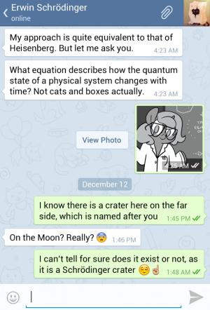
Would be nice if Webogram would show your own messages aligned to the right and all other messages to the left. Maybe different colors would be helpful, too.

Like in the mobile app:
The text was updated successfully, but these errors were encountered: