onboarding: Fix formatting of registration page buttons. #20578
Conversation
249b907
to
eeca7dd
Compare
|
Looks good to me. @timabbott FYI |
| @@ -698,7 +698,7 @@ html { | |||
| button.login-social-button { | |||
| width: 328px; | |||
| height: auto; | |||
| padding-left: 35px; | |||
| padding-left: 60px; | |||
There was a problem hiding this comment.
While this works, this doesn't seem like the sort of clean fix that would avoid future regressions.
Or maybe it is -- how did you pick 60px? Is there math on the size of elements we should be using instead?
There was a problem hiding this comment.
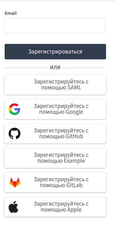
@timabbott Yes, I did calculate for 'Sign up with Google' button, the background-position is 13px (from the left edge of the button), and the logo's height is 60% of the button, i.e. 45px * 0.6 = 27px. Thus, the width of the logo is (27/76)*74 = 26px approximately (The original size of the logo is 74 × 76 px). Now, the '.new-style button' had a 22px padding on the right of the text. So, to center the text between the right edge of the logo and the right edge of the button and to have an equal space to the left of the text (i.e. 22px) , the padding should be = 13px + 26px + 22px = 61px. I visually adjusted it to 60px as other logos had slightly different aspect ratios.


There was a problem hiding this comment.
Hey @timabbott @alya I would love to address any other concerns you have. Please review so that I can work on new issues.. Thanks!
|
@timabbott @alya I think that it's fine to set padding-left to 60px according to the reasoning provided by @atharvabhatt200. |
|
Heads up @atharvabhatt200, we just merged some commits that conflict with the changes you made in this pull request! You can review this repository's recent commits to see where the conflicts occur. Please rebase your feature branch against the |
4ec3636
to
88b200c
Compare
|
Hello @zulip/design members, this pull request was labeled with the "design" label, so you may want to check it out! |
Fixes: #20563
Testing plan:
The change in the button styling was tested for all the languages and various window sizes.
GIFs or screenshots: