Data How To Guide
BOP students and scientists use data from the BOP Digital Platform to conduct original research in NY Harbor! This guide will walk you through viewing your own data, comparing data from multiple expeditions, exporting the data to a spreadsheet application like Excel, and working with the data in Excel.
To display any of these screenshots in a larger size, right click and select "Open Image in New Tab."
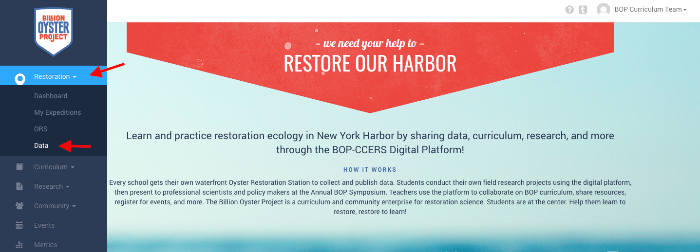
- Go to platform.bop.nyc and sign in. Move your mouse over to the left sidebar and click on "Restoration" followed by "Data":
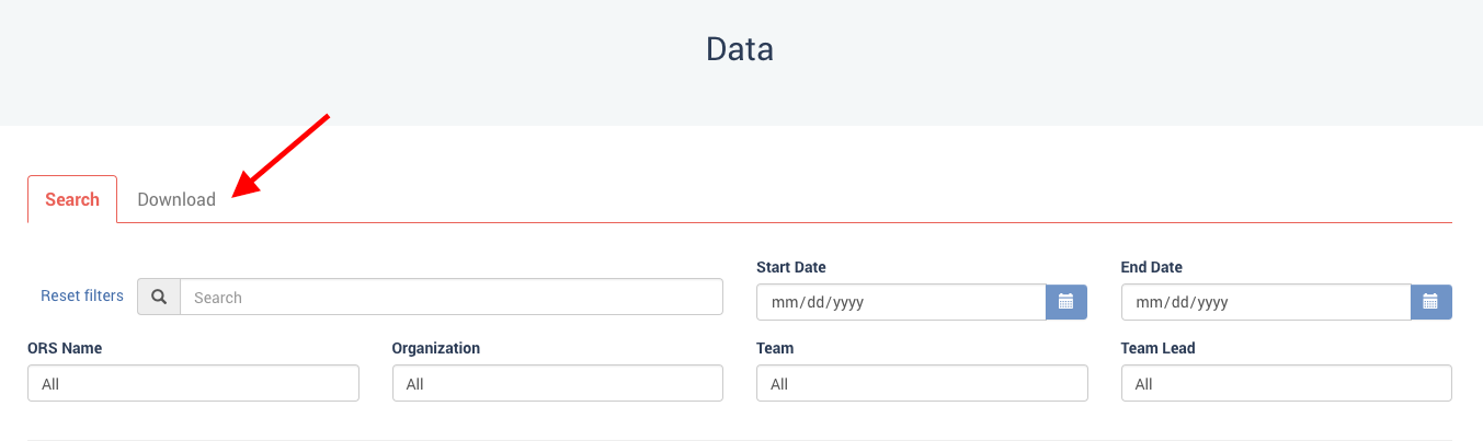
- This pulls up the "Data" page, which has two tabs: "Search" and "Download." Click on "Download":
- "Download" gives you three options- the first option is "Filter the expeditions." (For example, you might want to only look at data from your own school.)
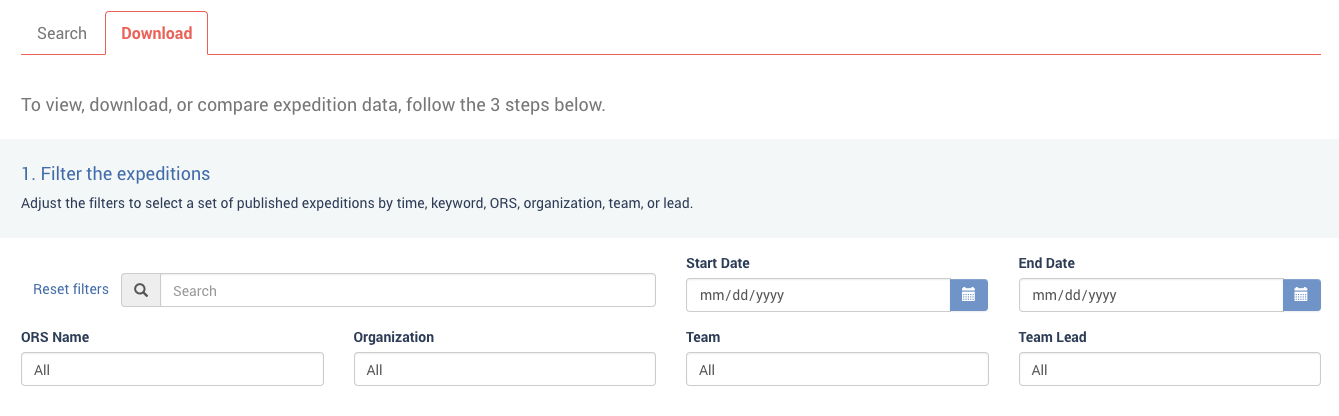
-
For this guide, we're going to look at specific data from every expedition, so we'll leave the "Filter" section blank, and move on to the second option, "Select the parameters to display." This section allows you to choose entire protocols by clicking the checkboxes at the top, or specific parameters within the protocols by checking the box next to each one. Since salinity can have a significant impact on both oyster growth and mortality, we'll look at "Oyster Measurements" and "Salinity."
*Note: after you click the first parameter, give the platform a few seconds to load before clicking the second parameter.
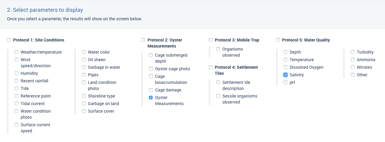
- When you check the "Oyster Measurements" and "Salinity" boxes, a third option will appear below the parameters, displaying, in this case, some but not all of the available data.
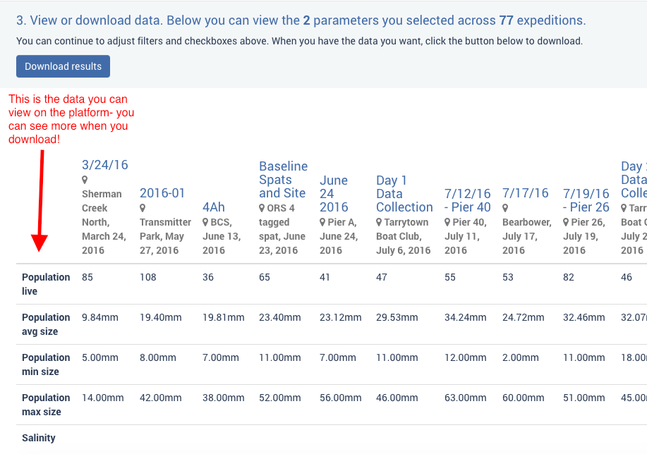
- To see all of the data related to oyster measurements and salinity, you'll need to download it and work with it in a spreadsheet program like Excel, which we've covered in the next section of this guide.
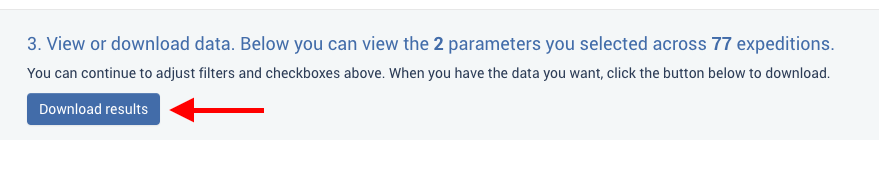
- After selecting which data you want to view on the "Data" page, click the "Download results" button on the right to download the data as a .csv file.
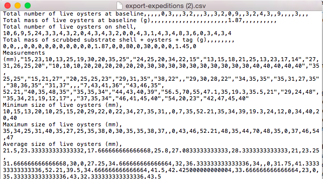
- ".csv" stands for "Comma Separated Values." This kind of file separates out bits of data using commas. It's easy for a computer to read this information, but if you looked at it in a text editor, it could be tricky to read:
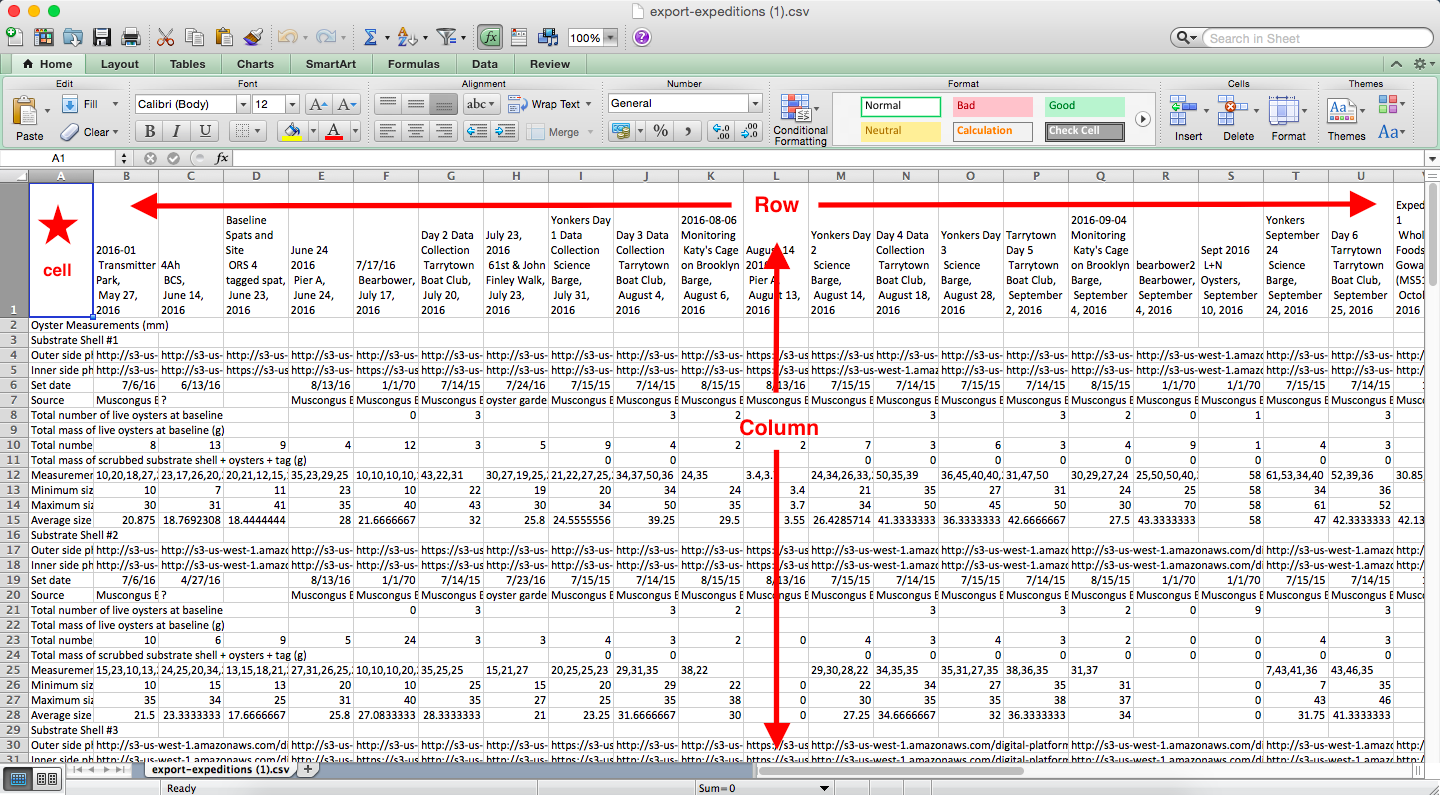
- That's why we use a spreadsheet program like Excel, which visibly separates the data into rows and columns.
- "Rows" are the boxes running horizontally across a sheet, and they're labeled with numbers.
- "Columns" are the boxes running vertically across a sheet, and they're labeled with letters.
- Each individual box is called a "cell." (To tell people which cell you're looking at, you label it with the column letter and the row number. The cell selected in the picture below is "A1.")
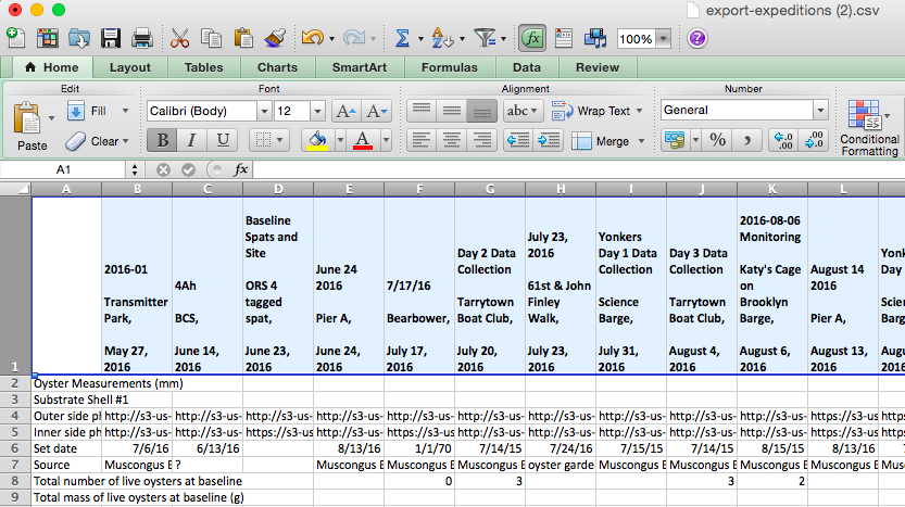
- When you click on the .csv file you've just downloaded, it's most likely that your computer will automatically open it in Excel (or a similar spreadsheet program like Numbers on a Mac). Here's that same data in Excel:
- That's still a little tough to look at, so we can start by making some modifications to make the spreadsheet more readable. The first row at the top of this spreadsheet labels which expedition the data comes from. You might make that row bold so it stands out. If you click the row label "1" on the left, it will select the entire row. Now, if you make a change, it will make a change to the entire row. Use the keyboard shortcut control + B (Windows) or command + B (Mac) to make the row bold:
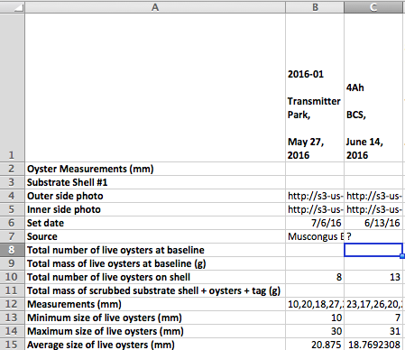
- The first column contains the labels for each kind of data you're looking at, like "Average shell length" or "Minimum shell length." But if you look at the picture below, you can see that the labels get squished in this column so that you can't read the whole thing. To widen the column, double click the line between columns "A" and "B."

- This will widen the column so that it's as wide as the longest label. While you're at it, you might make this whole column bold as well:
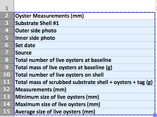
- This looks a little better, but there's still a lot of extra data we don't need in this spreadsheet, and that makes it harder to look at the data we do need. It's really helpful to decide exactly what you want to look at and then delete the rest. When you look at "Oyster Measurements," you have access to the following data about each of the ten substrate shells:
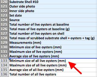
- In this case, we don't need to look at each substrate shell individually- instead we'll look at the data for all of the substrate shells as a whole. This is a little tricky- you'll need to read the labels carefully. Notice that in row #132 below, the last row of data for Substrate Shell #10, the text says "Average size of live oysters (mm)." But in row #133, the first row of data for all of the substrate shells, it says "Minimum size of all live oysters (mm)." So in this case, we can delete all of the rows up to and including row #132.
- Now we're left with a much more manageable 12 rows of data:
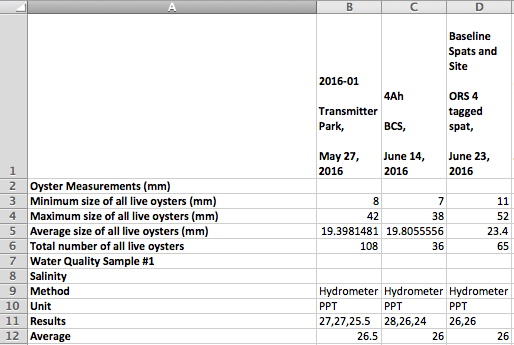
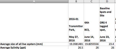
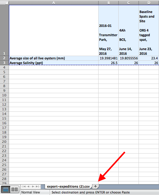
- We can make this even simpler by just looking at the average size of all live oysters and the average salinity, so you can delete all of the rows except for "Average size of all live oysters (mm)" and the salinity values in the row marked "Average." Since the row "Unit" tells us that the salinity was measured in PPT or "parts per thousand," we can rename the "Average" row to "Average Salinity (ppt)" so that it's easier to understand what we're looking at:
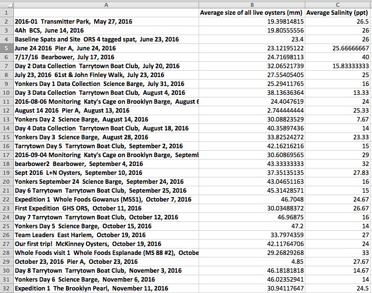
- This is pretty good, but it's still a little tough to see all of the expedition names at the top, so we can transpose the variables, which means switching the rows with the columns, so that it will look like this:
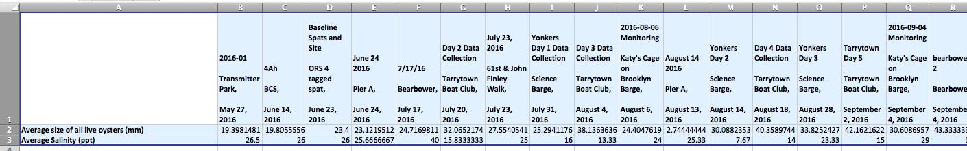
- To transpose the variables, select the range of cells you want to transpose. (Note: this won't work if you use "Select All," or if you select the entire row and column. Make sure to just select the cells.) Use the keyboard shortcut control + C (Windows) or command + C (Mac) to copy the data, or right click and select "Copy":
- At the bottom of the Excel screen, click the "+" tab to open up a new worksheet:
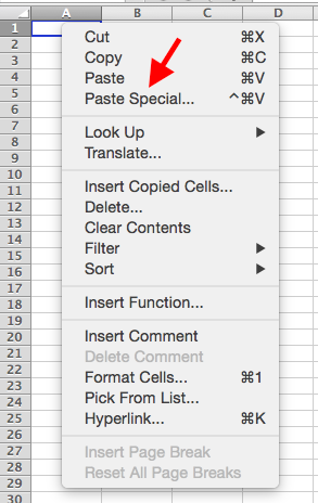
- Select the first cell, A1, in the new sheet. Right click and select "Paste Special":
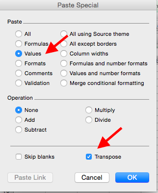
- This will bring up the "Paste Special" options- select "Values" and "Transpose" and click "OK":
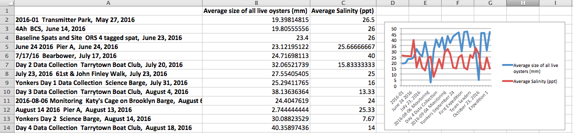
- Now, your sheet will display the expeditions in the first column, and the average length and average salinity in the first row. You can even get fancy and start adding in charts and graphs. Go to the top menu and click "Insert" and then "Charts..." to pull up your options- but think carefully about how you'll display your data! Looking at the graph below, does it really tell you anything conclusive about oyster growth and salinity? Or does it prompt more questions than answers? Are there further modifications to your data set that would make it more useful? Do you need more data?
What can you learn from your ORS data? From everyone's ORS data? Log on to the BOP Digital Platform and start poking around to find out!