Given an Excel file, we will extract data and plot a simple graph with a choice of markers.
This tutorial is beginner friendly, but is dependent on the user downloading MATLAB beforehand and having a license which done by using a college email and registering an account. If you are a BC student here is the website to download MATLAB: https://bcservices.bc.edu/service/matlab
In this tutorial we will use an Excel data file that is attached to this repository called boston_data.xls which contains example time, air temperature, wind speed, dewpoint, and air pressure data.
However we need to convert the Excel file into a .txt file in order to make the data readable for the program. To do this we would open up the boston_data.xls file on Excel, select file on the top right of the screen, select save as, select tab delimited file, and save the file into a separate project folder that will hold the additional MATLAB files.
Nice! Now we can open up MATLAB and create a new script which is a new file where you would be writing out all your code! Here is how the program looks when you open it:
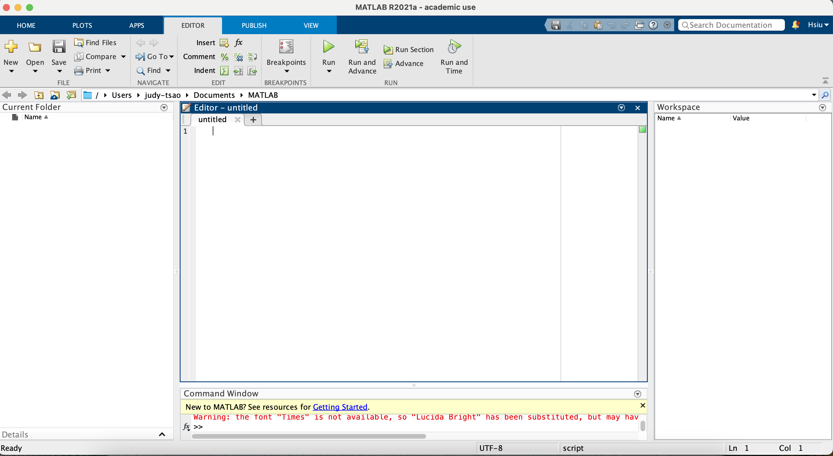
On the left is file directory which shows the files inside the MATLAB folder. The editor is where you will be writing your code. The right side of the screen is the workspace which will contain all the variables that you create. On the top there are various tools including the save to save the code and run which runs the code.
Let's start with naming the script by using double percentage signs (%%) which will allow us to comment and create a new header. Then let's add in the owner of the file using one perventage sign (%) which is usually used as in-line comments:

After creating the comments let's set up our input codes:

Clear and load are both commands of MATLAB. Clear removes any and all variables existing in the workspace to the right and load opens the file with the name that the user will specify.
When setting up variable for data in certain columns, we would use the format of variable = dataVariable(:,1); where the (:,1) represents the data in the first column of the .txt file. Referencing data columns as variables makes it easier for the users to call on that specific data set later.
Now let's move onto plotting the data.

First we need to create a window to place our graphs on and we would do this by using the figure command. The subplot command specifies how many plots the user wants on a figure window by spliting it into a grid based on the first two numbers in the parenthesis. In this example, subplot(2,1,1) refers to the figure window being split up into a 2 by 1 grid and the subplot being the first plot on the top.
The plot command takes two variables as the x and y axis as well as the type of marker. For example, plot(time, tair, 'k') is plotting time as the x axis, the air temperature as the y axis, and creating a black line marker to connect the data points. There are many different markers and colors MATLAB provides, here's a link to the chart of colors: https://www.mathworks.com/help/matlab/ref/plot.html
Hold on is a command used when handling more than one data set at a time. It instructs the program to keep the first data and the graph where it is while the user inputs another set of data on the same data set.
The x axis, y axis, and title labels are easy to make with the command('name') format. A legend can be added by using the legend command and adding a name for each of the data sets in the graph based on which ones were first added. Using 'location' in the parenthesis the user can specify where the legend will be placed on the graph such as 'SouthEast' or even 'NorthEast'.
Now you're ready to create your own graphs! Thank you for using this tutorial!