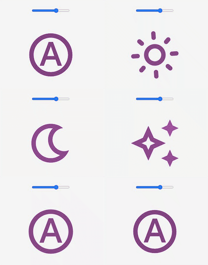
Simple button to handle the color-scheme auto / light / dark / dim . This custom elment it's a button with 4 SVG icons each for schema (auto, light, dark, dim). Dim schema it about orchestrating lightness and saturation, need to have enough saturation to still have a hue visible, but also just barely pass contrast scores. Check the very well done Adam Argyle intro about the shema / theme.
Little animation when button:hover and button:focus
https://web.dev/building-a-color-scheme/
examples • usage • api • accessibility • todo •
<style>
  color-scheme-button {
      width: 128px;
      height: 128px;

      --icon-color: purple;
    }
</style>

<color-scheme-button
  id="btn"
  title="Color Scheme"
  aria-label="Color Scheme">
</color-scheme-button>- Install package
npm install --save @cicciosgamino/color-scheme-button- Import
<!-- Import Js Module -->
<script type="module">
  // Importing this module registers <progress-ring> as an element that you
  // can use in this page.
  //
  // Note this import is a bare module specifier, so it must be converted
  // to a path using a server such as @web/dev-server.
  import '@cicciosgamino/color-scheme-button'
</script>- Place in your HTML
<color-scheme-button
  id="btn"
  title="Color Scheme"
  aria-label="Color Scheme">
</color-scheme-button>| Name | Type | Default | Description |
|---|---|---|---|
| title | String | '' |
Button title |
| ariaLabel | String | '' |
Button aria-label |
None
None events dispatched by default but you can uncomment the code to dispatch the schema-event. This event is dispateched with both, bubble and composed. In the detail.schema field you can retrieve the value of the schema.
| Event Name | Target | Detail | Description |
|---|---|---|---|
| schema-event | color-schema-button | `{ schema: 'auto | light |
| Name | Default | Description |
|---|---|---|
--icon-color |
#000 |
SVG fill attribute |
Acessibility is guaranted with the use of a button with the title and aria-label set on it.SVG icons inside the inner button are set role=img,aria-hidden="true",focusable="false" .
- Better Documentation
- More Examples
 |
|---|
| @cicciosgamino |
Reach out to me at one of the following places:
Donate help and contibutions!
GNU General Public License v3.0
Made 🧑💻 by @cicciosgamino


