Practicing data visualization with python
from matplotlib import pylab
import pandas as pd
import numpy as np
import matplotlib.pyplot as plt
from mpl_toolkits.mplot3d.axes3d import Axes3D
from numpy.random import randint
- this is an open source drawing library which supports rich drawing types
- It is used to draw 2D and 3D graphics
- You can understand your data easily by visualizing it with the help of matlotlib.
- You can generate plots, histograms, bar charts and many other charts with just a few lines of code.
Bar graphs are useful for comparing data across categories or viewing trends over time. However, bar graphs excel at measuring change over time when the changes are significant.
When to use Scatter plot
You can use a scatter plot to see how two variables are related to one another. Two variables that work well together can be plotted on a scatter diagram to examine their relationship and determine if it is positive or negative.
The size of the items (or "wedges") in one data series in a pie chart is proportional to the total number of those elements. Information in a pie chart is represented graphically as a fraction of the entire. The pie() method of the Matplotlib API produces a pie chart from an array of data.
To illustrate two main uses, consider the following:
-
If it's more critical that your audience get the big picture of your data than the finer details of how the individual slices compare in size, then by all means use pie charts.
-
To emphasize the size or smallness of a certain portion of the whole.
- Comparing category sizes: Pie charts fail rapidly if we want our audience to grasp our data beyond huge, little, or the same.
- Data comparison across pies is challenging because the pie slices you want to compare are visually distinct and situated in various locations.
- Displaying data that doesn't add up to 100%: if the slices don't add up to 100%, the data is incorrect. The pie must, by definition, represent a meaningful totality.
- Avoid things like 3D and explosions.These additions aren't necessary and can skew the results.
- Don't use very many slices.There isn't a hard and fast rule here, so think carefully about the needs of your dataset as well as audience.
- Organize your data in a useful way.This takes into account the natural construct that we have of reading in a clockwise direction.
- Remove the legend and provide direct labels for the information.A direct labeling system eliminates the need to constantly refer back and forth between the legend as well as the information being shown. As provided there is enough room for the labels to be legible, you should always try to label your segments directly with the value.
When to use histogram
One common type of graph is the histogram. It's a handy tool for summarizing interval-scaled data, whether those measurements are continuous or discontinuous. It's a useful way to show the key characteristics of the data's distribution.
When to use line graphLine graphs are useful for monitoring trends over both finite and infinite time frames. Line graphs are preferable to bar graphs when the differences are minimal. Changes over time for multiple groups can be compared using line graphs.
When to use Area graph
Similarities between line graphs and area graphs are considerable. One or more groups' changes over time can be monitored with their help. When you need to monitor the evolution of a single category that consists of multiple subcategories, an area graph is the way to go (for example public and private groups).
- Markers (points) can be drawn in a diagram with the aid of the plot() function. The plot() function automatically constructs a line connecting two points.
# read a dataframe. Data available in the folder
data = pd.read_csv("Fifa_world_cup.csv")
data.head()

# dpi produce high quality images
fig = plt.figure(dpi=600)
x = data["total attempts team1"]
y = data["goal preventions team2"]


pylab.plot(x, y,color='red', lw=0.5, marker='o')
- A subgraph is a graph where all of the edges and vertices belong to a smaller graph.
# The contents of the brackets represent (rows, columns, indexes)

m = data["conceded team1"]
n = data["goal inside the penalty area team2"]
fig = plt.figure(dpi=600)
pylab.subplot(1, 2, 1)  # (1st row, 2nd column, index 1 )
pylab.plot(x, y,color='red', lw=0.25 ,marker="o", markerfacecolor='red' )

pylab.subplot(2, 2, 2)  # (2nd row , 2nd column, index 2)
pylab.plot(m, n, color='green', lw=0.25 ,marker="o", markerfacecolor='green')
fig = plt.figure(dpi=600)
axes1 = fig.add_axes([0.1, 0.1, 0.8, 0.8]) # left , right, width, height
axes2 = fig.add_axes([0.2, 0.5, 0.2, 0.3])

axes1.plot(x, y,color='red', lw=0.25 ,marker="o", markerfacecolor='red')

axes2.plot(m, n, color='green', lw=0.25 ,marker="o", markerfacecolor='green')
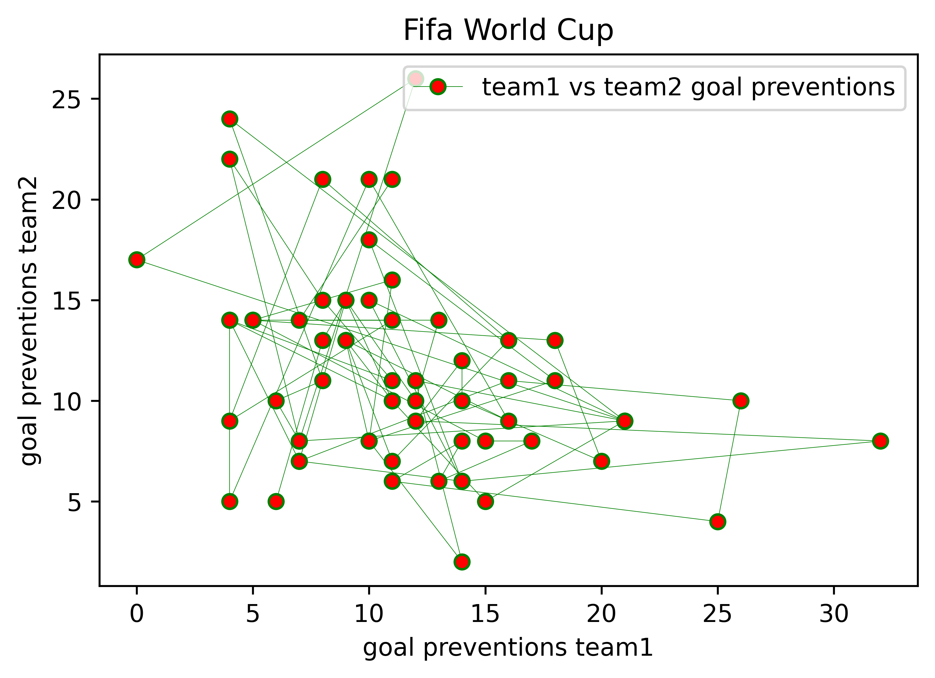
i = data["goal preventions team1"]
j = data["goal preventions team2"]

ax.legend(["Label1", "label2"])
fig, axes = plt.subplots(dpi= 600)
axes.set_xlabel('goal preventions team1') # x axis label
axes.set_ylabel('goal preventions team2') # y axis label
axes.set_title("Fifa World Cup") # Adding title


axes.plot(i, j, color='green', lw=0.25 ,marker="o", markerfacecolor='red')
axes.legend([ "team1 vs team2 goal preventions"])
fig, axes = plt.subplots(dpi= 600)


axes.plot(x, y,
        color='green',
        alpha=.7,
        lw=0.5,  # line width
        marker="o",
        markerfacecolor="red")
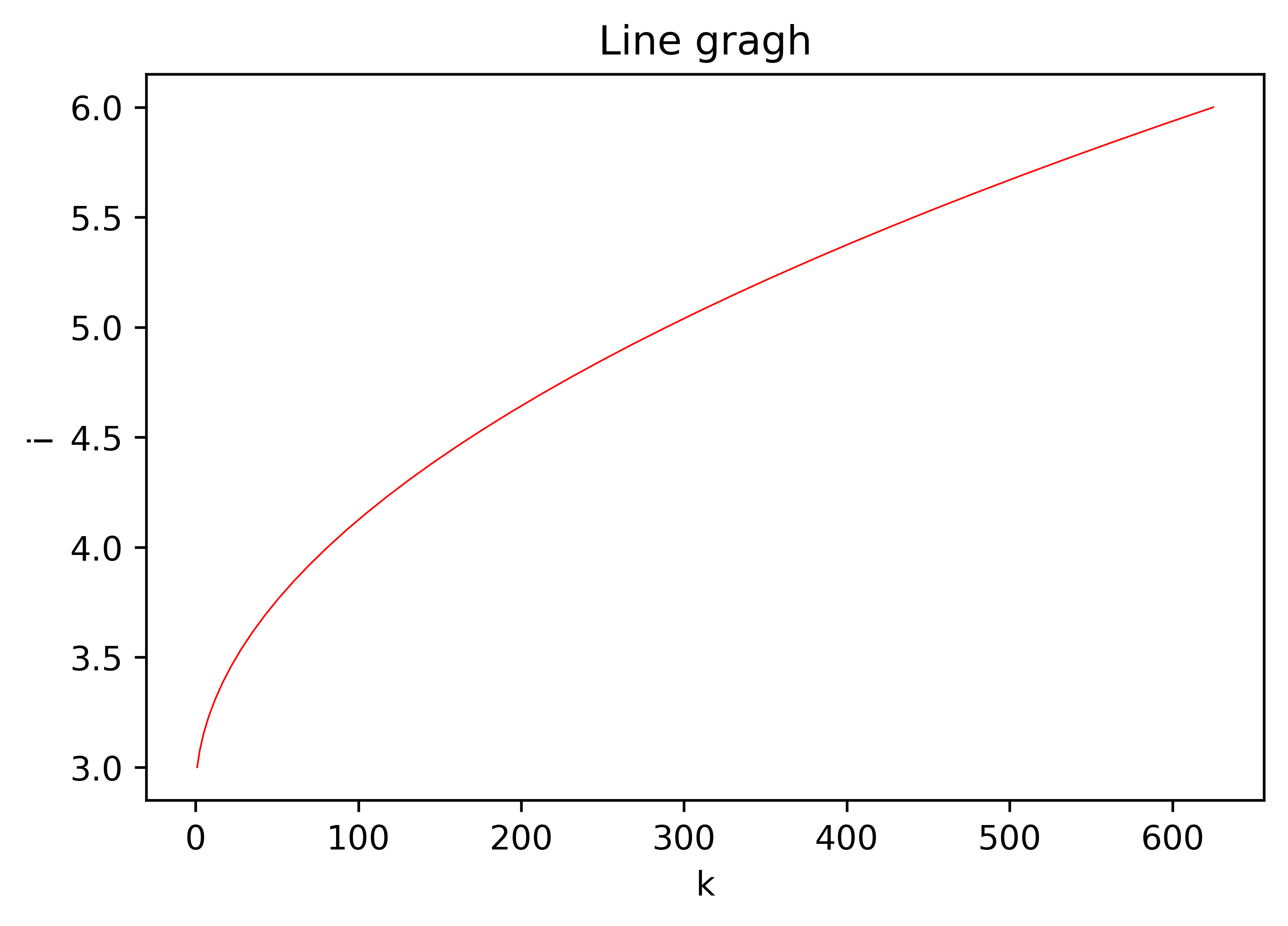
k  = np.linspace(1, 25, 25)
n = np.linspace(1, 20, 25)

fig, axes = plt.subplots(1, 2, dpi=400)

axes[0].plot(k, k**2, n, n**3, lw=2)
axes[0].grid(True)

axes[1].plot(k, k**2, n, n**3, lw=2)
axes[1].grid(True)
axes[1].set_ylim([0, 8000])
axes[1].set_xlim([5, 10])
k  = np.linspace(1, 25, 25)
fig , axes = plt.subplots(1, 4, figsize=(16, 5), dpi=600)
axes[0].set_title("scatter")
axes[0].scatter(k, k**2, color='red')
axes[1].set_title("step plot")
axes[1].step(k, k**3)

axes[2].set_title("bar plot")
axes[2].bar(k, k**4, width=0.8)

axes[3].set_title("fill_between")
axes[3].fill_between(k, k**4, color='green', alpha=0.5)
fig = plt.figure(figsize=(6, 6), dpi=400)
axes = fig.add_axes([0.0, 0.0, 6, 1], polar=True)

x = np.linspace(0, 2 * np.pi, 100)


axes.plot(x, x, color='red', lw=3)
delta = 0.025
x = np.arange(-3.0, 3.0, delta)
y = np.arange(-2.0, 2.0, delta)

X, Y = np.meshgrid(x, y)
Z1 = np.exp(-X**2 - Y**2)
Z2 = np.exp(-(X-1)**2 - (Y - 1)** 2)
Z = (Z1 - Z2)* 2

fig = plt.figure(figsize=(14, 6), dpi=400)
# specify the 3D graphics to draw, with projection='3d'
ax = fig.add_subplot(1, 2, 1, projection='3d')
ax.plot_surface(X, Y, Z, rstride=7, cstride=4, linewidth=0, color="red")
Languages = 'Python', 'C/C++', 'PHP', 'C#', 'Java', 'Other languages'
popularity = [29, 5.9, 6.2, 7.3,  19.1, 23.5]
colors = ['#1f77b4', '#ff7f0e', '#2ca02c', '#d62728' ,  '#9467bd', '#8c564b']
explode= [0.1, 0, 0, 0, 0, 0]
# wp=  {'linewidth': 0.5, 'edgecolor': 'green'}

fig, ax = plt.subplots(figsize= (8, 7), dpi=600)
ax.pie(popularity, labels=Languages,colors=colors,explode=explode, autopct= "%1.1f%%")

ax.set_title("Popular programming language")


