lightGray: '#8f908a',
mediumGray: '#333333',
darkGray: '#222222',
darkMediumGray: '#272727',
black: '#0a0a0a',
white: '#fefefe',
offWhite: '#f7f7f7',
mediumWhite: '#eeeeee',
pink: '#fb266c',
blue: '#60d5f0',
green: '#8ee80e',
yellow: '#fbec26',
red: '#ff4a4a',
teal: '#7bffbe',
purple: '#8943ff',
darkBlue: '#0075ff',
orange: '#ffa100',- DarkThemeProvider
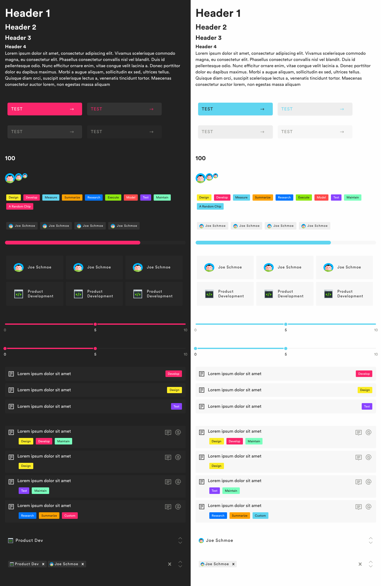
props: {
  primary: 'pink',              // The primary color
}
- LightThemeProvider
props // see DarkThemeProvider
- Avatar
props: {                        // Defaults to 1.5rem
  large: false,                 // Large? 2rem
  small: false,                 // Small? 1rem
  icon: '/path/to/img',
  label: 'Im displayed always',
  firstName: 'Joe',             // First and last name are displayed if
  lastName: 'Schmoe',           // the label is falsey
}
- ArrowButton
props: {
  secondary: false,             // Secdonary button style?
  color: 'primary',             // Color of button
  disabled: false,
}
- Button
props: {
  label: 'Click Me!',
  secondary: false,             // Secdonary button style?
  ternary: false,               // Third button style?
  color: 'primary',             // Color of button
  disabled: false,
}
- Chip
props: {
  label: 'Phase',               // The text for the chip
}
- Container
props: {                        // Defaults to 50rem
  small: false,                 // Small? 40rem
  large: false,                 // Large? 75rem
  extraLarge: false,            // Extra Large? 100rem
}
- H1
props: {
  light: false,                 // Do I bold this header?
}
- H2
props // See H1
- H3
props // See H1
- H4
props // See H1
- IconChip
props: {
  label: 'Joe Schmoe',          // The text next to icon
  icon: '/path/to/img',
}
- Paragraph
props: {
  bold: false,                  // Do I bold this paragraph?
}
- ProgressBar
props: {
  percent: 75,                  // Perent of progress to fill to 100
}
- Tile
props: {
  active: false,                // Have I been clicked?
  onClick: v => doSomething(v),
  value: 1,                     // This value is passed into onClick
  icon: '/path/to/img',
  label: 'Joe Schmoe'           // Text for Tile
}
- Wrapper
props: {
  scrollX: false,               // scroll on X?
  scrollY: false,               // scroll on Y?
}
-
AnimatedNumber
props: {
  number: 100,                  // The number im going to
  duration: 250,                // Time in ms for animation
  noDecimal: false,             // Round?
  format: () => {}              // Format function applied to number before display
  component: React.Component    // What do I display with
}
-
PhaseBar
props: {
  label: 'Lorem Ipsum',         // What is displayed in the bar (requirement name)
  phase: 'Design',              // What phase is this for
}
-
RequirementBar
props: {
  label: 'Lorem Ipsum',         // Requirement Name
  phases: ['Design', 'Develop'],// Array of phases
}
-
RangeSlider
-
Slider
-
Comment
props: {
  user: user                    // The user who made the comment
  comment: 'Lorem ipsum',       // The text
  createdAt: '01:12:13',        // Standard datetime stuff
}
-
Select
props: {
  // See react-select
}
npm install coder-componentsimport { Button } from 'coder-components';
// ...
import 'coder-components/styles/css/styles.css';