
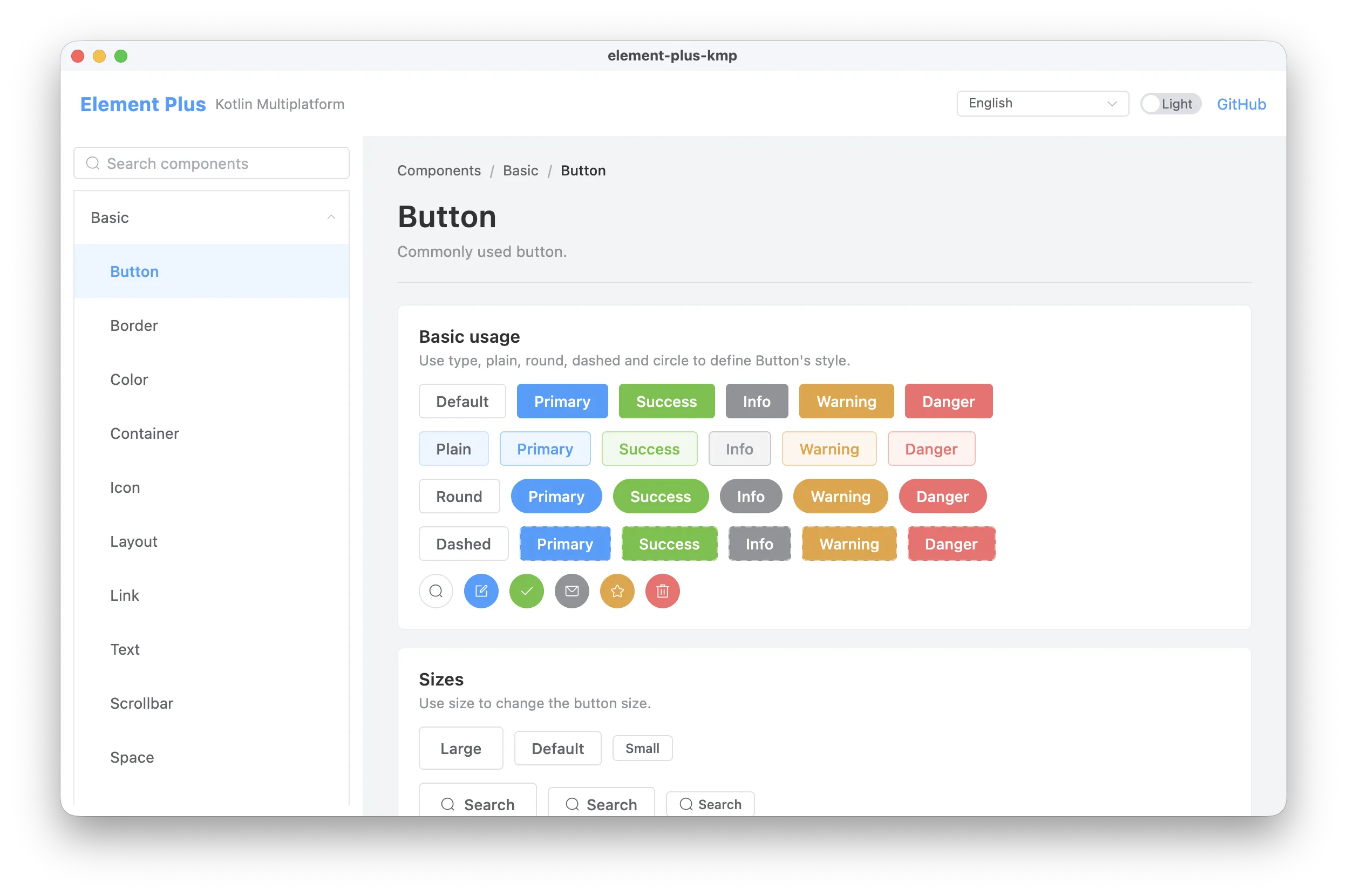
A Kotlin Multiplatform / Compose Multiplatform port of Element Plus. It follows the Element Plus visual language, component anatomy and theme tokens while exposing idiomatic, state-hoisted Compose APIs.
Supported targets: Android, iOS (arm64 + simulator), Desktop/JVM, Kotlin/JS and Kotlin/Wasm.
Live component gallery: https://enaium.github.io/element-plus-kmp/
implementation("cn.enaium.elementplus:element-plus-kmp:1.1.3")The library is built on Compose Multiplatform Foundation/UI and does not require Material.
Wrap the application in ElConfigProvider to install the theme, locale, size and component defaults. Mount ElMessage.Host, ElNotification.Host and ElMessageBox.Host once; after that, their services can be invoked imperatively from event handlers.
Every component has a runnable, state-hoisted example under sample. The coverage table links directly to the corresponding sample source file.
Every component name links to its sample source file.
| Category | Components |
|---|---|
| Basic | Button · Border · Color · Container · Icon · Layout · Link · Text · Scrollbar · Space · Splitter · Typography |
| Config | Config Provider |
| Form | Autocomplete · Cascader · Checkbox · Color Picker Panel · Color Picker · Date Picker Panel · Date Picker · DateTime Picker · Form · Input · Input Number · Input Tag · Input OTP · Mention · Radio · Rate · Select · Virtualized Select · Slider · Switch · Time Picker · Time Select · Transfer · TreeSelect · Upload |
| Data | Avatar · Badge · Calendar · Card · Carousel · Collapse · Descriptions · Empty · Image · Infinite Scroll · Pagination · Progress · Result · Skeleton · Table · Virtualized Table · Tag · Timeline · Tour · Tree · Virtualized Tree · Statistic · Segmented |
| Navigation | Affix · Anchor · Backtop · Breadcrumb · Dropdown · Menu · Page Header · Steps · Tabs |
| Feedback | Alert · Dialog · Drawer · Loading · Message · Message Box · Notification · Popconfirm · Popover · Tooltip |
| Other | Divider · Watermark |
All components live in the flat package cn.enaium.elementplus.components.
Element Plus uses v-model and DOM slots. In Compose, the same ideas map to explicit state:
| Element Plus | Element Plus KMP |
|---|---|
v-model="value" |
value: T + onValueChange: (T) -> Unit |
| slots | composable lambda parameters |
| CSS variables | ElTheme tokens |
size="large" |
ElSize.Large |
type="primary" |
ElType.Primary |
| locale keys | ElLocale |
directives (v-loading, v-infinite-scroll) |
state/overlay components (ElLoading, ElInfiniteScroll) |
services (ElMessage, ElNotification, ElMessageBox) |
service object + a Host wrapper |
Controlled components do not create hidden state:
ElInputNumberis controlled byDouble?.ElSelectis single-value generic;ElSelectMultiplehandles lists.ElDatePickeruseskotlinx.datetime.LocalDate;ElDateTimePickerusesLocalDateTime.ElTreeSelectandElCascaderuse path/key lists.
ElSelect and ElSelectMultiple support local/remote filtering, grouping, create-item, value-key comparisons, clear values, header/footer slots and custom option/tag/label/loading renderers. ElVirtualizedSelect and ElVirtualizedSelectMultiple expose the same behavior with a lazy dropdown. elSelectOptions(items, value, label) maps domain objects to the options attribute.
All component copy is read from the locale installed by ElConfigProvider. The library bundles all 68 Element Plus locales with their official translations, covering date picker month/week names, pagination, transfer counts, upload copy, form validation messages, tour buttons and accessibility labels.
ElLocales.all exposes every locale, ElLocales.byName(...) resolves BCP-47 tags, and ElLocale.English / ElLocale.Chinese are convenience aliases. Region tags fall back to the language (fr-FR → fr, pt_BR → pt-br); unknown tags fall back to English. RTL locales (ar, ar-eg, ckb, fa, he, ug-cn) install LayoutDirection.Rtl through ElConfigProvider.
Light colors, dark colors, the type palette and component sizes follow element-plus/theme-chalk:
- Primary
#409EFF, success#67C23A, warning#E6A23C, danger/error#F56C6C, info#909399. - Component heights: large 40dp, default 32dp, small 24dp.
- Text, border, fill, background, overlay and shadow/radius tokens are available through
LocalElTheme.current.colorsandElTheme.
Dark mode is a first-class theme via ElTheme.Dark. Theme tokens can be overridden for a subtree with a nested ElConfigProvider.
Some browser/DOM-specific features are intentionally injected:
- Upload:
ElUploadrenders the file list, progress, validation and actions; the host app supplies file picking and uploading throughonPickFilesandonUploadFile. - Image:
ElImageandElImageVieweracceptPainters, so any image loader can be plugged in. - Affix: pass the same
ScrollStateused by the surroundingverticalScroll. - Infinite Scroll: wraps a
LazyColumn; the caller appends rows and togglesloadingandfinished. - Virtualized Tree/Table: require a bounded height.
- Anchor: scroll-spy needs pixel
sectionOffsets; without them it behaves as a controlled active-link list. - Tour: target rectangles accept window
Rects, for example fromonGloballyPositioned { it.boundsInWindow() }. - Message, Notification and Message Box: mount the corresponding
Hostonce.
This library is MIT licensed. Element Plus is also MIT licensed. Icons are derived from @element-plus/icons-vue, and design tokens are derived from element-plus/theme-chalk. This is an independent Compose implementation of the Element Plus visual language.