
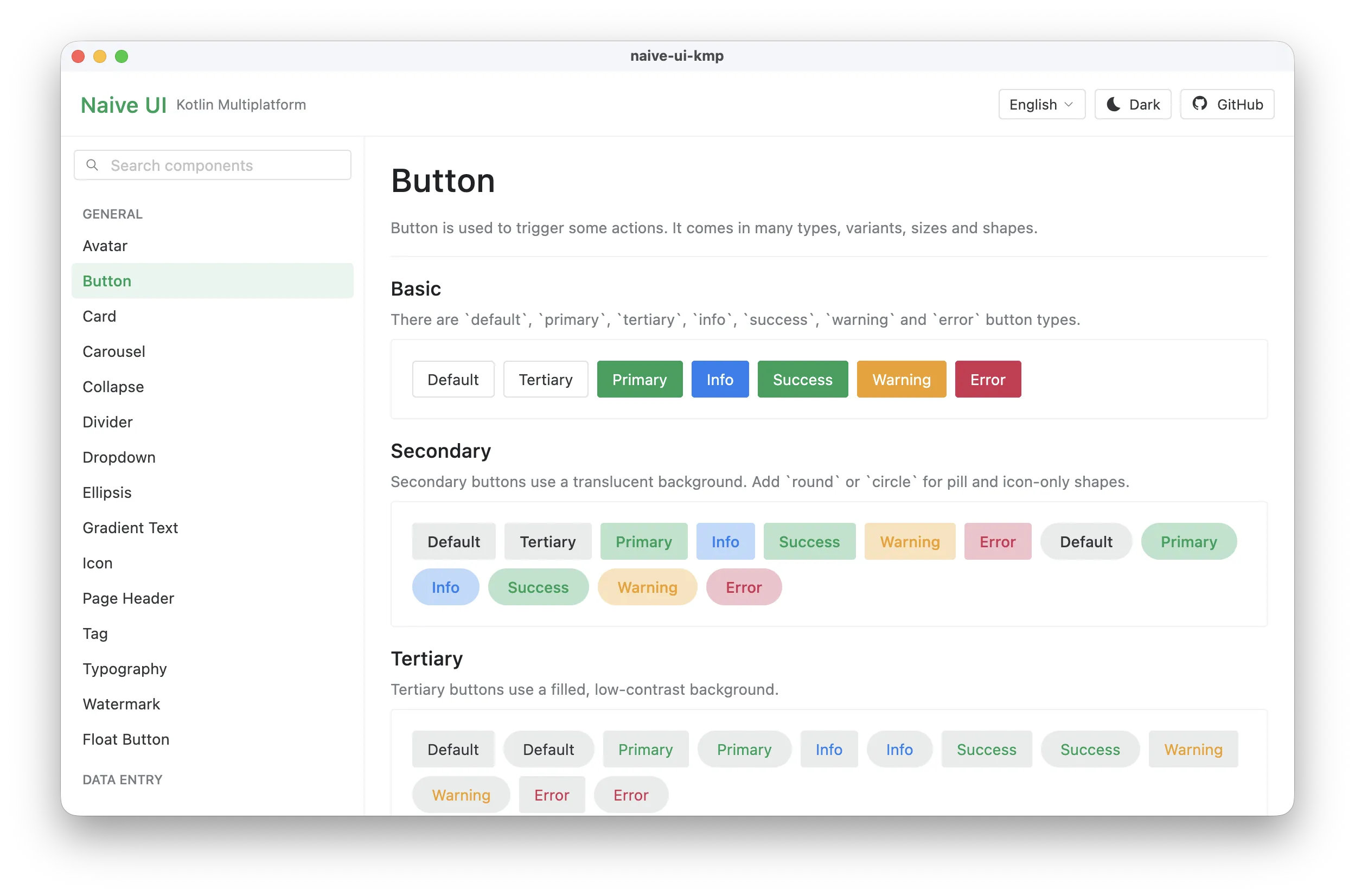
A Compose Multiplatform port of naive-ui (Vue 3) for Android, iOS, Desktop and Web.
The library ships all 94 components in scope, the naive-ui light and dark themes, theme overrides, 79 locales and right-to-left layouts. An interactive gallery mirrors the upstream documentation and provides 750+ runnable demos.
Live gallery: https://enaium.github.io/naive-ui-kmp/
implementation("cn.enaium.naiveui:naive-ui-kmp:1.1.2")- Complete naive-ui component set with the original visual language and API surface.
- Light and dark themes derived from naive-ui's design tokens, plus global and component overrides.
- All 79 naive-ui locales, including localized dates, weekdays, pagination, pickers and validation messages. RTL languages are supported.
- Naive UI icons ported as Compose vectors.
- Anchored popups for tooltips, popovers, dropdowns, selects, cascades, pickers and menus.
- Overlay scrollbars, virtual lists, remote images and QR codes.
- Interactive documentation gallery with a searchable component menu. In Chinese the menu shows
bilingual names such as
按钮 Button.
Every component name links to its sample Kotlin source file.
The sample app presents every component in a searchable vertical menu grouped by category. Each
entry opens a page with interactive demos, and the header can switch between all supported languages
and light/dark themes. The live gallery is deployed to GitHub Pages from the main branch.
Read AGENTS.md for contribution rules, verification commands and demo coverage requirements.
MIT. Component APIs, visual design, icons and demo content originate from naive-ui, also MIT licensed.