You signed in with another tab or window. Reload to refresh your session.You signed out in another tab or window. Reload to refresh your session.You switched accounts on another tab or window. Reload to refresh your session.Dismiss alert
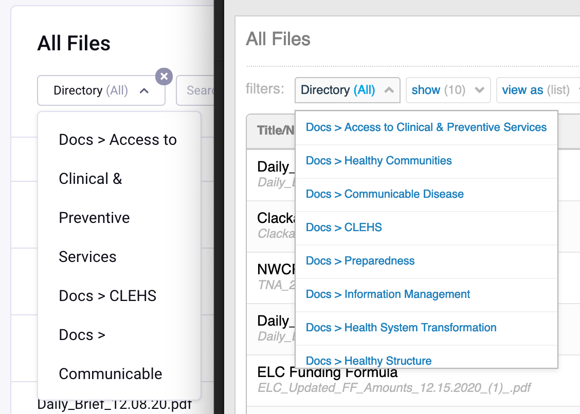
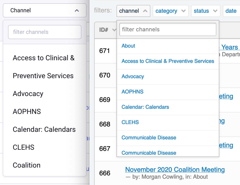
Some of my clients work in the complex, and often a wordy, world of healthcare and find the new fixed-width menus pretty difficult to use. These screenshots show the same file and channel menu in EEv6 and EEv3 so you can see what they are up against. We love the larger font-size, but with the padding and text-wrap, we can't tell where one directory/channel name ends and the next starts. Would love to see a menu style that accommodates my wordy client's needs a little better. Let me know if you have any questions.