This is a solution to the QR code component challenge on Frontend Mentor. Frontend Mentor challenges help you improve your coding skills by building realistic projects.
This is my first ever HTML/CSS challenge. Click here to read all of the information provided by Frontend Mentor concerning this project: The Directions
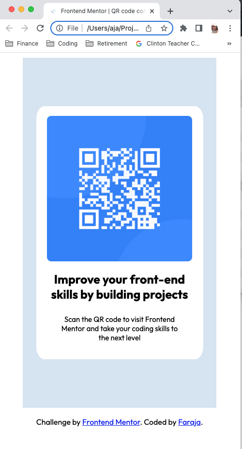
| Mobile View |
|---|
 |
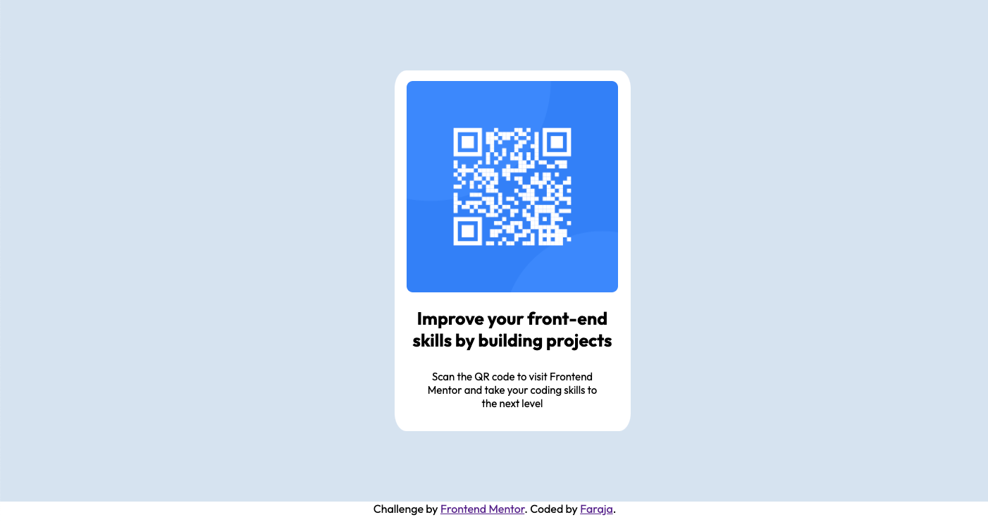
| Desktop View |
|---|
 |
- Solution URL: On Code Pen
- Live Site URL: Full View
At first, I felt frustrated when the divs I had created wouldn't move, but then I remembered to set the white one to display: inline-block. Things quickly began to fall into place after I figured that out. Wow, I just looked at my repository history. It says I uploaded the files 2 hours ago. I didn't realize that I've been working on this for so long. I would've guessed 1 hour. And I'm only part of the way done at this point. I have completed the mobile version. I still need to do the desktop version. I'll save that for another time, upload another screenshot, and write an update here once it is done.
The next day--Okay, that was quick. I used the code below to make it responsive for desktop view.
@media screen and (min-width: 900px) {
  .lt-blue-rect {
    background-color: hsl(212, 45%, 89%);
    width: 100%;
    height: auto;
    padding: 100px 25px;
    margin: 0;
  }
}
This function can be tested at the live site on codepen by changing the size of your browser. Just hover over the right or left edge of your browser window. When you see a double arrow, click and drag toward the middle of your screen until the browser window is as small as you can get it. That's the mobile view. The view changes back to desktop view at about 900px.
After viewing the solution of others, I noticed that I had not changed the font colors, so I fixed that. The screenshots here do not reflect the changes, but the changes can be viewed in the code and on codepen.
This challenge was very good practice for me!
- Semantic HTML5 markup
- CSS 3 properties
Interestingly, I learned many things not directly related to the challenge--I learned more about how to use GitHub! Editing this Read Me file did not come easy for me. I didn't understand how to post the screenshots, how to add code snippets, or add hyperlinks at first, but reading through the Frontend Mentor directions and some research at the GitHub Docs helped me to learn markdown syntax. Here is another great resource recommended by Frontend Mentor: The Markdown Guide I am learning the importance and power of good research while coding. I did also look up some other things, such as border-radius:
.proud-of-this-css {
  border-radius: 5%;
 }
Another example of learning more about GitHub--I panicked for a bit after posting my screenshot. The bookmark to that section of this Read Me doc would not work anymore! At first I thought it was the example markdown for the image, so I put that back in. Still didn't work. Then I figured it out. I had renamed the section "Screenshots" since I plan to post another one when I'm done with the desktop version. So all I had to do was update the spelling in the TOC. Whew!
This challenge was fun and rewarding, but I think I know enough of the basics of HTML and CSS now. So I don't want to spend much more time doing these types of challenges. I want to move on and learn Python and more about JavaScript and then work on challenges involving those.
- GitHub Docs - This helped me to write the markdown for adding my screenshots above.
- The Markdown Guide - This resource is recommended by Frontend Mentor for learning to write markdown.
Faraja Thompson
I'd like to acknowledge my son and mentor DeForestt Thompson. His steadfast support and encouragement keep me motivated! Thanks for forcing me to use the command-line, Son <3 <3 <3.
Thanks for checking out this front-end coding challenge.
Frontend Mentor challenges help you improve your coding skills by building realistic projects.
To do this challenge, you need a basic understanding of HTML and CSS.
Your challenge is to build out this QR code component and get it looking as close to the design as possible.
You can use any tools you like to help you complete the challenge. So if you've got something you'd like to practice, feel free to give it a go.
Want some support on the challenge? Join our Slack community and ask questions in the #help channel.
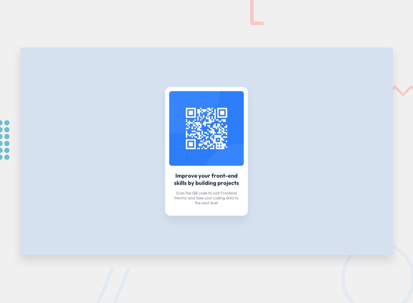
Your task is to build out the project to the designs inside the /design folder. You will find both a mobile and a desktop version of the design.
The designs are in JPG static format. Using JPGs will mean that you'll need to use your best judgment for styles such as font-size, padding and margin.
If you would like the design files (we provide Sketch & Figma versions) to inspect the design in more detail, you can subscribe as a PRO member.
You will find all the required assets in the /images folder. The assets are already optimized.
There is also a style-guide.md file containing the information you'll need, such as color palette and fonts.
Feel free to use any workflow that you feel comfortable with. Below is a suggested process, but do not feel like you need to follow these steps:
- Initialize your project as a public repository on GitHub. Creating a repo will make it easier to share your code with the community if you need help. If you're not sure how to do this, have a read-through of this Try Git resource.
- Configure your repository to publish your code to a web address. This will also be useful if you need some help during a challenge as you can share the URL for your project with your repo URL. There are a number of ways to do this, and we provide some recommendations below.
- Look through the designs to start planning out how you'll tackle the project. This step is crucial to help you think ahead for CSS classes to create reusable styles.
- Before adding any styles, structure your content with HTML. Writing your HTML first can help focus your attention on creating well-structured content.
- Write out the base styles for your project, including general content styles, such as
font-familyandfont-size. - Start adding styles to the top of the page and work down. Only move on to the next section once you're happy you've completed the area you're working on.
As mentioned above, there are many ways to host your project for free. Our recommend hosts are:
You can host your site using one of these solutions or any of our other trusted providers. Read more about our recommended and trusted hosts.
We strongly recommend overwriting this README.md with a custom one. We've provided a template inside the README-template.md file in this starter code.
The template provides a guide for what to add. A custom README will help you explain your project and reflect on your learnings. Please feel free to edit our template as much as you like.
Once you've added your information to the template, delete this file and rename the README-template.md file to README.md. That will make it show up as your repository's README file.
Submit your solution on the platform for the rest of the community to see. Follow our "Complete guide to submitting solutions" for tips on how to do this.
Remember, if you're looking for feedback on your solution, be sure to ask questions when submitting it. The more specific and detailed you are with your questions, the higher the chance you'll get valuable feedback from the community.
There are multiple places you can share your solution:
- Share your solution page in the #finished-projects channel of the Slack community.
- Tweet @frontendmentor and mention @frontendmentor, including the repo and live URLs in the tweet. We'd love to take a look at what you've built and help share it around.
- Share your solution on other social channels like LinkedIn.
- Blog about your experience building your project. Writing about your workflow, technical choices, and talking through your code is a brilliant way to reinforce what you've learned. Great platforms to write on are dev.to, Hashnode, and CodeNewbie.
We provide templates to help you share your solution once you've submitted it on the platform. Please do edit them and include specific questions when you're looking for feedback.
The more specific you are with your questions the more likely it is that another member of the community will give you feedback.
We love receiving feedback! We're always looking to improve our challenges and our platform. So if you have anything you'd like to mention, please email hi[at]frontendmentor[dot]io.
This challenge is completely free. Please share it with anyone who will find it useful for practice.
Have fun building! 🚀
