
This repository is for the codebase of a lightweight Angular v7 web component that displays embedded YouTube videos.
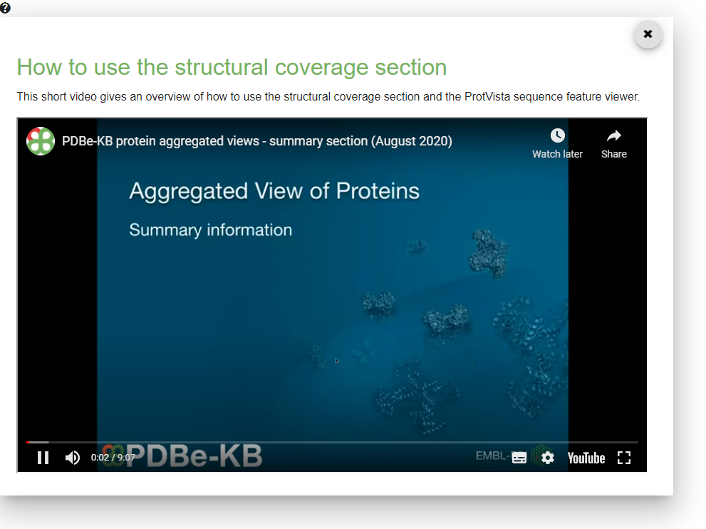
This component is used on the PDBe-KB Aggregated Views of Proteins to display tutorial videos which describe the various functionality of these pages.
Get the code and install dependencies
git clone https://github.com/PDBe-KB/component-tutorial.git
cd component-tutorial
npm i
Running the app
ng serve
Running tests
ng test
The main template (i.e. index.html by default) should also have the following CSS imports:
<link rel="stylesheet" href="https://ebi.emblstatic.net/web_guidelines/EBI-Framework/v1.3/css/ebi-global.css" type="text/css" media="all"/>
<link rel="stylesheet" href="https://ebi.emblstatic.net/web_guidelines/EBI-Icon-fonts/v1.3/fonts.css" type="text/css" media="all"/>
<link rel="stylesheet" href="https://ebi.emblstatic.net/web_guidelines/EBI-Framework/v1.3/css/theme-pdbe-green.css" type="text/css" media="all"/>
The component can be added to any Angular v7 apps.
Import the component in app.module.ts by default.
import {BrowserModule} from '@angular/platform-browser';
import {NgModule} from '@angular/core';
import {NoopAnimationsModule} from '@angular/platform-browser/animations';
import {
  MatButtonModule, MatDialogModule, MatMenuModule,
  MatRadioModule, MatCheckboxModule, MatTooltipModule
} from '@angular/material';

import {AppComponent} from './app.component';
import {TutorialComponent} from './tutorial/tutorial.component';

@NgModule({
  declarations: [
    AppComponent,
    TutorialComponent
  ],
  imports: [
    BrowserModule,
    NoopAnimationsModule,
    MatButtonModule,
    MatDialogModule,
    MatMenuModule,
    MatRadioModule,
    MatCheckboxModule,
    MatTooltipModule
  ],
  entryComponents: [
    TutorialComponent
  ],
  providers: [],
  bootstrap: [AppComponent]
})
export class AppModule {
}
<span>
  <a (click)="openDialog()" style="border-bottom-style: none;">
    <i class="icon icon-generic" data-icon="?"></i>
  </a>
</span>
The data model for the input data is described in
src/app/tutorial/tutorial.models.ts
{
    title: 'How to use the structural coverage section',
    text: 'This short video gives an overview of how to use ...',
    url: 'https://www.youtube.com/embed/knwZnt3i95I?autoplay=1'
}
We use SemVer for versioning. For the versions available, see the tags on this repository.
- Mihaly Varadi - Initial Implementation - mvaradi
See also the list of contributors who participated in this project.
This project is licensed under the EMBL-EBI License - see the LICENSE file for details
We would like to thank the PDBe team and the PDBe-KB partner resources for their feedback and contributions.