Unfortunate color choices with semantic highlighting #2856
Description
(this is in reference to the PowerShell Preview extension 2020.7.0)
I understand that there are some limitations around the mapping PS token types to the (smaller) set of types the VS Code API allows and that this requires some compromises. That said, I'm particularly bothered by the way things are colored with the default VS Code theme. I don't mean which colors are chosen (that's obviously personal taste), I mean places where token types that are frequently adjacent to each other are given the same color. The point of giving things colors is to provide contrast, that's not happening in a number of common cases.
- Parameter names and variables are the same color.

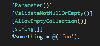
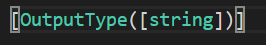
- Attributes and types are the same color. This makes complex parameter declarations a bit harder to read. It also makes attributes that have a type as an argument a bit worse.