- Overview
- Learning Objectives
- Setup And Tutorial
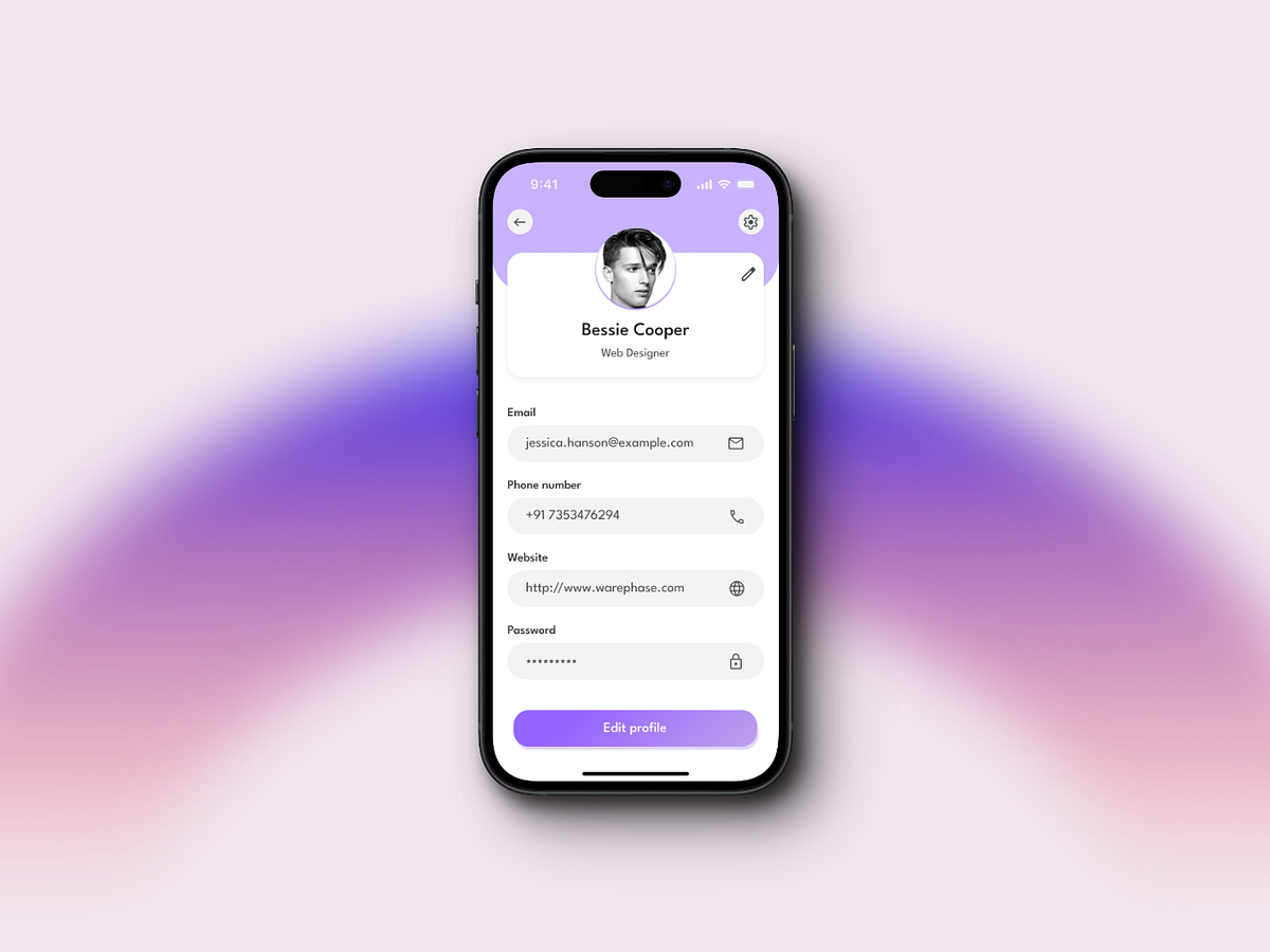
- Project Overview
- Submission Guidelines
- Design Inspiration
In this week, we will learn about the basics of Flutter and Dart. We will also learn how to set up the development environment for Flutter and create a simple Profile Page application. You will also learn about the basic structure of a Flutter application and how to create a simple application using Flutter.
By the end of this week, you will be able to:
- Understand the basics of Flutter and Dart
- Set up the development environment for Flutter
- Create a simple Profile Page application
- Understand the basic structure of a Flutter application
- Create a simple application using Flutter
- Flutter - Beautiful native apps in record time
- Flutter - Get started: install
- Flutter - Get started: test drive
- Flutter - Building layouts
- Flutter Basic Widgets
- Stateful vs Stateless
- Flutter CodeLab
- Custom Themes
- Short Video
To setup this project, please follow this simple git and github tutorial provided here
Assuming you followed the selection project, your flutter doctor should be all green. If it is not all green, please go back to Installing flutter here and make sure everything is installed correctly.
- Open Android Studio
- Click on
More Actionsshown below:
- Click on
Virtual Device Manager - Click on
Create Virtual Device - Select a device and click
Next - Select a system image and download it. Usually, the recommended image is "Tiramisu" or "Marshmallow"
- Click
NextandFinish - Click on the
Playbutton to start the emulator

- If your mac has an Apple Silicon chip, you need to run the following command:
sudo softwareupdate --install-rosetta --agree-to-license- run the following command to install CocoaPods:
sudo gem install cocoapods- Download Xcode from the App Store
- Run the following command to install the Xcode command line tools:
sudo sh -c 'xcode-select -s /Applications/Xcode.app/Contents/Developer && xcodebuild -runFirstLaunch'- Run the following command to install the simulator:
xcodebuild -downloadPlatform iOS- Run the following command to Accept apple's license agreement:
sudo xcodebuild -license- Run the following command to run the simulator:
open -a SimulatorCongratulations! You have successfully set up your emulator.
- Go into the
libfolder and openmain.dart
import 'package:flutter/material.dart';

void main() {
  runApp(const MainApp());
}

class MainApp extends StatelessWidget {
  const MainApp({super.key});

  @override
  Widget build(BuildContext context) {
    return const MaterialApp(
      home: Scaffold(
        body: Center(
          child: Text('Hello World!'),
        ),
      ),
    );
  }
}- The
main()function is the entry point of the app. It is where the app starts executing. - The
runApp()function takes a widget and runs it. In this case, we are running theMainAppwidget. - The
MainAppwidget is a stateless widget. Stateless widgets are immutable, meaning that their properties can't change—all values are final. This widget does not have to be calledMainApp, but it is good practice to name your widget the same as your file. - The
MainAppwidget has abuild()method that returns a widget. This is the widget that will be displayed when the app is launched. - The
MainAppwidget returns aMaterialAppwidget. TheMaterialAppwidget is a widget that provides a framework for implementing the basic material design layout of your app.
MaterialApp(
    title: 'Weather App',
    theme: ThemeData(
      primarySwatch: Colors.blue,
    ),
    home: const Scaffold(),
    debugShowCheckedModeBanner: false,
);- The
MaterialAppwidget is the root widget of your app. It is what allows you to use Material Design components in your app. - The
MaterialAppwidget has ahomeproperty that takes a widget. This is the widget that will be displayed when the app is launched. - The
MaterialAppwidget also has athemeproperty that takes aThemeDataobject. This is where you can customize the theme of your app. - The
MaterialAppwidget also has atitleproperty that takes a string. This is the title of your app that will be displayed in the app switcher. - The
MaterialAppwidget also has adebugShowCheckedModeBannerproperty that takes a boolean. This is whether or not you want the debug banner to be displayed in the top right corner of your app.
Scaffold(
    appBar: AppBar(
      title: const Text('Weather App'),
    ),
    body: const Center(
      child: Text('Hello World!'),
    ),
    floatingActionButton: FloatingActionButton(
      onPressed: () {},
      child: const Icon(Icons.add),
    ),
);- The
Scaffoldwidget is a widget that provides a framework for implementing the basic material design layout of your app. - The
Scaffoldwidget has abodyproperty that takes a widget. This is the widget that will be displayed in the body of the scaffold. - The
Scaffoldwidget also has anappBarproperty that takes aAppBarwidget. This is the widget that will be displayed in the app bar of the scaffold. - The
Scaffoldwidget also has afloatingActionButtonproperty that takes a widget. This is the widget that will be displayed in the bottom right corner of the scaffold.
Row(
  mainAxisAlignment: MainAxisAlignment.center,
  children: const [
    Text('Hello'),
    Text('World'),
  ],
);- The
Rowwidget is a widget that displays its children in a horizontal array. - The
Rowwidget has amainAxisAlignmentproperty that takes aMainAxisAlignmentenum. This is how the children of the row will be aligned. - The
Rowwidget also has acrossAxisAlignmentproperty that takes aCrossAxisAlignmentenum. This is how the children of the row will be aligned vertically. - The
Rowwidget also has achildrenproperty that takes a list of widgets. These are the widgets that will be displayed in the row.
Column(
  mainAxisAlignment: MainAxisAlignment.center,
  children: const [
    Text('Hello'),
    Text('World'),
  ],
);- The
Columnwidget is a widget that displays its children in a vertical array. - The
Columnwidget has amainAxisAlignmentproperty that takes aMainAxisAlignmentenum. This is how the children of the column will be aligned. - The
Columnwidget also has acrossAxisAlignmentproperty that takes aCrossAxisAlignmentenum. This is how the children of the column will be aligned horizontally. - The
Columnwidget also has achildrenproperty that takes a list of widgets. These are the widgets that will be displayed in the column.
Container(
  width: 100,
  height: 100,
  color: Colors.blue,
  decoration: const BoxDecoration(
    shape: BoxShape.circle,
  ),
  child: const Text('Hello World!'),
);- The
Containerwidget is a widget that allows you to customize the size, color, and child of a widget. - The
Containerwidget has awidthproperty that takes a double. This is the width of the container. - The
Containerwidget also has aheightproperty that takes a double. This is the height of the container. - The
Containerwidget also has acolorproperty that takes aColorobject. This is the color of the container. - The
Containerwidget also has achildproperty that takes a widget. This is the widget that will be displayed inside the container.
SizedBox(
  width: 100,
  height: 100,
  child: const Text('Hello World!'),
);- The
SizedBoxwidget is a widget that allows you to customize the size of a widget. - The
SizedBoxwidget has awidthproperty that takes a double. This is the width of the sized box. - The
SizedBoxwidget also has aheightproperty that takes a double. This is the height of the sized box. - The
SizedBoxwidget also has achildproperty that takes a widget. This is the widget that will be displayed inside the sized box.
SingleChildScrollView(
  scrollDirection: Axis.horizontal,
  physics: const BouncingScrollPhysics(),
  child: Column(
    children: const [
      Text('Hello'),
      Text('World'),
    ],
  ),
);- The
SingleChildScrollViewwidget is a widget that allows you to scroll through its children. - The
SingleChildScrollViewwidget has achildproperty that takes a widget. This is the widget that will be displayed inside the scroll view. - The
SingleChildScrollViewwidget also has ascrollDirectionproperty that takes aAxisenum. This is the direction that the scroll view will scroll in. - The
SingleChildScrollViewwidget also has aphysicsproperty that takes aScrollPhysicsobject. This is the physics of the scroll view.
CircleAvatar(
  radius: 50,
  backgroundImage: NetworkImage(
    'https://picsum.photos/200',
  ),
);- The
CircleAvatarwidget is a widget that displays an image in a circle. - The
CircleAvatarwidget has aradiusproperty that takes a double. This is the radius of the circle. - The
CircleAvatarwidget also has abackgroundImageproperty that takes anImageProviderobject. This is the image that will be displayed in the circle. - The
CircleAvatarwidget also has achildproperty that takes a widget. This is the widget that will be displayed inside the circle.
- Go into the
pubspec.yamlfile - Under the
fluttersection, you'll see aassetssection - Add the following code to the
assetssection:
- assets/images/- This will tell Flutter to look in the
assets/images/folder for any assets that you want to use in your app - Save the
pubspec.yamlfile
- create a folder called
imagesin theassetsfolder - add an image to the
imagesfolder
- There are two ways to add an image to your app
AssetImage- This is used for images that are stored locally in your app
NetworkImage- This is used for images that are stored on the internet
Image(
  image: AssetImage('assets/images/image.png'),
);- The
Imagewidget is a widget that displays an image. - The
Imagewidget has animageproperty that takes anImageProviderobject. This is the image that will be displayed. - The
AssetImagewidget is a widget that displays an image that is stored locally in your app.
Image(
  image: NetworkImage('https://picsum.photos/200'),
);- The
NetworkImagewidget is a widget that displays an image that is stored on the internet. - The
NetworkImagewidget has aurlproperty that takes a string. This is the url of the image that will be displayed. - The
Imagewidget is a widget that displays an image.
Container(
  width: 100,
  height: 100,
  decoration: BoxDecoration(
    image: DecorationImage(
      image: AssetImage('assets/images/image.png'),
    ),
  ),
);- The
Containerwidget is a widget that allows you to customize the size, color, and child of a widget. - The
Containerwidget has adecorationproperty that takes aBoxDecorationobject. This is the decoration of the container. - The
BoxDecorationwidget is a widget that allows you to customize the decoration of a container. - The
BoxDecorationwidget has animageproperty that takes aDecorationImageobject. This is the image that will be displayed in the container.
- Go into the
libfolder and create a folder calledwidgets - Create a file called
details_row.dartin thewidgetsfolder
import 'package:flutter/material.dart';

class DetailsRow extends StatelessWidget {
  const DetailsRow({
    super.key,
    required this.text,
    required this.icon,
  });

  final String text;
  final Icon icon;

  @override
  Widget build(BuildContext context) {
    return Row(
      mainAxisAlignment: MainAxisAlignment.spaceAround,
      children: [
        icon,
        Text(
          text,
          style: const TextStyle(
            color: Colors.black,
            fontSize: 20,
            fontWeight: FontWeight.bold,
          ),
        ),
        const SizedBox(),
      ],
    );
  }
}- The
DetailsRowwidget is a widget that displays a row of details. - We have created a custom widget called
DetailsRowthat takes two properties:textandicon. - The
textproperty is a string that will be displayed in the row. - The
iconproperty is an icon that will be displayed in the row.
- Go into the
main.dartfile - Import the
DetailsRowwidget
import 'widgets/details_row.dart';- Use the
DetailsRowwidget
DetailsRow(
  text: 'Feels Like 70°',
  icon: const Icon(
    Icons.thermostat_outlined,
    color: Colors.black,
  ),
),- Go into the
libfolder and create a folder calledscreens - Create a file called
home_screen.dartin thescreensfolder
import 'package:flutter/material.dart';

class HomeScreen extends StatelessWidget {
  const HomeScreen({
    super.key,
  });

  @override
  Widget build(BuildContext context) {
    return Scaffold(
      appBar: AppBar(
        title: const Text('Weather App'),
      ),
      body: const Center(
        child: Text('Hello World!'),
      ),
      floatingActionButton: FloatingActionButton(
        onPressed: () {},
        child: const Icon(Icons.add),
      ),
    );
  }
}- The
HomeScreenpage is a widget that displays the home screen of the app. - We have created a custom page called
HomeScreen. - The
HomeScreenpage is a stateless widget. Stateless widgets are immutable, meaning that their properties can't change—all values are final. This widget does not have to be calledHomeScreen, but it is good practice to name your widget the same as your file.
- Go into the
main.dartfile - Import the
HomeScreenpage
import 'screens/home_screen.dart';- Use the
HomeScreenpage
MaterialApp(
  title: 'Weather App',
  theme: ThemeData(
    primarySwatch: Colors.blue,
  ),
  home: const HomeScreen(),
  debugShowCheckedModeBanner: false,
);In this week, you will create a simple Profile Page application using Flutter. The application will have a simple layout with a profile picture, name, and a short description. You will also learn how to create a simple application using Flutter.
- Create a simple Profile Page application using Flutter
- The application must either follow the design inspirations provided or be as complex as the design inspirations provided
- The code should be well-documented and easy to understand
- The code structure should be clean and organized
- The app should be pushed to Github and a pull request should be created. You can check how to push your code to Github in section 2.1.2 Add Changes.
- The pull request title should be in the following format:
<your-name> - <project-name>. You can check how to make a pull request in section 2.1.5. Create a pull request. - The pull request description should contain the following:
- A description of the changes made..
- A screenshot of the app.
- A description of the changes made..