[Tabs][a11y]: Fix a11y keyboard interaction (when focus overrides selected state) #3669
Conversation
|
👋 Thanks for opening your first pull request. A contributor should give feedback soon. If you haven’t already, please check out the contributing guidelines. |
|
🟢 This pull request modifies 2 files and might impact 1 other files. Details:All files potentially affected (total: 1)📄
|
 ginabak
changed the title
ginabak
changed the title
| - Added a `alwaysRenderCustomProperties` to `ThemeProvider` for elements that render outside of the DOM tree to their parent context ([#3652](https://github.com/Shopify/polaris-react/pull/3652)) | ||
| - Increased precision of hue, saturation, lightness, and alpha in HSBLA `color-transformers` (https://github.com/Shopify/polaris-react/pull/3640) | ||
| - Fixed keyboard interactions for the `Tab` component ([#3650](https://github.com/Shopify/polaris-react/pull/3650)) | ||
| - Fixed keyboard interaction when selected Tab was focused and rendering the wrong `::before` colour ([#3669](https://github.com/Shopify/polaris-react/pull/3669)) |
There was a problem hiding this comment.
Line 31 was my unreleased portion. I just moved the other ones in what I thought was the appropriate "sub heading" and changed the verb tenses to be past tense as per the Polaris Documentation Guideline
ginabak
changed the title
src/components/Tabs/Tabs.scss
Outdated
| } | ||
|
|
||
| .Tab-selected { | ||
| outline: 3px solid transparent; |
There was a problem hiding this comment.
the reason I added a transparent outline was for Windows High Contrast Mode A11Y reasons:
This was BEFORE (it's hard to tell which one is ACTUALLY selected):
This is what it looks like AFTER(this is what it looks like now - it's very obvious):
NOT SURE if this is the best route would LOVE to know THOUGHTSSSS!
There was a problem hiding this comment.
I would just wrap this in a media query so it only applies to high contrast mode. We can also be explicit about the color we use here by including our high contrast color mixin
| outline: 3px solid transparent; | |
| @media (-ms-high-contrast: active) { | |
| outline: 3px solid ms-high-contrast-color('text'); | |
| } |
ms-high-contrast-color('text') this will return the highest contrast value according to whatever the background color is set to. If the background is black, text will always be white etc... so we use this for borders / outlines and such.
There was a problem hiding this comment.
oooh, I like this 👀 😄
There was a problem hiding this comment.
We seem to be using this approach, media query + HC mixin, in a lot of places so I am all in favour of using it for consistency.
That said, it comes with some tradeoffs. The media query only works in Microsoft browsers so a user using WHCM in Chrome would still see the before experience.
The issue with the transparent outline is that even though the CSS property visually has no impact on the user, it is still rendered by the browser even when its not needed.
|
🎩 on Zoom on MacOS (FireFox): In the GIF above, I'm using arrow keys but when I get to the last one it goes back to the first tab ... 🤭 |
 ginabak
requested review from
DanGodfrey,
emma-boardman,
beefchimi and
arapehl
ginabak
requested review from
DanGodfrey,
emma-boardman,
beefchimi and
arapehl
src/components/Tabs/Tabs.scss
Outdated
| } | ||
|
|
||
| .Tab-selected { | ||
| outline: 3px solid transparent; |
There was a problem hiding this comment.
I would just wrap this in a media query so it only applies to high contrast mode. We can also be explicit about the color we use here by including our high contrast color mixin
| outline: 3px solid transparent; | |
| @media (-ms-high-contrast: active) { | |
| outline: 3px solid ms-high-contrast-color('text'); | |
| } |
ms-high-contrast-color('text') this will return the highest contrast value according to whatever the background color is set to. If the background is black, text will always be white etc... so we use this for borders / outlines and such.
|
With the high contrast
|
|
|
||
| &:active .Title::before { | ||
| background: var(--p-action-primary-pressed); | ||
| } |
There was a problem hiding this comment.
Nit: Space between blocks
src/components/Tabs/Tabs.scss
Outdated
| } | ||
|
|
||
| @media (-ms-high-contrast: active) { | ||
| outline: 3px solid ms-high-contrast-color('text'); |
There was a problem hiding this comment.
Where does the 3px come from? Is this informed by somewhere else in Polaris? If so, is there a way to share that code? If not, you should at least wrap 3pm in the rem() function.
There was a problem hiding this comment.
this was not informed by Polaris, I just did a quick search and I see on ActionList.scss that they use 1px:
| } | ||
|
|
||
| @media (-ms-high-contrast: active) { | ||
| outline: rem(3px) solid ms-high-contrast-color('text'); |
There was a problem hiding this comment.
@beefchimi 👀 how's this?
|
🎉 Thanks for your contribution to Polaris React! |
I think this is ok - I would expect the three dots to be accessible via the If I'm tabbing through the element in your gif as a whole, my first tab would focus the first |
…ected state) (#3669)

* Experiment Tabs.scss

* Fix issue when hover overwrites selected state - on keyboard and mouse hover

* Add unreleased.md

* Add transparent border for Windows High Contrast Mode

* Change focus to grey

* Change transparent border to wrap in media query

* Address Curtis comments -space and rem
WHY are these changes introduced?
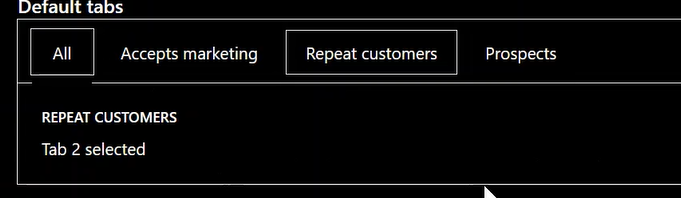
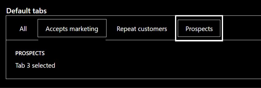
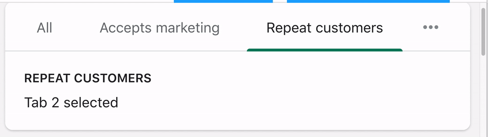
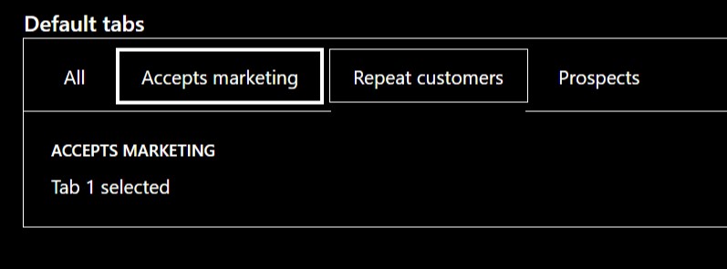
Fixes #3638 (when selected Tab is focused (on keyboard), it has a grey underline instead the primary green)
WHAT is this pull request doing?
A11y related: when auditing online-store-ui's
PanelCardcomponent (see Initial Audit #2291) we noticed that during the manual keyboard testing, when the selected tab is focused, the::beforeunderline was grey instead of the primary green--p-action-primarycolour.BEFORE
AFTER
Please note the following:
prenew design language traits:How to 🎩
🖥 Local development instructions
🗒 General tophatting guidelines
📄 Changelog guidelines
dev s)🎩 checklist
README.mdwith documentation changes