[Navigation] Add a new prop to truncate nav item text #7619
Conversation
size-limit report 📦
|
 Rmnlly
force-pushed
the
truncateText-navigation-option
branch
2 times, most recently
from
Rmnlly
force-pushed
the
truncateText-navigation-option
branch
2 times, most recently
from
1c2e7a9 to
e7a69f4
Compare
Rmnlly
changed the title
|
@Rmnlly should nav items just be truncated by default? I wonder how this could impact translations... My gut feeling is we shouldn't add a property here and items should just truncate if necessary. |
|
@alex-page (Sorry I messed up the reply haha) Do you mean instead of a prop to allow this functionality, instead have this be the default for all navigation items? I imagined there are cases where people would prefer to have the multiline full title displayed. As for translations I'm not sure what the impact might be besides the ellipsis having an alternative meaning in another language? |
|
In my opinion we should have a strong pattern here that works across all items. Either they truncate or don't. I personally prefer the items to go onto two lines as for translations this can easily happen. Do you have a strong example for why we would make truncation an option? |
It's only for apps according to a slack convo but that doesn't mean it couldn't get misused. I'd also prefer to never truncate. If we absolutely need to because of ridiculously long app names then maybe line-clamp with truncate is an option? Looks like we'd be able to use |
|
I hadn't heard of line-clamp but it actually solved a bug I was dealing with so thats awesome! I updated the badge spacing too. |
Rmnlly
force-pushed
the
truncateText-navigation-option
branch
from
7c9fed7 to
696c709
Compare
 Rmnlly
force-pushed
the
truncateText-navigation-option
branch
from
Rmnlly
force-pushed
the
truncateText-navigation-option
branch
from
696c709 to
be1af05
Compare
There was a problem hiding this comment.
I don't love that we need to add a new prop for this and truncating text in the nav. My original suggestion was to line clamp to two lines and then truncate for all nav items. This seems like it could be a better middle ground but might require some UX buy in.
Things that make me nervous about this:
- Could be misused and create a worse merchant experience
- Moving the margins to first-child / last-child. Why was that necessary?
- Using line clamp for single line truncation seems like overkill. Can you change that to use the truncate mixin?
- Can you use
/snapitand test this in web? Share the spin link when you can
Rmnlly
force-pushed
the
truncateText-navigation-option
branch
from
be1af05 to
67620dd
Compare
|
/snapit |
|
🫰✨ Thanks @Rmnlly! Your snapshots have been published to npm. Test the snapshots by updating your yarn add @shopify/plugin-polaris@0.0.0-snapshot-release-20221109152312yarn add @shopify/polaris-icons@0.0.0-snapshot-release-20221109152312yarn add @shopify/polaris-migrator@0.0.0-snapshot-release-20221109152312yarn add @shopify/polaris@0.0.0-snapshot-release-20221109152312yarn add @shopify/polaris-tokens@0.0.0-snapshot-release-20221109152312yarn add @shopify/stylelint-polaris@0.0.0-snapshot-release-20221109152312 |
|
@alex-page What do you think after the changes/the extra context added? Just making sure you're okay if we're going to move forward since I added ya originally. |
 Rmnlly
force-pushed
the
truncateText-navigation-option
branch
from
Rmnlly
force-pushed
the
truncateText-navigation-option
branch
from
c1dc700 to
7306485
Compare
This PR was opened by the [Changesets
release](https://github.com/changesets/action) GitHub action. When
you're ready to do a release, you can merge this and the packages will
be published to npm automatically. If you're not ready to do a release
yet, that's fine, whenever you add more changesets to main, this PR will
be updated.


# Releases
## @shopify/polaris-icons@6.6.0

### Minor Changes

- [#7456](#7456)
[`3bc63f7f9`](3bc63f7)
Thanks [@SereneChen-7](https://github.com/SereneChen-7)! - Add
attribution model icons


- [#7724](#7724)
[`d748c20ef`](d748c20)
Thanks [@jaychashop](https://github.com/jaychashop)! - Added passkey
major and minor icons


- [#7686](#7686)
[`6b989379e`](6b98937)
Thanks [@matyikriszta](https://github.com/matyikriszta)! - Update
FormMajor icon

## @shopify/polaris@10.13.0

### Minor Changes

- [#7803](#7803)
[`23665dfd2`](23665df)
Thanks [@aveline](https://github.com/aveline)! - Added support for `ul`
element on `Box`


- [#7799](#7799)
[`508e148f1`](508e148)
Thanks [@chazdean](https://github.com/chazdean)! - Updated `Box` to
accept role attribute


- [#7746](#7746)
[`757aeebe3`](757aeeb)
Thanks [@laurkim](https://github.com/laurkim)! - Removed `ContentBlock`
and its examples in the style guide


- [#7775](#7775)
[`300b6d4bc`](300b6d4)
Thanks [@laurkim](https://github.com/laurkim)! - Removed `Tiles` and
examples in style guide


- [#7788](#7788)
[`0eb43a9fd`](0eb43a9)
Thanks [@laurkim](https://github.com/laurkim)! - Added storybook example
for `AlphaCard` with subdued section


- [#7794](#7794)
[`d43e3bc88`](d43e3bc)
Thanks [@aveline](https://github.com/aveline)! - Added support for
responsive spacing on `Bleed`


- [#7790](#7790)
[`dc4540ca7`](dc4540c)
Thanks [@laurkim](https://github.com/laurkim)! - Added support for
responsive padding to `AlphaCard` and updated default padding to be
responsive


- [#7767](#7767)
[`cb24dbb9e`](cb24dbb)
Thanks [@aveline](https://github.com/aveline)! - Updated `Box` and
`AlphaStack` to accept aria attributes


- [#7697](#7697)
[`b7b729235`](b7b7292)
Thanks [@aveline](https://github.com/aveline)! - Added support for
responsive padding to `Box`


- [#7754](#7754)
[`aee0c5c4c`](aee0c5c)
Thanks [@aveline](https://github.com/aveline)! - Added support for
responsive `gap` on `Inline`


- [#7619](#7619)
[`15570cc15`](15570cc)
Thanks [@Rmnlly](https://github.com/Rmnlly)! - Added `truncateText` prop
to `Navigation.Item` to prevent text wrapping


- [#7806](#7806)
[`5f3b61d0a`](5f3b61d)
Thanks [@aveline](https://github.com/aveline)! - Added support for `li`
and `tabIndex` on `Box`

### Patch Changes

- [#7768](#7768)
[`4cb1c6a8b`](4cb1c6a)
Thanks [@laurkim](https://github.com/laurkim)! - Renamed storybook
example names for consistency


- [#7808](#7808)
[`ed3444d77`](ed3444d)
Thanks [@laurkim](https://github.com/laurkim)! - Temporarily removed
console warnings for deprecated typography components


- [#7755](#7755)
[`1e5a2b665`](1e5a2b6)
Thanks [@kyledurand](https://github.com/kyledurand)! - Added position,
opacity, top, left, right, bottom, z-index to `Box`


- [#7761](#7761)
[`81f379315`](81f3793)
Thanks [@laurkim](https://github.com/laurkim)! - Refactored `Columns`
`gap` to use `getResponsiveProps` util


- [#7777](#7777)
[`cb882f460`](cb882f4)
Thanks [@laurkim](https://github.com/laurkim)! - Refactored `position`
properties on `Box` to use logical property names


- [#7757](#7757)
[`f9e1985c9`](f9e1985)
Thanks [@aveline](https://github.com/aveline)! - Fixed typo in
`responsive-props` mixin. Added jsdoc examples for responsive spacing
props in `Box`.


- [#7764](#7764)
[`9ab44a69f`](9ab44a6)
Thanks [@laurkim](https://github.com/laurkim)! - Cleaned up prop
descriptions and added missing default values for `Box`, `AlphaCard`,
`AlphaStack`, `Columns`, `Tiles`, `Bleed`, and `Inline`


- [#7769](#7769)
[`a9e018ec4`](a9e018e)
Thanks [@nabihaalikhan](https://github.com/nabihaalikhan)! - Updated
badge spacing to right align with secondary action icons


- [#7748](#7748)
[`ed3da747e`](ed3da74)
Thanks [@laurkim](https://github.com/laurkim)! - Renamed `spacing` prop
to `gap` on `Inline`, `AlphaStack`, `Columns`, and `Tiles`


- [#7732](#7732)
[`d08e1c30c`](d08e1c3)
Thanks [@kyledurand](https://github.com/kyledurand)! - Removed `spacing`
prop from Bleed component


- [#7779](#7779)
[`7c0a4b6a9`](7c0a4b6)
Thanks [@laurkim](https://github.com/laurkim)! - Updated `Bleed` props
to use logical properties, fixed reversed logic for horizontal/vertical
bleed, and updated style guide


- [#7793](#7793)
[`824aef031`](824aef0)
Thanks [@Rmnlly](https://github.com/Rmnlly)! - Extends Navigation Item
highlight to full width to cover secondary actions

- Updated dependencies
\[[`3bc63f7f9`](3bc63f7),
[`d748c20ef`](d748c20),
[`6b989379e`](6b98937)]:
    -   @shopify/polaris-icons@6.6.0

## @shopify/plugin-polaris@0.0.18

### Patch Changes

- Updated dependencies
\[[`28220456f`](2822045)]:
    -   @shopify/polaris-migrator@0.9.1

## @shopify/polaris-migrator@0.9.1

### Patch Changes

- [#7744](#7744)
[`28220456f`](2822045)
Thanks [@laurkim](https://github.com/laurkim)! - Fixed mapping for
`TextStyle` `variation="strong"` to use `Text` `fontWeight="semibold"`
instead of `fontWeight="bold"`

## polaris.shopify.com@0.26.0

### Minor Changes

- [#7746](#7746)
[`757aeebe3`](757aeeb)
Thanks [@laurkim](https://github.com/laurkim)! - Removed `ContentBlock`
and its examples in the style guide


- [#7775](#7775)
[`300b6d4bc`](300b6d4)
Thanks [@laurkim](https://github.com/laurkim)! - Removed `Tiles` and
examples in style guide


- [#7790](#7790)
[`dc4540ca7`](dc4540c)
Thanks [@laurkim](https://github.com/laurkim)! - Added support for
responsive padding to `AlphaCard` and updated default padding to be
responsive


- [#7754](#7754)
[`aee0c5c4c`](aee0c5c)
Thanks [@aveline](https://github.com/aveline)! - Added support for
responsive `gap` on `Inline`

### Patch Changes

- [#7745](#7745)
[`70ed3137b`](70ed313)
Thanks [@laurkim](https://github.com/laurkim)! - Updated alpha status
message that documentation is in development for `Bleed`, `Columns`,
`Tiles`, `Inline`, `AlphaCard`, `AlphaStack`, and `Box`


- [#7803](#7803)
[`23665dfd2`](23665df)
Thanks [@aveline](https://github.com/aveline)! - Added support for `ul`
element on `Box`


- [#7799](#7799)
[`508e148f1`](508e148)
Thanks [@chazdean](https://github.com/chazdean)! - Updated `Box` to
accept role attribute


- [#7761](#7761)
[`81f379315`](81f3793)
Thanks [@laurkim](https://github.com/laurkim)! - Refactored `Columns`
`gap` to use `getResponsiveProps` util


- [#7777](#7777)
[`cb882f460`](cb882f4)
Thanks [@laurkim](https://github.com/laurkim)! - Refactored `position`
properties on `Box` to use logical property names


- [#7747](#7747)
[`0ec96f068`](0ec96f0)
Thanks [@kyledurand](https://github.com/kyledurand)! - Fixed bleed
examples


- [#7794](#7794)
[`d43e3bc88`](d43e3bc)
Thanks [@aveline](https://github.com/aveline)! - Added support for
responsive spacing on `Bleed`


- [#7757](#7757)
[`f9e1985c9`](f9e1985)
Thanks [@aveline](https://github.com/aveline)! - Fixed typo in
`responsive-props` mixin. Added jsdoc examples for responsive spacing
props in `Box`.


- [#7764](#7764)
[`9ab44a69f`](9ab44a6)
Thanks [@laurkim](https://github.com/laurkim)! - Cleaned up prop
descriptions and added missing default values for `Box`, `AlphaCard`,
`AlphaStack`, `Columns`, `Tiles`, `Bleed`, and `Inline`


- [#7767](#7767)
[`cb24dbb9e`](cb24dbb)
Thanks [@aveline](https://github.com/aveline)! - Updated `Box` and
`AlphaStack` to accept aria attributes


- [#7778](#7778)
[`e0c64cd5b`](e0c64cd)
Thanks [@laurkim](https://github.com/laurkim)! - Removed link to deleted
`Tiles` component and cleaned up links


- [#7748](#7748)
[`ed3da747e`](ed3da74)
Thanks [@laurkim](https://github.com/laurkim)! - Renamed `spacing` prop
to `gap` on `Inline`, `AlphaStack`, `Columns`, and `Tiles`


- [#7744](#7744)
[`28220456f`](2822045)
Thanks [@laurkim](https://github.com/laurkim)! - Fixed mapping for
`TextStyle` `variation="strong"` to use `Text` `fontWeight="semibold"`
instead of `fontWeight="bold"`


- [#7732](#7732)
[`d08e1c30c`](d08e1c3)
Thanks [@kyledurand](https://github.com/kyledurand)! - Removed `spacing`
prop from Bleed component


- [#7779](#7779)
[`7c0a4b6a9`](7c0a4b6)
Thanks [@laurkim](https://github.com/laurkim)! - Updated `Bleed` props
to use logical properties, fixed reversed logic for horizontal/vertical
bleed, and updated style guide


- [#7806](#7806)
[`5f3b61d0a`](5f3b61d)
Thanks [@aveline](https://github.com/aveline)! - Added support for `li`
and `tabIndex` on `Box`

- Updated dependencies
\[[`3bc63f7f9`](3bc63f7),
[`4cb1c6a8b`](4cb1c6a),
[`d748c20ef`](d748c20),
[`6b989379e`](6b98937),
[`ed3444d77`](ed3444d),
[`1e5a2b665`](1e5a2b6),
[`23665dfd2`](23665df),
[`508e148f1`](508e148),
[`757aeebe3`](757aeeb),
[`300b6d4bc`](300b6d4),
[`0eb43a9fd`](0eb43a9),
[`81f379315`](81f3793),
[`cb882f460`](cb882f4),
[`d43e3bc88`](d43e3bc),
[`f9e1985c9`](f9e1985),
[`dc4540ca7`](dc4540c),
[`9ab44a69f`](9ab44a6),
[`cb24dbb9e`](cb24dbb),
[`b7b729235`](b7b7292),
[`aee0c5c4c`](aee0c5c),
[`a9e018ec4`](a9e018e),
[`ed3da747e`](ed3da74),
[`15570cc15`](15570cc),
[`d08e1c30c`](d08e1c3),
[`7c0a4b6a9`](7c0a4b6),
[`5f3b61d0a`](5f3b61d),
[`824aef031`](824aef0)]:
    -   @shopify/polaris-icons@6.6.0
    -   @shopify/polaris@10.13.0

Co-authored-by: github-actions[bot] <github-actions[bot]@users.noreply.github.com>
<!--
  ☝️How to write a good PR title:
- Prefix it with [ComponentName] (if applicable), for example: [Button]
  - Start with a verb, for example: Add, Delete, Improve, Fix…
  - Give as much context as necessary and as little as possible
  - Prefix it with [WIP] while it’s a work in progress
-->
### WHY are these changes introduced?
Overwrites have been used in admin to get navigation item text to
truncate with ellipsis since the app pinning project. This is an effort
to port the changes to Polaris to reduce the overwriting and tech debt
in core.

Fixes https://github.com/Shopify/core-workflows/issues/561 <!-- link to
issue if one exists -->

<!--
  Context about the problem that’s being addressed.
-->

### WHAT is this pull request doing?
I've added a prop to allow text truncation in navigation items. It
applies a class that stops the line wrapping of item text and instead
does an ellipsis truncation through CSS.

<!--
  Summary of the changes committed.

Before / after screenshots are appreciated for UI changes. Make sure to
include alt text that describes the screenshot.

If you include an animated gif showing your change, wrapping it in a
details tag is recommended. Gifs usually autoplay, which can cause
accessibility issues for people reviewing your PR:

    <details>
      <summary>Summary of your gif(s)</summary>
      <img src="..." alt="Description of what the gif shows">
    </details>
-->
<img width="275" alt="Screen Shot 2022-11-04 at 12 20 29 PM"
src="https://user-images.githubusercontent.com/33904740/200025372-15995417-9fda-468f-9ab0-75d1a24b8c89.png">

There is a new story for the truncation enabled items. Here you can see
anything going beyond the width of the text container will be truncated
with ellipsis. Notice that "Inventory" is fine as it not long enough to
trigger it. Secondary navigation items are also treated the same as
their parent.

<!-- ℹ️ Delete the following for small / trivial changes -->

### How to 🎩

🖥 [Local development
instructions](https://github.com/Shopify/polaris/blob/main/README.md#local-development)
🗒 [General tophatting
guidelines](https://github.com/Shopify/polaris/blob/main/documentation/Tophatting.md)
📄 [Changelog
guidelines](https://github.com/Shopify/polaris/blob/main/.github/CONTRIBUTING.md#changelog)

<!--
  Give as much information as needed to experiment with the component
  in the playground.
-->

<details>
<summary>Copy-paste this code in
<code>playground/Playground.tsx</code>:</summary>

```jsx
import React from 'react';
import {Page} from '../src';

export function Playground() {
  return (
    <Page title="Playground">
      {/* Add the code you want to test in here */}
    </Page>
  );
}
```

</details>

### 🎩 checklist

- [x] Tested on
[mobile](https://github.com/Shopify/polaris/blob/main/documentation/Tophatting.md#cross-browser-testing)
- [x] Tested on [multiple
browsers](https://help.shopify.com/en/manual/shopify-admin/supported-browsers)
- [x] Tested for
[accessibility](https://github.com/Shopify/polaris/blob/main/documentation/Accessibility%20testing.md)
- [ ] Updated the component's `README.md` with documentation changes
- [ ] [Tophatted
documentation](https://github.com/Shopify/polaris/blob/main/documentation/Tophatting%20documentation.md)
changes in the style guide
This PR was opened by the [Changesets
release](https://github.com/changesets/action) GitHub action. When
you're ready to do a release, you can merge this and the packages will
be published to npm automatically. If you're not ready to do a release
yet, that's fine, whenever you add more changesets to main, this PR will
be updated.


# Releases
## @shopify/polaris-icons@6.6.0

### Minor Changes

- [Shopify#7456](Shopify#7456)
[`3bc63f7f9`](Shopify@3bc63f7)
Thanks [@SereneChen-7](https://github.com/SereneChen-7)! - Add
attribution model icons


- [Shopify#7724](Shopify#7724)
[`d748c20ef`](Shopify@d748c20)
Thanks [@jaychashop](https://github.com/jaychashop)! - Added passkey
major and minor icons


- [Shopify#7686](Shopify#7686)
[`6b989379e`](Shopify@6b98937)
Thanks [@matyikriszta](https://github.com/matyikriszta)! - Update
FormMajor icon

## @shopify/polaris@10.13.0

### Minor Changes

- [Shopify#7803](Shopify#7803)
[`23665dfd2`](Shopify@23665df)
Thanks [@aveline](https://github.com/aveline)! - Added support for `ul`
element on `Box`


- [Shopify#7799](Shopify#7799)
[`508e148f1`](Shopify@508e148)
Thanks [@chazdean](https://github.com/chazdean)! - Updated `Box` to
accept role attribute


- [Shopify#7746](Shopify#7746)
[`757aeebe3`](Shopify@757aeeb)
Thanks [@laurkim](https://github.com/laurkim)! - Removed `ContentBlock`
and its examples in the style guide


- [Shopify#7775](Shopify#7775)
[`300b6d4bc`](Shopify@300b6d4)
Thanks [@laurkim](https://github.com/laurkim)! - Removed `Tiles` and
examples in style guide


- [Shopify#7788](Shopify#7788)
[`0eb43a9fd`](Shopify@0eb43a9)
Thanks [@laurkim](https://github.com/laurkim)! - Added storybook example
for `AlphaCard` with subdued section


- [Shopify#7794](Shopify#7794)
[`d43e3bc88`](Shopify@d43e3bc)
Thanks [@aveline](https://github.com/aveline)! - Added support for
responsive spacing on `Bleed`


- [Shopify#7790](Shopify#7790)
[`dc4540ca7`](Shopify@dc4540c)
Thanks [@laurkim](https://github.com/laurkim)! - Added support for
responsive padding to `AlphaCard` and updated default padding to be
responsive


- [Shopify#7767](Shopify#7767)
[`cb24dbb9e`](Shopify@cb24dbb)
Thanks [@aveline](https://github.com/aveline)! - Updated `Box` and
`AlphaStack` to accept aria attributes


- [Shopify#7697](Shopify#7697)
[`b7b729235`](Shopify@b7b7292)
Thanks [@aveline](https://github.com/aveline)! - Added support for
responsive padding to `Box`


- [Shopify#7754](Shopify#7754)
[`aee0c5c4c`](Shopify@aee0c5c)
Thanks [@aveline](https://github.com/aveline)! - Added support for
responsive `gap` on `Inline`


- [Shopify#7619](Shopify#7619)
[`15570cc15`](Shopify@15570cc)
Thanks [@Rmnlly](https://github.com/Rmnlly)! - Added `truncateText` prop
to `Navigation.Item` to prevent text wrapping


- [Shopify#7806](Shopify#7806)
[`5f3b61d0a`](Shopify@5f3b61d)
Thanks [@aveline](https://github.com/aveline)! - Added support for `li`
and `tabIndex` on `Box`

### Patch Changes

- [Shopify#7768](Shopify#7768)
[`4cb1c6a8b`](Shopify@4cb1c6a)
Thanks [@laurkim](https://github.com/laurkim)! - Renamed storybook
example names for consistency


- [Shopify#7808](Shopify#7808)
[`ed3444d77`](Shopify@ed3444d)
Thanks [@laurkim](https://github.com/laurkim)! - Temporarily removed
console warnings for deprecated typography components


- [Shopify#7755](Shopify#7755)
[`1e5a2b665`](Shopify@1e5a2b6)
Thanks [@kyledurand](https://github.com/kyledurand)! - Added position,
opacity, top, left, right, bottom, z-index to `Box`


- [Shopify#7761](Shopify#7761)
[`81f379315`](Shopify@81f3793)
Thanks [@laurkim](https://github.com/laurkim)! - Refactored `Columns`
`gap` to use `getResponsiveProps` util


- [Shopify#7777](Shopify#7777)
[`cb882f460`](Shopify@cb882f4)
Thanks [@laurkim](https://github.com/laurkim)! - Refactored `position`
properties on `Box` to use logical property names


- [Shopify#7757](Shopify#7757)
[`f9e1985c9`](Shopify@f9e1985)
Thanks [@aveline](https://github.com/aveline)! - Fixed typo in
`responsive-props` mixin. Added jsdoc examples for responsive spacing
props in `Box`.


- [Shopify#7764](Shopify#7764)
[`9ab44a69f`](Shopify@9ab44a6)
Thanks [@laurkim](https://github.com/laurkim)! - Cleaned up prop
descriptions and added missing default values for `Box`, `AlphaCard`,
`AlphaStack`, `Columns`, `Tiles`, `Bleed`, and `Inline`


- [Shopify#7769](Shopify#7769)
[`a9e018ec4`](Shopify@a9e018e)
Thanks [@nabihaalikhan](https://github.com/nabihaalikhan)! - Updated
badge spacing to right align with secondary action icons


- [Shopify#7748](Shopify#7748)
[`ed3da747e`](Shopify@ed3da74)
Thanks [@laurkim](https://github.com/laurkim)! - Renamed `spacing` prop
to `gap` on `Inline`, `AlphaStack`, `Columns`, and `Tiles`


- [Shopify#7732](Shopify#7732)
[`d08e1c30c`](Shopify@d08e1c3)
Thanks [@kyledurand](https://github.com/kyledurand)! - Removed `spacing`
prop from Bleed component


- [Shopify#7779](Shopify#7779)
[`7c0a4b6a9`](Shopify@7c0a4b6)
Thanks [@laurkim](https://github.com/laurkim)! - Updated `Bleed` props
to use logical properties, fixed reversed logic for horizontal/vertical
bleed, and updated style guide


- [Shopify#7793](Shopify#7793)
[`824aef031`](Shopify@824aef0)
Thanks [@Rmnlly](https://github.com/Rmnlly)! - Extends Navigation Item
highlight to full width to cover secondary actions

- Updated dependencies
\[[`3bc63f7f9`](Shopify@3bc63f7),
[`d748c20ef`](Shopify@d748c20),
[`6b989379e`](Shopify@6b98937)]:
    -   @shopify/polaris-icons@6.6.0

## @shopify/plugin-polaris@0.0.18

### Patch Changes

- Updated dependencies
\[[`28220456f`](Shopify@2822045)]:
    -   @shopify/polaris-migrator@0.9.1

## @shopify/polaris-migrator@0.9.1

### Patch Changes

- [Shopify#7744](Shopify#7744)
[`28220456f`](Shopify@2822045)
Thanks [@laurkim](https://github.com/laurkim)! - Fixed mapping for
`TextStyle` `variation="strong"` to use `Text` `fontWeight="semibold"`
instead of `fontWeight="bold"`

## polaris.shopify.com@0.26.0

### Minor Changes

- [Shopify#7746](Shopify#7746)
[`757aeebe3`](Shopify@757aeeb)
Thanks [@laurkim](https://github.com/laurkim)! - Removed `ContentBlock`
and its examples in the style guide


- [Shopify#7775](Shopify#7775)
[`300b6d4bc`](Shopify@300b6d4)
Thanks [@laurkim](https://github.com/laurkim)! - Removed `Tiles` and
examples in style guide


- [Shopify#7790](Shopify#7790)
[`dc4540ca7`](Shopify@dc4540c)
Thanks [@laurkim](https://github.com/laurkim)! - Added support for
responsive padding to `AlphaCard` and updated default padding to be
responsive


- [Shopify#7754](Shopify#7754)
[`aee0c5c4c`](Shopify@aee0c5c)
Thanks [@aveline](https://github.com/aveline)! - Added support for
responsive `gap` on `Inline`

### Patch Changes

- [Shopify#7745](Shopify#7745)
[`70ed3137b`](Shopify@70ed313)
Thanks [@laurkim](https://github.com/laurkim)! - Updated alpha status
message that documentation is in development for `Bleed`, `Columns`,
`Tiles`, `Inline`, `AlphaCard`, `AlphaStack`, and `Box`


- [Shopify#7803](Shopify#7803)
[`23665dfd2`](Shopify@23665df)
Thanks [@aveline](https://github.com/aveline)! - Added support for `ul`
element on `Box`


- [Shopify#7799](Shopify#7799)
[`508e148f1`](Shopify@508e148)
Thanks [@chazdean](https://github.com/chazdean)! - Updated `Box` to
accept role attribute


- [Shopify#7761](Shopify#7761)
[`81f379315`](Shopify@81f3793)
Thanks [@laurkim](https://github.com/laurkim)! - Refactored `Columns`
`gap` to use `getResponsiveProps` util


- [Shopify#7777](Shopify#7777)
[`cb882f460`](Shopify@cb882f4)
Thanks [@laurkim](https://github.com/laurkim)! - Refactored `position`
properties on `Box` to use logical property names


- [Shopify#7747](Shopify#7747)
[`0ec96f068`](Shopify@0ec96f0)
Thanks [@kyledurand](https://github.com/kyledurand)! - Fixed bleed
examples


- [Shopify#7794](Shopify#7794)
[`d43e3bc88`](Shopify@d43e3bc)
Thanks [@aveline](https://github.com/aveline)! - Added support for
responsive spacing on `Bleed`


- [Shopify#7757](Shopify#7757)
[`f9e1985c9`](Shopify@f9e1985)
Thanks [@aveline](https://github.com/aveline)! - Fixed typo in
`responsive-props` mixin. Added jsdoc examples for responsive spacing
props in `Box`.


- [Shopify#7764](Shopify#7764)
[`9ab44a69f`](Shopify@9ab44a6)
Thanks [@laurkim](https://github.com/laurkim)! - Cleaned up prop
descriptions and added missing default values for `Box`, `AlphaCard`,
`AlphaStack`, `Columns`, `Tiles`, `Bleed`, and `Inline`


- [Shopify#7767](Shopify#7767)
[`cb24dbb9e`](Shopify@cb24dbb)
Thanks [@aveline](https://github.com/aveline)! - Updated `Box` and
`AlphaStack` to accept aria attributes


- [Shopify#7778](Shopify#7778)
[`e0c64cd5b`](Shopify@e0c64cd)
Thanks [@laurkim](https://github.com/laurkim)! - Removed link to deleted
`Tiles` component and cleaned up links


- [Shopify#7748](Shopify#7748)
[`ed3da747e`](Shopify@ed3da74)
Thanks [@laurkim](https://github.com/laurkim)! - Renamed `spacing` prop
to `gap` on `Inline`, `AlphaStack`, `Columns`, and `Tiles`


- [Shopify#7744](Shopify#7744)
[`28220456f`](Shopify@2822045)
Thanks [@laurkim](https://github.com/laurkim)! - Fixed mapping for
`TextStyle` `variation="strong"` to use `Text` `fontWeight="semibold"`
instead of `fontWeight="bold"`


- [Shopify#7732](Shopify#7732)
[`d08e1c30c`](Shopify@d08e1c3)
Thanks [@kyledurand](https://github.com/kyledurand)! - Removed `spacing`
prop from Bleed component


- [Shopify#7779](Shopify#7779)
[`7c0a4b6a9`](Shopify@7c0a4b6)
Thanks [@laurkim](https://github.com/laurkim)! - Updated `Bleed` props
to use logical properties, fixed reversed logic for horizontal/vertical
bleed, and updated style guide


- [Shopify#7806](Shopify#7806)
[`5f3b61d0a`](Shopify@5f3b61d)
Thanks [@aveline](https://github.com/aveline)! - Added support for `li`
and `tabIndex` on `Box`

- Updated dependencies
\[[`3bc63f7f9`](Shopify@3bc63f7),
[`4cb1c6a8b`](Shopify@4cb1c6a),
[`d748c20ef`](Shopify@d748c20),
[`6b989379e`](Shopify@6b98937),
[`ed3444d77`](Shopify@ed3444d),
[`1e5a2b665`](Shopify@1e5a2b6),
[`23665dfd2`](Shopify@23665df),
[`508e148f1`](Shopify@508e148),
[`757aeebe3`](Shopify@757aeeb),
[`300b6d4bc`](Shopify@300b6d4),
[`0eb43a9fd`](Shopify@0eb43a9),
[`81f379315`](Shopify@81f3793),
[`cb882f460`](Shopify@cb882f4),
[`d43e3bc88`](Shopify@d43e3bc),
[`f9e1985c9`](Shopify@f9e1985),
[`dc4540ca7`](Shopify@dc4540c),
[`9ab44a69f`](Shopify@9ab44a6),
[`cb24dbb9e`](Shopify@cb24dbb),
[`b7b729235`](Shopify@b7b7292),
[`aee0c5c4c`](Shopify@aee0c5c),
[`a9e018ec4`](Shopify@a9e018e),
[`ed3da747e`](Shopify@ed3da74),
[`15570cc15`](Shopify@15570cc),
[`d08e1c30c`](Shopify@d08e1c3),
[`7c0a4b6a9`](Shopify@7c0a4b6),
[`5f3b61d0a`](Shopify@5f3b61d),
[`824aef031`](Shopify@824aef0)]:
    -   @shopify/polaris-icons@6.6.0
    -   @shopify/polaris@10.13.0

Co-authored-by: github-actions[bot] <github-actions[bot]@users.noreply.github.com>
WHY are these changes introduced?
Overwrites have been used in admin to get navigation item text to truncate with ellipsis since the app pinning project. This is an effort to port the changes to Polaris to reduce the overwriting and tech debt in core.
Fixes https://github.com/Shopify/core-workflows/issues/561
WHAT is this pull request doing?
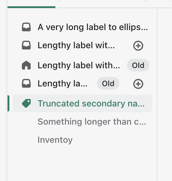
I've added a prop to allow text truncation in navigation items. It applies a class that stops the line wrapping of item text and instead does an ellipsis truncation through CSS.
There is a new story for the truncation enabled items. Here you can see anything going beyond the width of the text container will be truncated with ellipsis. Notice that "Inventory" is fine as it not long enough to trigger it. Secondary navigation items are also treated the same as their parent.
How to 🎩
🖥 Local development instructions
🗒 General tophatting guidelines
📄 Changelog guidelines
Copy-paste this code in
playground/Playground.tsx:🎩 checklist
README.mdwith documentation changes