[Polaris Lighthouse] Add tooling section to doc website #8027
There are no files selected for viewing
This file contains hidden or bidirectional Unicode text that may be interpreted or compiled differently than what appears below. To review, open the file in an editor that reveals hidden Unicode characters.
Learn more about bidirectional Unicode characters
| Original file line number | Diff line number | Diff line change |
|---|---|---|
| @@ -0,0 +1,5 @@ | ||
| --- | ||
| 'polaris.shopify.com': minor | ||
| --- | ||
|
|
||
| Add tooling section to document tools help build and maintain Polaris in consuming applications. |
This file contains hidden or bidirectional Unicode text that may be interpreted or compiled differently than what appears below. To review, open the file in an editor that reveals hidden Unicode characters.
Learn more about bidirectional Unicode characters
| Original file line number | Diff line number | Diff line change |
|---|---|---|
| @@ -1,26 +1,5 @@ | ||
| # Polaris for VS Code | ||
|
|
||
| Official VS Code extension for building with the Shopify Polaris Design System | ||
|
|
||
| [Polaris for VS Code documentation](https://polaris.shopify.com/tools/polaris-for-vscode) | ||
This file contains hidden or bidirectional Unicode text that may be interpreted or compiled differently than what appears below. To review, open the file in an editor that reveals hidden Unicode characters.
Learn more about bidirectional Unicode characters
| Original file line number | Diff line number | Diff line change |
|---|---|---|
| @@ -0,0 +1,6 @@ | ||
| --- | ||
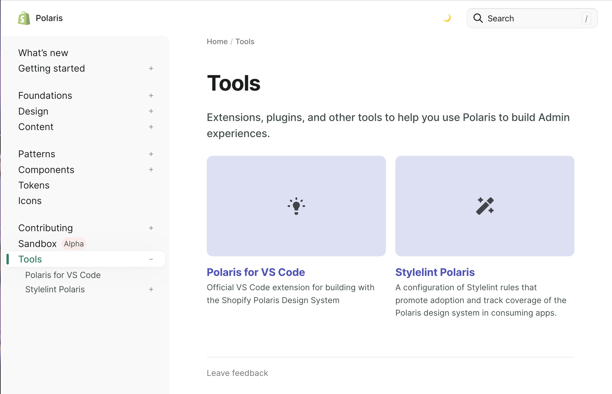
| title: Tools | ||
| description: Extensions, plugins, and other tools to help you use Polaris to build Admin experiences. | ||
| icon: ToolsMajor | ||
| order: 11 | ||
| --- | ||
|
|
||
This file contains hidden or bidirectional Unicode text that may be interpreted or compiled differently than what appears below. To review, open the file in an editor that reveals hidden Unicode characters.
Learn more about bidirectional Unicode characters
| Original file line number | Diff line number | Diff line change |
|---|---|---|
| @@ -0,0 +1,28 @@ | ||
| --- | ||
| title: Polaris for VS Code | ||
| description: Official VS Code extension for building with the Shopify Polaris Design System | ||
| icon: HintMajor | ||
| --- | ||
|
There was a problem hiding this comment. Content copied from polaris-for-vscode/README.md |
||
|
|
||
|  | ||
|
|
||
| ## Features | ||
|
|
||
| ### Design Token Autocomplete | ||
|
|
||
| Get code autocomplete suggestions for the [Polaris Design Tokens](https://polaris.shopify.com/tokens/colors#navigation) | ||
|
|
||
| - 🗄️ Automatically works for CSS and Sass files | ||
| - 🔍 Preview design token values in autocomplete description | ||
| - 🎨 Color previews for all `color` tokens | ||
| - 🥇 Relevant code completions based on the current line of code | ||
|
|
||
| ## How to use | ||
|
|
||
| Install the [Polaris for VS Code extension](https://marketplace.visualstudio.com/items?itemName=Shopify.polaris-for-vscode). Once enabled, the extension will automatically run in any CSS and Sass files. | ||
|
|
||
| To trigger the token autocomplete feature: | ||
|
|
||
| 1. Open a CSS or Sass file from your project | ||
| 2. Start typing the CSS property you want to set, for example: `color:` | ||
| 3. Type the extension trigger characters: `--`. This will bring up the relevant autocomplete tokens associated with the CSS property typed. | ||
This file contains hidden or bidirectional Unicode text that may be interpreted or compiled differently than what appears below. To review, open the file in an editor that reveals hidden Unicode characters.
Learn more about bidirectional Unicode characters
| Original file line number | Diff line number | Diff line change |
|---|---|---|
| @@ -0,0 +1,211 @@ | ||
| --- | ||
| title: Stylelint Polaris | ||
| description: A configuration of Stylelint rules that promote adoption and track coverage of the Polaris design system in consuming apps. | ||
| icon: WandMajor | ||
| collapseChildren: true | ||
| keywords: | ||
| - stylelint | ||
| - dev tools | ||
| - developer tools | ||
| - tools | ||
| - tooling | ||
| - development | ||
| - plugin | ||
| - rules | ||
| - linter | ||
| - linting | ||
| - css | ||
| --- | ||
|
|
||
|
There was a problem hiding this comment. Content copied from stylelint-polaris/README.md |
||
| ## Installation | ||
|
|
||
| ```sh | ||
| yarn add -D @shopify/stylelint-polaris stylelint | ||
| ``` | ||
|
|
||
| > Note: `stylelint-polaris` requires a peer dependency of `stylelint@>=14.15.0` | ||
|
|
||
| [Source code](https://github.com/Shopify/polaris/tree/main/stylelint-polaris) | ||
|
|
||
| ## Usage | ||
|
|
||
| Extend `@shopify/stylelint-polaris` in your [Stylelint config](https://stylelint.io/user-guide/configure/). Example in `package.json` | ||
|
|
||
| ```json | ||
| { | ||
| "stylelint": { | ||
| "extends": ["@shopify/stylelint-polaris"] | ||
| } | ||
| } | ||
| ``` | ||
|
|
||
| > IMPORTANT: `@shopify/stylelint-polaris` must be added to the end of the `extends` array | ||
|
|
||
| ### Run the linter | ||
|
|
||
| ```sh | ||
| npx stylelint '**/*.{css,scss}' | ||
| ``` | ||
|
|
||
| ### Run the linter and autofix failures | ||
|
|
||
| ```sh | ||
| npx stylelint --fix '**/*.{css,scss}' | ||
| ``` | ||
|
|
||
| ### Ignoring existing failures | ||
|
|
||
| Enabling the linter could result in a large amount of warnings and errors in existing codebases. It is important to fix as many failures upfront as possible, but that shouldn't block the linter from being added. The [styles-insert-stylelint-disable](https://github.com/Shopify/polaris/tree/main/polaris-migrator#v10) migration inserts [ignore comments](https://stylelint.io/user-guide/ignore-code/) so that enabling `stylelint-polaris` can be unblocked. | ||
|
|
||
| The migration will insert comments as follows: | ||
|
|
||
| ```diff | ||
| + // stylelint-disable-next-line -- generated by polaris-migrator DO NOT COPY | ||
| padding: 1rem; | ||
| ``` | ||
|
|
||
| Run the following command substituting `<path>` with a glob pattern of files to run against: | ||
|
|
||
| ```sh | ||
| npx @shopify/polaris-migrator styles-insert-stylelint-disable <path> | ||
| ``` | ||
|
|
||
| ## Rules | ||
|
|
||
| There are over 40 rules configured in Stylelint Polaris to help you avoid errors and follow stylistic and non-stylistic conventions while building for the Shopify admin. | ||
|
|
||
| - [Colors](/tools/stylelint-polaris/rules#colors) | ||
| - [Conventions](/tools/stylelint-polaris/rules#conventions) | ||
| - [Depth](/tools/stylelint-polaris/rules#depth) | ||
| - [Layout](/tools/stylelint-polaris/rules#layout) | ||
| - [Legacy](/tools/stylelint-polaris/rules#legacy) | ||
| - [Media queries](/tools/stylelint-polaris/rules#media-queries) | ||
| - [Motion](/tools/stylelint-polaris/rules#motion) | ||
| - [Shape](/tools/stylelint-polaris/rules#shape) | ||
| - [Spacing](/tools/stylelint-polaris/rules#spacing) | ||
| - [Typography](/tools/stylelint-polaris/rules#typography) | ||
| - [Z-index](/tools/stylelint-polaris/rules#z-index) | ||
|
|
||
| ## Development | ||
|
|
||
| ### Add new rules | ||
|
|
||
| 1. Navigate to the root [`stylelint-polaris` config](https://github.com/Shopify/polaris/blob/main/stylelint-polaris/index.js) | ||
| 1. Locate the `stylelint-polaris/coverage` options | ||
| 1. Identify the appropriate category for the new rule | ||
| 1. Insert the rule using standard Stylelint [rule configurations](https://stylelint.io/user-guide/configure#rules) | ||
| 1. Add documentation for the rule with examples of code that will be reported as a problem and code that will fix the problem | ||
| 1. The title should be the category + the stylelint rule name, for example `### colors/color-named` | ||
|
|
||
| ```js | ||
| module.exports = { | ||
| rules: { | ||
| 'polaris/coverage': { | ||
| colors: {...}, // Standard Stylelint rules config | ||
| layout: {...}, // Standard Stylelint rules config | ||
| motion: { | ||
| 'new-rule': 'new-rule-options', | ||
| }, | ||
| }, | ||
| }, | ||
| }; | ||
| ``` | ||
|
|
||
| ### Build custom rules | ||
|
|
||
| 1. Refer to the [Writing plugins](https://stylelint.io/developer-guide/plugins) guide of the Stylelint documentation | ||
| 1. Create your rule in the [plugins](plugins) directory | ||
| 1. Validate your plugin with [tests](https://github.com/stylelint/jest-preset-stylelint#usage) (reference sibling plugins for examples) | ||
| 1. Refer to the [Add new rules](#add-new-rules) section to add your custom rule to the `stylelint-polaris` config | ||
|
|
||
| ### Add custom messages | ||
|
|
||
| Custom messages are surfaced in the command line, CI, and supported editors along side the default `stylelint` rule messages. They are added to the root level config and aim to provide more insight on how to resolve rule violations. | ||
|
|
||
| In a majority of cases, the default rule messages are clear and concise. However, they don't always guide developers to a desired outcome. Thus, there are two mechanisms we suggest for improving and providing custom rule messages: | ||
|
|
||
| Set a generic custom message on the `message` property of the secondary options of a given `stylelint-polaris/coverage` category. This message is appended to the default rule message and we expect will cover most cases. | ||
|
|
||
| ```js | ||
| module.exports = { | ||
| rules: { | ||
| 'polaris/coverage': { | ||
| colors: [ | ||
| { | ||
| 'color-named': 'never' | ||
| 'color-no-hex': true, | ||
| }, | ||
| {message: 'Please use a Polaris color token: https://polaris.shopify.com/tokens/colors'}, | ||
| ], | ||
| }, | ||
| }, | ||
| } | ||
| ``` | ||
|
|
||
| Example failure message: | ||
|
|
||
| ```diff | ||
| - Unexpected named color "red" (color-named) | ||
| + Unexpected named color "red" (color-named) Please use a Polaris color token | ||
| ``` | ||
|
|
||
| Set a custom message on the `message` property in the [Stylelint rule config's secondary options](https://stylelint.io/user-guide/configure/#message) if supported. This message is appended to the default rule message instead of the generic category message when provided. | ||
|
|
||
| ```js | ||
| module.exports = { | ||
| rules: { | ||
| 'polaris/coverage': { | ||
| layout: [ | ||
| { | ||
| 'property-disallowed-list': [ | ||
| ['position'], | ||
| {message: 'Please use the Polaris "Sticky" component'}, | ||
| ], | ||
| }, | ||
| {message: 'Please use a Polaris layout component'}, | ||
| ], | ||
| }, | ||
| }, | ||
| }; | ||
| ``` | ||
|
|
||
| Example failure message: | ||
|
|
||
| ```diff | ||
| - Unexpected value "sticky" for property "position" (declaration-property-value-disallowed-list) Please use a Polaris layout component | ||
| + Unexpected value "sticky" for property "position" (declaration-property-value-disallowed-list) Please use the Polaris "Sticky" component | ||
| ``` | ||
|
|
||
| ### Tophat `stylelint-polaris` updates in `polaris-react` | ||
|
|
||
| > Open your terminal to the root of the `polaris` monorepo: | ||
|
|
||
| 1. Install and symlink dependencies | ||
|
|
||
| ```sh | ||
| yarn install | ||
| ``` | ||
|
|
||
| 2. Build `@shopify/polaris` dependencies, but not `@shopify/polaris` itself | ||
|
|
||
| ```sh | ||
| yarn build -- --filter=@shopify/polaris^... | ||
| ``` | ||
|
|
||
| > Note: Remove the `^` character if you do want to build `@shopify/polaris` | ||
|
|
||
| 3. Run `stylelint` in `polaris-react` | ||
|
|
||
| All files | ||
|
|
||
| ```sh | ||
| yarn turbo run lint:styles --filter=@shopify/polaris | ||
| ``` | ||
|
|
||
| Specific file | ||
|
|
||
| ```sh | ||
| yarn run stylelint path/to/component.scss | ||
|
|
||
| // yarn run stylelint polaris-react/src/components/TopBar/TopBar.scss | ||
| ``` | ||
This file contains hidden or bidirectional Unicode text that may be interpreted or compiled differently than what appears below. To review, open the file in an editor that reveals hidden Unicode characters.
Learn more about bidirectional Unicode characters
| Original file line number | Diff line number | Diff line change |
|---|---|---|
| @@ -0,0 +1,15 @@ | ||
| --- | ||
| title: colors/at-rule-disallowed-list | ||
| description: Disallows use of legacy color mixins | ||
| keywords: | ||
| - stylelint | ||
| - colors | ||
| - colors rules | ||
| --- | ||
|
|
||
| ```diff | ||
| // Do | ||
| + fill: var(--p-icon-subdued); | ||
| // Don't | ||
| - fill: recolor-icon(--p-text-subdued); | ||
| ``` | ||
|
There was a problem hiding this comment. Additional content is wrapped around this markdown in rule page template |
||
This file contains hidden or bidirectional Unicode text that may be interpreted or compiled differently than what appears below. To review, open the file in an editor that reveals hidden Unicode characters.
Learn more about bidirectional Unicode characters
| Original file line number | Diff line number | Diff line change |
|---|---|---|
| @@ -0,0 +1,17 @@ | ||
| --- | ||
| title: colors/color-named | ||
| description: Disallows named colors | ||
| keywords: | ||
| - stylelint | ||
| - colors | ||
| - colors rules | ||
| --- | ||
|
|
||
| ```diff | ||
| // Do | ||
| + color: var(--p-text); | ||
| + fill: var(--p-icon) | ||
| // Don't | ||
| - color: black; | ||
| - fill: dimgray; | ||
| ``` |
This file contains hidden or bidirectional Unicode text that may be interpreted or compiled differently than what appears below. To review, open the file in an editor that reveals hidden Unicode characters.
Learn more about bidirectional Unicode characters
| Original file line number | Diff line number | Diff line change |
|---|---|---|
| @@ -0,0 +1,17 @@ | ||
| --- | ||
| title: colors/color-no-hex | ||
| description: Disallows hex colors | ||
| keywords: | ||
| - stylelint | ||
| - colors | ||
| - colors rules | ||
| --- | ||
|
|
||
| ```diff | ||
| // Do | ||
| + color: var(--p-text); | ||
| + fill: var(--p-icon) | ||
| // Don't | ||
| - color: #202223; | ||
| - fill: #5c5f62; | ||
| ``` |
This file contains hidden or bidirectional Unicode text that may be interpreted or compiled differently than what appears below. To review, open the file in an editor that reveals hidden Unicode characters.
Learn more about bidirectional Unicode characters
| Original file line number | Diff line number | Diff line change |
|---|---|---|
| @@ -0,0 +1,16 @@ | ||
| --- | ||
| title: colors/declaration-property-value-disallowed-list | ||
| description: Disallows custom decimal opacity values | ||
| keywords: | ||
| - stylelint | ||
| - colors | ||
| - colors rules | ||
| --- | ||
|
|
||
| ```diff | ||
| // Do | ||
| + background: var(--p-hint-from-direct-light); | ||
| // Don't | ||
| - background: black; | ||
| - opacity: 0.15; | ||
| ``` |
This file contains hidden or bidirectional Unicode text that may be interpreted or compiled differently than what appears below. To review, open the file in an editor that reveals hidden Unicode characters.
Learn more about bidirectional Unicode characters
| Original file line number | Diff line number | Diff line change |
|---|---|---|
| @@ -0,0 +1,17 @@ | ||
| --- | ||
| title: colors/function-disallowed-list | ||
| description: Disallows allows use of built in and legacy color functions | ||
| keywords: | ||
| - stylelint | ||
| - colors | ||
| - colors rules | ||
| --- | ||
|
|
||
| ```diff | ||
| // Do | ||
| + color: var(--p-text-disabled); | ||
| + background: var(--p-action-secondary-hovered-dark); | ||
| // Don't | ||
| - color: rgb(140, 145, 150); | ||
| - background: color('hover'); | ||
| ``` |
This file contains hidden or bidirectional Unicode text that may be interpreted or compiled differently than what appears below. To review, open the file in an editor that reveals hidden Unicode characters.
Learn more about bidirectional Unicode characters
| Original file line number | Diff line number | Diff line change |
|---|---|---|
| @@ -0,0 +1,24 @@ | ||
| --- | ||
| title: colors/global-disallowed-list | ||
| description: Disallows use of legacy color custom properties and mixin map data | ||
| keywords: | ||
| - stylelint | ||
| - colors | ||
| - colors rules | ||
| --- | ||
|
|
||
| Disallows use of legacy custom properties. | ||
|
|
||
| ```diff | ||
| // Do | ||
| + border: transparent; | ||
| // Don't | ||
| - border: var(--p-override-transparent); | ||
| ``` | ||
|
|
||
| Disallows use of legacy mixin map data. | ||
|
|
||
| ```diff | ||
| // Don't | ||
| - @type map $filter-palette-data: $polaris-color-filters; | ||
| ``` |
Oops, something went wrong.
Add this suggestion to a batch that can be applied as a single commit.
This suggestion is invalid because no changes were made to the code.
Suggestions cannot be applied while the pull request is closed.
Suggestions cannot be applied while viewing a subset of changes.
Only one suggestion per line can be applied in a batch.
Add this suggestion to a batch that can be applied as a single commit.
Applying suggestions on deleted lines is not supported.
You must change the existing code in this line in order to create a valid suggestion.
Outdated suggestions cannot be applied.
This suggestion has been applied or marked resolved.
Suggestions cannot be applied from pending reviews.
Suggestions cannot be applied on multi-line comments.
Suggestions cannot be applied while the pull request is queued to merge.
Suggestion cannot be applied right now. Please check back later.
There was a problem hiding this comment.
Choose a reason for hiding this comment
The reason will be displayed to describe this comment to others. Learn more.
moved this file's content to polaris.shopify.com/content/tools/index.md so there is one source of truth