[TextField] Add ability to hide input type="number" stepper arrows by default until the field is interacted with #8586
Conversation
 tatianau
force-pushed
the
tu-textfield-stepper
branch
from
tatianau
force-pushed
the
tu-textfield-stepper
branch
from
6959996 to
0cde4b6
Compare
size-limit report 📦
|
tatianau
force-pushed
the
tu-textfield-stepper
branch
6 times, most recently
from
a7bd4ab to
7c2ace6
Compare
tatianau
changed the title
tatianau
force-pushed
the
tu-textfield-stepper
branch
3 times, most recently
from
4840eec to
8fcc61f
Compare
tatianau
changed the title
tatianau
force-pushed
the
tu-textfield-stepper
branch
from
8fcc61f to
7a7655b
Compare
tatianau
requested review from
alex-page,
chloerice,
oksanashopify,
stefanlegg and
voiid
and removed request for
chloerice
| /** Limit increment value for numeric and date-time inputs */ | ||
| step?: number; | ||
| /** Hide stepper by default, reveal on hover and focus */ | ||
| stepperShownOnInteraction?: boolean; |
There was a problem hiding this comment.
Can this be the default behaviour? I prefer to ship strong design opinions instead of adding properties that multiply the number of ways the component looks.
There was a problem hiding this comment.
Having it be the default behavior also mitigates conflicting UIs in different sections in the admin where some TextFields wouldn't have this prop enabled
There was a problem hiding this comment.
@alex-page @laurkim Thank you for your suggestions!
I can see how we may enforce it eventually as a strong design opinion in the future as it makes sense for the component to mimic the default browser behaviour by default. However, I'm not sure if we can do it right away without introducing breaking changes for consumers.
Conditionally hiding and showing the spinner may result in an unexpected layout jump caused by increased textfield width depending on how consumers handle those text field layouts at the parent level.
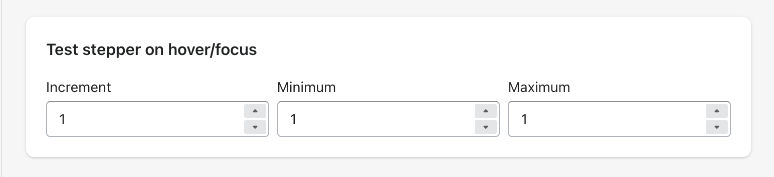
Copy-paste this code in playground/Playground.tsx:
import React, {useCallback, useState} from 'react';

import {
  AlphaCard,
  Columns,
  Page,
  TextField,
  Text,
  Box,
  Inline,
  AlphaStack,
} from '../src';

export function Playground() {
  const [value, setValue] = useState('1');
  const handleChange = useCallback((newValue) => setValue(newValue), []);

  return (
    <Page title="Playground">
      <AlphaStack gap="5">
        <AlphaCard>
          <Text as="h2" variant="headingMd">
            Controlled width example with 1fr `Columns` component
          </Text>
          <Box paddingBlockStart="4">
            <Columns
              columns={{
                md: '1fr 1fr',
              }}
              gap={{
                md: '2',
              }}
            >
              <TextField
                label="Quantity"
                type="number"
                value={value}
                onChange={handleChange}
                autoComplete="off"
                stepperShownOnInteraction
              />
              <TextField
                label="Minimum"
                type="number"
                value={value}
                onChange={handleChange}
                autoComplete="off"
                stepperShownOnInteraction
              />
            </Columns>
          </Box>
        </AlphaCard>
        <AlphaCard>
          <Text as="h2" variant="headingMd">
            Uncontrolled width example with `Inline` component
          </Text>
          <Box paddingBlockStart="4">
            <Inline gap="4">
              <TextField
                label="Quantity"
                type="number"
                value={value}
                onChange={handleChange}
                autoComplete="off"
                stepperShownOnInteraction
              />
              <TextField
                label="Minimum"
                type="number"
                value={value}
                onChange={handleChange}
                autoComplete="off"
                stepperShownOnInteraction
              />
            </Inline>
          </Box>
        </AlphaCard>
      </AlphaStack>
    </Page>
  );
}
09-16-3h7k2-iqpgp.mp4
@alex-page Would we consider this change as an interim step towards global change while giving the teams a warning that soon it will become the default experience and they need to use this prop proactively in their components and adjust the layouts if needed before the next major version with breaking changes rolls out deprecating this prop as a configurable option?
There was a problem hiding this comment.
Breaking changes are good. We definitely should break more stuff.
There was a problem hiding this comment.
@zecarlostorre did mention it was something we were considering as an evolution of the design language. I do think it would be a nice change given how busy a lot of these surfaces get so I'm certainly for it. Any steps needed for alignment?
There was a problem hiding this comment.
Would the following work?
- v10.36.0
- Ship this PR with the ability to configure the stepper via a prop
- Inform the teams that they should add the prop to all input=“number” components and update the layouts if broken to give them time to migrate and adjust properly considering their project commitments so that there are no frustrations from teams and merchants using those UIs
- v11.0.0
- Remove this prop to enable the behaviour by default - by the time this ships, the majority of the teams will have adjusted to this change so it doesn’t come as a surprise
Or what option would be ideal in this case @alex-page?
There was a problem hiding this comment.
I don't think we need major alignment here. It's the best solution for the long term and default design. We should be confident making those changes.
The Inline bug above should be addressed. We don't want the input jumping like that in 1P/3P apps if they update their Polaris version.
I could see this shipping without it being a breaking change and just applying the styles to the input only. I might be missing the reason why this needs to be a breaking change. Adding a property to remove it in the next version is super confusing to developers, educating them to use something and then it being removed is probably not the best approach.
There was a problem hiding this comment.
The <Inline> is not a bug, it’s just an example of an uncontrolled children’s width from a parent level. It could happen the same way if <Columns> are used with something more flexible than controlled width (e.g. auto or minmax() instead of fr or percentage) and there are a lot of other cases that don’t explicitly control width that could break the same way.
All that to say, I’m all for boldly shipping this and for strong design opinions, just wondering who’d be handling the aftermath in case it breaks for consumers but maybe I'm overthinking it.
If we are confident it won't break - I can update the PR to enforce this behaviour by default and remove the prop. I'' update the spin instance in the admin and that to see if there is something immediately obvious that's broken or not.
There was a problem hiding this comment.
Is this an issue that exists today or only exists because of this change? If it is only because of this change then we should look into addressing why the HTML is changing and causing layout shift on hover.
There was a problem hiding this comment.
NVM 🙈 All fixed now.
| <div | ||
| className={className} | ||
| onClick={handleClick} | ||
| onMouseEnter={ | ||
| stepperShownOnInteraction ? handleMouseEnter : undefined | ||
| } | ||
| onMouseLeave={ | ||
| stepperShownOnInteraction ? handleMouseLeave : undefined | ||
| } | ||
| > |
There was a problem hiding this comment.
Is there a reason we can't use CSS :hover?
There was a problem hiding this comment.
The main reason is the separation of concerns. The existing rendering logic for the spinner is all handled in the component with conditional rendering. If we were to handle the rendering of the stepper on hover in the stylesheet - this would result in the fragmentation of those rendering responsibilities when some are in the component, and others in the styles, and it may be less clear if they are coupled or not, e.g. the component logic may be saying I'm rendered while the stylesheet is no I'm actually not unless hovered over. So I thought it would make sense to follow the existing pattern without splitting those responsibilities. Let me know if you think otherwise.
There was a problem hiding this comment.
We definitely want to avoid adding event code when it mirrors what we can do in CSS. I understand why you did this but I think it should be a CSS change.
There was a problem hiding this comment.
Thanks, Alex, turns out I was overthinking it, have been in javascript land for too long, and the solution is actually much shorter and simpler than before 🥲 and it no longer causes the layout shift no matter what consumers do, so it should be all good.
There was a problem hiding this comment.
Wuhuu! It happens to everyone. Thanks @tatianau 🎉
tatianau
force-pushed
the
tu-textfield-stepper
branch
3 times, most recently
from
8cd7cbc to
b177c7f
Compare
 tatianau
force-pushed
the
tu-textfield-stepper
branch
from
tatianau
force-pushed
the
tu-textfield-stepper
branch
from
b177c7f to
2ac0d3f
Compare
This PR was opened by the [Changesets
release](https://github.com/changesets/action) GitHub action. When
you're ready to do a release, you can merge this and the packages will
be published to npm automatically. If you're not ready to do a release
yet, that's fine, whenever you add more changesets to main, this PR will
be updated.


# Releases
## @shopify/stylelint-polaris@9.0.0

### Major Changes

- [#8657](#8657)
[`764f17d86`](764f17d)
Thanks [@alex-page](https://github.com/alex-page)! - Turn on
reportNeedlessDisables for all comments

## @shopify/polaris-migrator@0.16.0

### Minor Changes

- [#8272](#8272)
[`cccd69848`](cccd698)
Thanks [@lgriffee](https://github.com/lgriffee)! - Create migrations to
replace deprecated custom properties in polaris-react v11.0.0 and v9.0.0

### Patch Changes

- Updated dependencies
\[[`764f17d86`](764f17d)]:
    -   @shopify/stylelint-polaris@9.0.0

## @shopify/polaris@10.36.0

### Minor Changes

- [#8555](#8555)
[`696473b82`](696473b)
Thanks [@clarkjennings](https://github.com/clarkjennings)! - Added a
forward `ref` to permit programmatic scrolling for `Scrollable`
(example: `scrollRef.current?.scrollTo(0)`)


- [#8650](#8650)
[`078cf9aea`](078cf9a)
Thanks [@kyledurand](https://github.com/kyledurand)! - Deprecated
breadcrumbs prop on SkeletonPage, added backAction prop with story


- [#8586](#8586)
[`83bde8690`](83bde86)
Thanks [@tatianau](https://github.com/tatianau)! - Made hiding the
stepper arrows for inputs of type "number" and revealing them on hover
and focus the default `TextField` behaviour to mimic the default browser
experience


- [#8288](#8288)
[`d27a361c2`](d27a361)
Thanks [@rcd00](https://github.com/rcd00)! - Updated the style of
keyboard component and add optional size prop


- [#8600](#8600)
[`515a62f3b`](515a62f)
Thanks [@kyledurand](https://github.com/kyledurand)! - Fixed list reset
class from not applying to ordered lists


- [#8655](#8655)
[`fb373c3e1`](fb373c3)
Thanks [@stewx](https://github.com/stewx)! - Adjust CSS for expanded
navigation section to remove unwanted space during collapse/expand

### Patch Changes

- [#8595](#8595)
[`437a3bbf1`](437a3bb)
Thanks [@KateWood](https://github.com/KateWood)! - Added option zebra
striping to `IndexTable`
([#8595](#8595))


- [#8626](#8626)
[`ff70ab3d1`](ff70ab3)
Thanks [@alex-page](https://github.com/alex-page)! - Fix border radius
on active/pressed navigation items


- [#8644](#8644)
[`62b712362`](62b7123)
Thanks [@alex-page](https://github.com/alex-page)! - Remove unnecessary
stylelint-disable comments


- [#8651](#8651)
[`446ba341c`](446ba34)
Thanks [@aveline](https://github.com/aveline)! - Updated default stack
order custom property


- [#8659](#8659)
[`3e7e0837d`](3e7e083)
Thanks [@mrcthms](https://github.com/mrcthms)! - Removed comments after
stylelint rule changes that are breaking the rules


- [#8606](#8606)
[`230786ace`](230786a)
Thanks [@alex-page](https://github.com/alex-page)! - Remove unused
shared scss functions and move low usage or low value functions into
components


- [#8629](#8629)
[`6ee523a5f`](6ee523a)
Thanks [@mrcthms](https://github.com/mrcthms)! - Updated the animation
duration and box-shadow for the `Tooltip`

## @shopify/polaris-cli@0.1.17

### Patch Changes

- Updated dependencies
\[[`cccd69848`](cccd698)]:
    -   @shopify/polaris-migrator@0.16.0

## polaris.shopify.com@0.39.0

### Minor Changes

- [#8604](#8604)
[`65a678d29`](65a678d)
Thanks [@lgriffee](https://github.com/lgriffee)! - Added a `shadow`
token page


- [#8615](#8615)
[`4aacd1983`](4aacd19)
Thanks [@yurm04](https://github.com/yurm04)! - Added search event that
sets the default google parameters in addition to custom


- [#8613](#8613)
[`1a36ed60c`](1a36ed6)
Thanks [@yurm04](https://github.com/yurm04)! - Added 'engagement'
category to search event


- [#8272](#8272)
[`cccd69848`](cccd698)
Thanks [@lgriffee](https://github.com/lgriffee)! - Create migrations to
replace deprecated custom properties in polaris-react v11.0.0 and v9.0.0

### Patch Changes

- [#8621](#8621)
[`dca759b0b`](dca759b)
Thanks [@jesstelford](https://github.com/jesstelford)! - Fix <Code>
renderer on Patterns pages to support code blocks without meta


- [#8622](#8622)
[`613f637c9`](613f637)
Thanks [@gwyneplaine](https://github.com/gwyneplaine)! - Fix minor
layout bugs in app-settings-layout pattern code example


- [#8379](#8379)
[`c8207636c`](c820763)
Thanks [@nayeobkim](https://github.com/nayeobkim)! - Updated
documentation and guidance for `AlphaCard`, `AlphaStack`, `Box`,
`Bleed`, `Columns`, and `Inline`


- [#8614](#8614)
[`3526fc2fc`](3526fc2)
Thanks [@laurkim](https://github.com/laurkim)! - Added best practices to
`Text`, `AlphaCard`, and `AlphaStack`


- [#8616](#8616)
[`74f0bc42a`](74f0bc4)
Thanks [@kyledurand](https://github.com/kyledurand)! - Fixed icon page
layout


- [#8602](#8602)
[`575b351d5`](575b351)
Thanks [@yurm04](https://github.com/yurm04)! - Added search tracking
using google analytics

- Updated dependencies
\[[`696473b82`](696473b),
[`437a3bbf1`](437a3bb),
[`078cf9aea`](078cf9a),
[`83bde8690`](83bde86),
[`ff70ab3d1`](ff70ab3),
[`62b712362`](62b7123),
[`446ba341c`](446ba34),
[`d27a361c2`](d27a361),
[`3e7e0837d`](3e7e083),
[`230786ace`](230786a),
[`6ee523a5f`](6ee523a),
[`515a62f3b`](515a62f),
[`fb373c3e1`](fb373c3)]:
    -   @shopify/polaris@10.36.0

Co-authored-by: github-actions[bot] <github-actions[bot]@users.noreply.github.com>
… default until the field is interacted with (Shopify#8586)

### WHY are these changes introduced?
The feature is highly requested by the admin teams in layouts when more
than one field is used which makes the layouts visually busy when all
steppers are shown. Not showing the steppers until interacted is also
the [default browser
behaviour](https://developer.mozilla.org/en-US/docs/Web/HTML/Element/input/number).

Most recent requests:
- [products
team](https://www.figma.com/file/s0qpRFHIBSu7NZMbS0bmpx/Quantity-Rules-D2C?node-id=236%3A51100&t=DctGps261ZsdJscy-0)
- [catalogs
team](https://www.figma.com/file/W4WnWEvcr7IzyMstE5tRO5/Volume-pricing---Explore?node-id=2110%3A86536&t=7ypLETpm7cM8vgZe-0)
- [inventory
team](https://shopify.slack.com/archives/C4Y8N30KD/p1674684831520929)


### WHAT is this pull request doing?
This PR is adding support for hiding the stepper arrows if the input
`type` is set to `number` and showing when the field is interacted with
(hover, focus) to mimic the default browser behaviour.

<!--
#### Naming considerations
I have considered a few naming options to convey what it does, landed on
`stepperShownOnInteraction` and am open to any feedback if there is
anything that does it better and maybe less verbouse.
- `spinner` vs `stepper` - landed on the `stepper` as this is what it's
being called on
[MDN](https://developer.mozilla.org/en-US/docs/Web/HTML/Element/input/number)
as well as referred to widely by UXers and FEDs whereas `spinner` is
more of an under-the-hood naming of the
[spinbutton](https://developer.mozilla.org/en-US/docs/Web/Accessibility/ARIA/Roles/spinbutton_role)
and the internal `<Spinner/>` Polaris component consumers may or may not
know about
- `stepperHidden` was one of the options, however, it doesn't convey the
conditional nature of the stepper rendering, just the fact that it's
hidden, so it wasn't enough
- `stepperShownOnInteraction ` conveys all of that - the element, what
it does and under which conditions (focus/hover)
-->
#### Before
<img width="100%" alt="Example usage of the TextField in the Admin UI
when the stepper arrows are shown by default making the layout busy if
more than one field is used in the layout"
src="https://user-images.githubusercontent.com/15054990/224130473-245440ef-f65c-46e7-965c-3808e0d4df14.png">


#### After


https://user-images.githubusercontent.com/15054990/224126631-6c751b2b-a298-4ebc-8aca-57ca1df515e1.mp4


### How to 🎩
Any of the tophatting options produce the same result

#### Admin test page
- Open the [spin
URL](https://shop1.shopify.polaris-textfield.tatiana-uspenskaia.us.spin.dev/admin/catalogs/30/editor/products/1)

#### Storybook playground
- Checkout this branch
- Run `yarn turbo run dev --filter=@shopify/polaris` to open storybook
- Open the TextField component's `Number` variation
- Can also copy the details below into your
`polaris-react/playground/Playground.tsx` to see how it works in
different contexts

<details>
<summary>Copy-paste this code in
<code>playground/Playground.tsx</code>:</summary>

```jsx
import React, {useCallback, useState} from 'react';

import {
  AlphaCard,
  Columns,
  Page,
  TextField,
  Text,
  Box,
  Inline,
  AlphaStack,
} from '../src';

export function Playground() {
  const [value, setValue] = useState('1');
  const handleChange = useCallback((newValue) => setValue(newValue), []);

  return (
    <Page title="Playground">
      <AlphaStack gap="5">
        <AlphaCard>
          <Text as="h2" variant="headingMd">
            Controlled width example with 1fr `Columns` component
          </Text>
          <Box paddingBlockStart="4">
            <Columns
              columns={{
                md: '1fr 1fr',
              }}
              gap={{
                md: '2',
              }}
            >
              <TextField
                label="Quantity"
                type="number"
                value={value}
                onChange={handleChange}
                autoComplete="off"
              />
              <TextField
                label="Minimum"
                type="number"
                value={value}
                onChange={handleChange}
                autoComplete="off"
              />
            </Columns>
          </Box>
        </AlphaCard>
        <AlphaCard>
          <Text as="h2" variant="headingMd">
            Uncontrolled width example with `Inline` component
          </Text>
          <Box paddingBlockStart="4">
            <Inline gap="4">
              <TextField
                label="Quantity"
                type="number"
                value={value}
                onChange={handleChange}
                autoComplete="off"
              />
              <TextField
                label="Minimum"
                type="number"
                value={value}
                onChange={handleChange}
                autoComplete="off"
              />
            </Inline>
          </Box>
        </AlphaCard>
      </AlphaStack>
    </Page>
  );
}


```

</details>


### 🎩 checklist

- [x] Tested on
[mobile](https://github.com/Shopify/polaris/blob/main/documentation/Tophatting.md#cross-browser-testing)
- [x] Tested on [multiple
browsers](https://help.shopify.com/en/manual/shopify-admin/supported-browsers)
- [x] Tested for
[accessibility](https://github.com/Shopify/polaris/blob/main/documentation/Accessibility%20testing.md)
- [x] Updated the component's `README.md` with documentation changes
- [x] [Tophatted
documentation](https://github.com/Shopify/polaris/blob/main/documentation/Tophatting%20documentation.md)
changes in the style guide
This PR was opened by the [Changesets
release](https://github.com/changesets/action) GitHub action. When
you're ready to do a release, you can merge this and the packages will
be published to npm automatically. If you're not ready to do a release
yet, that's fine, whenever you add more changesets to main, this PR will
be updated.


# Releases
## @shopify/stylelint-polaris@9.0.0

### Major Changes

- [Shopify#8657](Shopify#8657)
[`764f17d86`](Shopify@764f17d)
Thanks [@alex-page](https://github.com/alex-page)! - Turn on
reportNeedlessDisables for all comments

## @shopify/polaris-migrator@0.16.0

### Minor Changes

- [Shopify#8272](Shopify#8272)
[`cccd69848`](Shopify@cccd698)
Thanks [@lgriffee](https://github.com/lgriffee)! - Create migrations to
replace deprecated custom properties in polaris-react v11.0.0 and v9.0.0

### Patch Changes

- Updated dependencies
\[[`764f17d86`](Shopify@764f17d)]:
    -   @shopify/stylelint-polaris@9.0.0

## @shopify/polaris@10.36.0

### Minor Changes

- [Shopify#8555](Shopify#8555)
[`696473b82`](Shopify@696473b)
Thanks [@clarkjennings](https://github.com/clarkjennings)! - Added a
forward `ref` to permit programmatic scrolling for `Scrollable`
(example: `scrollRef.current?.scrollTo(0)`)


- [Shopify#8650](Shopify#8650)
[`078cf9aea`](Shopify@078cf9a)
Thanks [@kyledurand](https://github.com/kyledurand)! - Deprecated
breadcrumbs prop on SkeletonPage, added backAction prop with story


- [Shopify#8586](Shopify#8586)
[`83bde8690`](Shopify@83bde86)
Thanks [@tatianau](https://github.com/tatianau)! - Made hiding the
stepper arrows for inputs of type "number" and revealing them on hover
and focus the default `TextField` behaviour to mimic the default browser
experience


- [Shopify#8288](Shopify#8288)
[`d27a361c2`](Shopify@d27a361)
Thanks [@rcd00](https://github.com/rcd00)! - Updated the style of
keyboard component and add optional size prop


- [Shopify#8600](Shopify#8600)
[`515a62f3b`](Shopify@515a62f)
Thanks [@kyledurand](https://github.com/kyledurand)! - Fixed list reset
class from not applying to ordered lists


- [Shopify#8655](Shopify#8655)
[`fb373c3e1`](Shopify@fb373c3)
Thanks [@stewx](https://github.com/stewx)! - Adjust CSS for expanded
navigation section to remove unwanted space during collapse/expand

### Patch Changes

- [Shopify#8595](Shopify#8595)
[`437a3bbf1`](Shopify@437a3bb)
Thanks [@KateWood](https://github.com/KateWood)! - Added option zebra
striping to `IndexTable`
([Shopify#8595](Shopify#8595))


- [Shopify#8626](Shopify#8626)
[`ff70ab3d1`](Shopify@ff70ab3)
Thanks [@alex-page](https://github.com/alex-page)! - Fix border radius
on active/pressed navigation items


- [Shopify#8644](Shopify#8644)
[`62b712362`](Shopify@62b7123)
Thanks [@alex-page](https://github.com/alex-page)! - Remove unnecessary
stylelint-disable comments


- [Shopify#8651](Shopify#8651)
[`446ba341c`](Shopify@446ba34)
Thanks [@aveline](https://github.com/aveline)! - Updated default stack
order custom property


- [Shopify#8659](Shopify#8659)
[`3e7e0837d`](Shopify@3e7e083)
Thanks [@mrcthms](https://github.com/mrcthms)! - Removed comments after
stylelint rule changes that are breaking the rules


- [Shopify#8606](Shopify#8606)
[`230786ace`](Shopify@230786a)
Thanks [@alex-page](https://github.com/alex-page)! - Remove unused
shared scss functions and move low usage or low value functions into
components


- [Shopify#8629](Shopify#8629)
[`6ee523a5f`](Shopify@6ee523a)
Thanks [@mrcthms](https://github.com/mrcthms)! - Updated the animation
duration and box-shadow for the `Tooltip`

## @shopify/polaris-cli@0.1.17

### Patch Changes

- Updated dependencies
\[[`cccd69848`](Shopify@cccd698)]:
    -   @shopify/polaris-migrator@0.16.0

## polaris.shopify.com@0.39.0

### Minor Changes

- [Shopify#8604](Shopify#8604)
[`65a678d29`](Shopify@65a678d)
Thanks [@lgriffee](https://github.com/lgriffee)! - Added a `shadow`
token page


- [Shopify#8615](Shopify#8615)
[`4aacd1983`](Shopify@4aacd19)
Thanks [@yurm04](https://github.com/yurm04)! - Added search event that
sets the default google parameters in addition to custom


- [Shopify#8613](Shopify#8613)
[`1a36ed60c`](Shopify@1a36ed6)
Thanks [@yurm04](https://github.com/yurm04)! - Added 'engagement'
category to search event


- [Shopify#8272](Shopify#8272)
[`cccd69848`](Shopify@cccd698)
Thanks [@lgriffee](https://github.com/lgriffee)! - Create migrations to
replace deprecated custom properties in polaris-react v11.0.0 and v9.0.0

### Patch Changes

- [Shopify#8621](Shopify#8621)
[`dca759b0b`](Shopify@dca759b)
Thanks [@jesstelford](https://github.com/jesstelford)! - Fix <Code>
renderer on Patterns pages to support code blocks without meta


- [Shopify#8622](Shopify#8622)
[`613f637c9`](Shopify@613f637)
Thanks [@gwyneplaine](https://github.com/gwyneplaine)! - Fix minor
layout bugs in app-settings-layout pattern code example


- [Shopify#8379](Shopify#8379)
[`c8207636c`](Shopify@c820763)
Thanks [@nayeobkim](https://github.com/nayeobkim)! - Updated
documentation and guidance for `AlphaCard`, `AlphaStack`, `Box`,
`Bleed`, `Columns`, and `Inline`


- [Shopify#8614](Shopify#8614)
[`3526fc2fc`](Shopify@3526fc2)
Thanks [@laurkim](https://github.com/laurkim)! - Added best practices to
`Text`, `AlphaCard`, and `AlphaStack`


- [Shopify#8616](Shopify#8616)
[`74f0bc42a`](Shopify@74f0bc4)
Thanks [@kyledurand](https://github.com/kyledurand)! - Fixed icon page
layout


- [Shopify#8602](Shopify#8602)
[`575b351d5`](Shopify@575b351)
Thanks [@yurm04](https://github.com/yurm04)! - Added search tracking
using google analytics

- Updated dependencies
\[[`696473b82`](Shopify@696473b),
[`437a3bbf1`](Shopify@437a3bb),
[`078cf9aea`](Shopify@078cf9a),
[`83bde8690`](Shopify@83bde86),
[`ff70ab3d1`](Shopify@ff70ab3),
[`62b712362`](Shopify@62b7123),
[`446ba341c`](Shopify@446ba34),
[`d27a361c2`](Shopify@d27a361),
[`3e7e0837d`](Shopify@3e7e083),
[`230786ace`](Shopify@230786a),
[`6ee523a5f`](Shopify@6ee523a),
[`515a62f3b`](Shopify@515a62f),
[`fb373c3e1`](Shopify@fb373c3)]:
    -   @shopify/polaris@10.36.0

Co-authored-by: github-actions[bot] <github-actions[bot]@users.noreply.github.com>
5 participants
WHY are these changes introduced?
The feature is highly requested by the admin teams in layouts when more than one field is used which makes the layouts visually busy when all steppers are shown. Not showing the steppers until interacted is also the default browser behaviour.
Most recent requests:
Resolves https://github.com/Shopify/core-issues/issues/52378
WHAT is this pull request doing?
This PR is adding support for hiding the stepper arrows if the input
typeis set tonumberand showing when the field is interacted with (hover, focus) to mimic the default browser behaviour.Before
After
09-54-40fwk-oxmyb.mp4
How to 🎩
Any of the tophatting options produce the same result
Admin test page
Storybook playground
yarn turbo run dev --filter=@shopify/polaristo open storybookNumbervariationpolaris-react/playground/Playground.tsxto see how it works in different contextsCopy-paste this code in
playground/Playground.tsx:🎩 checklist
README.mdwith documentation changes