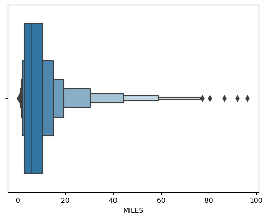
Uber-Data-Analysis-Project-With-Python Now we use matplotlib and seaborn library to visualization lets do same thing with time column here we will using the time column which we have extracted above now we will compare the two categories with purpose of user now we find the correlation between the colomns using heatmap insight from the heapmap As the graph is not clearly understandable. Let’s zoom in it for values lees than 100