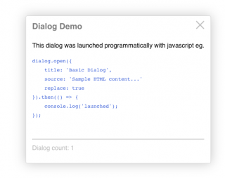
A flexible javascript popup dialog.
dialog.open({
        title: 'Dialog Title',
        source: 'Body content can be (HTML, CSS selector, DOM element, or URL)',
    }).then(...);
- Easy to use.
- Lazy loading (3kb initial page load).
- Usable as a webpack/ES6 module or a pre-built browser bundle.
- Handles multiple programming scenarios and content sources.
- Simple HTML structure and easy custom styling using CSS3 variables.
- Dialogs can be 'modal', and/or can be layered on top of each other.
- Implements the 'Promise' interface, allowing sequential notifications.
- Download & copy this package's "dist" folder into your web server's public folder eg.
public/js/dist/*. - Rename "dist" to "dialog" eg.
public/js/dialog - Load the dialog script at the end of your web page (before the closing
bodytag) like this:
<body>
    ...

    <script src="/js/dialog/dialog.js"></script>
</body>
</html>
- When the browser loads, dialog will be attached to the browser's global window object. Use it anywhere in your scripts like this:
<button>Target</button>

<script>
    dialog.open();          // Display the dialog cheat sheet

    ...

    dialog.closeLast();     // close the on-top dialog

    ...

    dialog.closeAll();

</script>
Install the dialog package into your project using npm:
$ cd to/your/project
$ npm install @aamasri/dialog
Then import and use it in your project's ES6 modules:
import dialog from 'dialog';Leveraging Webpack's on-demand (lazy) loading and code-splitting:function helloWorld() { dialog.open({ title: 'Greetings', source: 'Hello World' }); }
import(/* webpackChunkName: "dialog" */ 'dialog').then((dialog) => {
    dialog.closeAll();
dialog.open(...

});
dialog.open({ .. }).then((dialogElement) => { .. }) // create a new dialog
dialog.close(dialogElement) // close a specific dialog instance
dialog.closeAll() // close all dialogs
dialog.closeLast() // close the on-top dialog
    dialog.open({
             title: `${userName}'s User Profile`,
             source: userUrl,
             fragment: '.contact-info'
             modal: true,
             onClose: function() { alert: `Don't hesitate to call ${userName}!`; }
         }).then( function(dialogElement) {
             console.log('fyi the contact info dialog just launched');
         window.setTimeout( function() {
            dialog.close(dialogElement);
         }, 10000);
     });
Here's the full list of dialog.open options:
| Option | Type | Description | Default |
|---|---|---|---|
| title | string | undefined | dialog title, else source element title attribute | "Missing Title" |
| source | string | object | undefined | the content source: html content, selector, url, or element | usage instructions |
| fragment** | string | undefined | selector by which to extract a portion of the source HTML | |
| modal** | boolean | undefined | dialog background blurring & dimming | false |
| iframe | boolean | undefined | if the source is a url, whether to load it in an iFrame. Adds a full-screen link. | false |
| fullscreenUrl | string | undefined | forces a full-screen button (or for case that the fullscreen url differs from the source url) | false |
| replace | boolean | undefined | whether to close any existing dialogs or layer up | false |
| persistent | boolean | undefined | whether ESC key or blur events close the dialog | false |
| onClose | function | string | undefined | callback function or eval(string) to execute after dialog dismissed | |
| classes | string | undefined | additional classes to apply to the dialog container element | |
| attributes | string | undefined | attributes to apply to the dialog container element eg. 'data-ignore-events="true"' |
** it is recommended to use the "iframe" or "fragment" options when loading a URL that returns a FULL HTML document.
This is because HTML documents cannot be nested without an iframe; not specifying the "iframe" or "fragment" option will cause the dialog to reload the URL in an iframe (which may unnecessarily increase the dialog load time).
:root {
    --dialogBoxShadow: 0 0 28px #CCC;
    --dialogBoxShadow: 0 0 28px #CCC;
    --dialogBoxShadow: 0 0 28px #CCC;
    --dialogBackground: #FFF;
    --dialogBorder: 1px solid #DDD;
    --dialogBoxShadow: 0 0 28px #CCC;
    --dialogBorderRadius: 4px;
    --dialogFontFamily: Helvetica, Verdana, sans-serif;
    --dialogLineHeight: 1.8;
    --dialogTitleSize: 1.3rem;
    --dialogTitleColor: #888;
    --dialogTitleWeight: bold;
    --dialogModalBackground: rgba(170, 170, 170, 0.3);
    --dialogModalOpacity: 0.3;
Dialog supports npm under the name @aamasri/dialog.
$ npm install @aamasri/dialog --save
Dialog depends on 2 external packages:
- jquery
- animejs
- @aamasri/web-components
- @aamasri/busy-js
Invoking the dialog() function will dynamically load these dependencies at run-time (if these scripts don't already exist on the page) and they'll be added to the global window object.
If your page already loads the jQuery, animejs, @aamasri/busy-js, or @aamasri/dom-utils packages, dialog will use them instead.
- Increment the "version" attribute of `package.json`.
- Update the "versionDescription" string of `package.json`.
- Re-build the browser output bundle...
npm run build-production
...and observe that webpack completed with no errors. - Test the bundle by loading page: "dist/index.html" in a browser (setup a development webserver).
- Publish to the git repository and npm package registry:
npm run publish
- Ananda Masri
- And awesome contributors
