Getting Started꞉ Animated 3D Icons
On this page, you'll learn how to create custom, animated, three-dimensional icons.
This tutorial shows one specific way to accomplish this, by assembling and adding components to simple "Cube" primitives. Of course, there are unlimited possibilities here -- using detailed 3D models, with complex animation paths, reacting to different values or events, and so on.
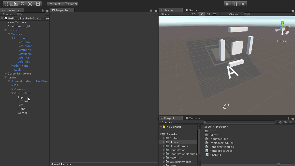
 📷 Building, sizing, and positioning the custom icon's geometry
- Complete the Scene Setup step.
- Add a checkbox item to your scene. See the Checkbox Item instructions for assistance.
- Create an empty GameObject named CustomIcon as a child of the item renderer object.
- Add five "Cube" primitives, named Top, Bottom, Left, Right, and Center.
- Apply an appropriate size and position to each of the five cubes.
- Rotate the item object, making it face mostly upwards.
- Select the CustomIcon object.
- Rotate the object, making it face straight forward (negate the item's rotation).
- Position the object, making it float above the item's flat plane.
 📷 Adding a component to dynamically animate the entire icon
- Add the
ScaleViaIndicatorcomponent to the CustomIcon object.- Set the scale-related properties to control the scale at start, at maximum highlight progress, and at maximum selection progress.
- The scale will dynamically update based upon highlight and selection progress values, which are provided by the object set in the "Indicator" property.
- Play the scene.
- Drag an active cursor near to the item.
- Notice how the icon scale animates based upon the item's highlight and selection progress.
- Review the code of the
ScaleViaIndicatorcomponent.- Notice its simplicity, using the indicator values to interpolate between scales.
- Consider ways you could expand on this to perform more complex animations.
 📷 Adding components to dynamically animate the icon's internal elements
- Add the
ScaleViaIndicatorcomponent to all child objects of the CustomIcon object.- Set the scale-related properties to control the scale at start, at maximum highlight progress, and at maximum selection progress.
- Note the different settings used for the Center object compared to the others.
- Play the scene.
- Drag an active cursor near to the item.
- Notice how the icon elements' scale is animated based upon the item's highlight and selection progress.
- Stop the scene.
- Add the
ColorViaIndicatorcomponent to all child objects of the CustomIcon object.- Optionally, change the color settings for each object.
- Add the
ShowViaItemBoolValuecomponent to the Center object. - Play the scene.
- Drag an active cursor near to the item.
- Notice how the icon elements' color is animated based upon the item's highlight and selection progress.
- Notice how the Center object's visibility matches the checkbox item's boolean value (its toggled/untoggled state).
- Review the code of the
ColorViaIndicatorandShowViaItemBoolValuecomponents.- Notice its simplicity of the code in these components.
- Consider ways you could expand on this to perform more complex animations.
This tutorial uses the GettingStarted-Customize-ItemIcon3D scene, from the "HoverDemos" folder. The sections above include links for the components used in this tutorial.