-
Notifications
You must be signed in to change notification settings - Fork 162
Interface Modules꞉ Cast
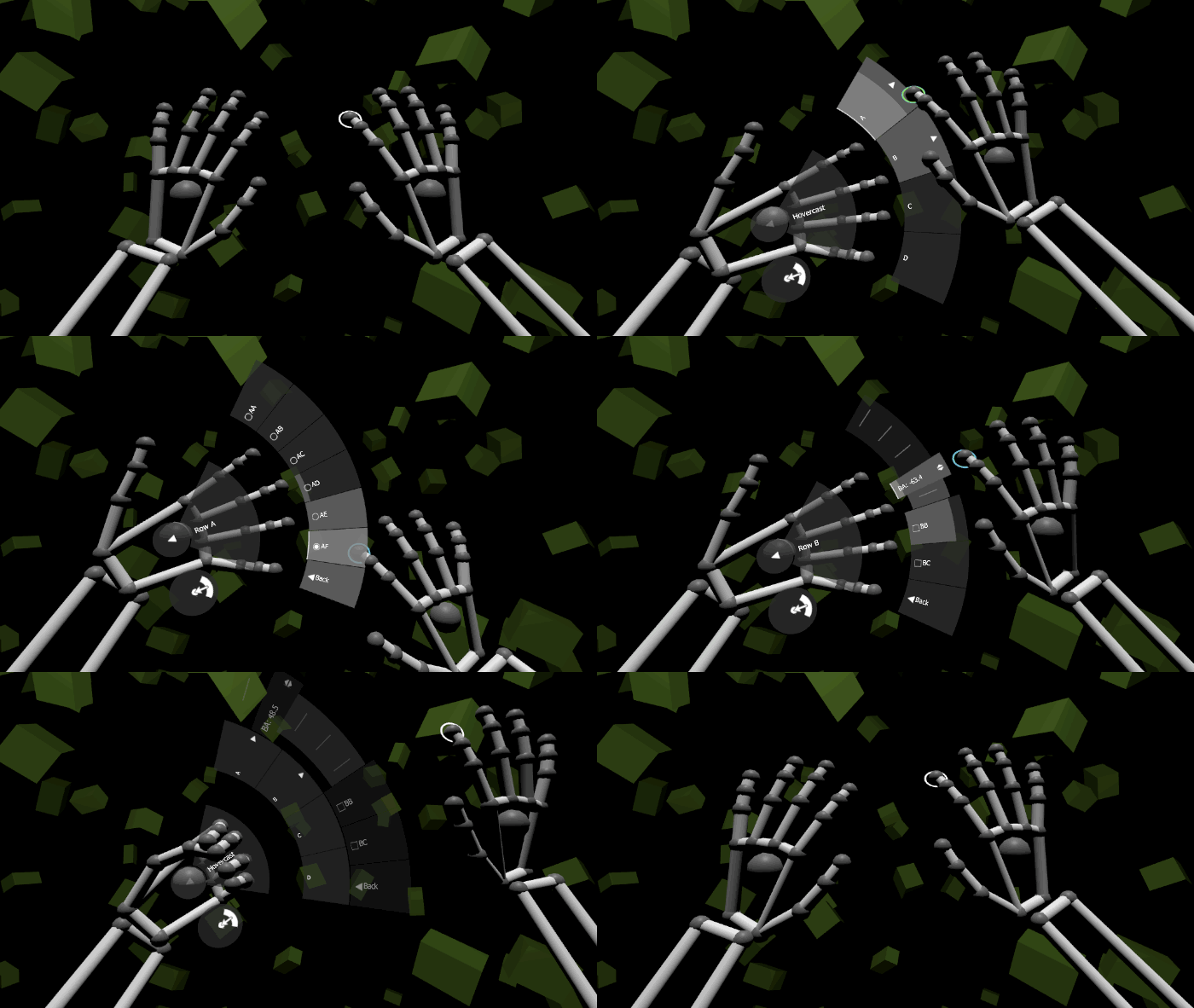
The Hovercast interface provides an arc-shaped, hierarchical menu structure that attaches to a cursor. By default, the interface follows the "Left Palm" cursor, and fades into view only when the cursor is facing the user's eyes.
The interface includes a button for opening and closing the menu, a button and gesture for navigating "back" in the menu hierarchy, and a non-interactive element for displaying the title of the active menu level. It displays one arc-shaped row of items at a time, and (upon item selections or other events) smoothly animates transitions between these rows.
 📷 Using the Hovercast interface with Leap Motion hands
The "Cast" input module is contained in the /Assets/Hover/InterfaceModules/Cast folder.
Use a "builder" component to generate this interface in your scene:
- Create an empty GameObject named Hovercast.
- Add the
HovercastBuildercomponent to Hovercast.- Modify the properties, if necessary.
- Click the "Build Interface" button.
- Modify the properties, if necessary, within the newly-generated components.
- Adjust the cursor capabilities based upon the desired input module.
See the Hover.InputModules.Cast namespace for technical reference, and /Assets/HoverExamples/Scenes/InterfaceModules-Cast.unity for an example scene.
 📷 Using the Hovercast interface with Leap Motion hands
When using Leap Motion hands, Hovercast is designed to extend from the palm of the left hand, and to be controlled with a single cursor from the opposite hand (or the "Look" cursor, if desired). The recommended cursor setup:
| Object | Component | Property | Value |
|---|---|---|---|
| HoverKit/.../LeftPalm | HoverCursorData |
Capability | Transform Only |
| HoverKit/.../RightIndex | HoverCursorData |
Capability | Full |
| HoverKit/... (all others) | HoverCursorData |
Capability | None |
| CursorRenderers/LeftPalm | Disable entire GameObject | --- | --- |
| Hovercast | HoverCursorFollower |
Cursor Type | Left Palm |
 📷 Using the Hovercast interface with Vive controllers
When using Vive controllers, Hovercast is designed to extend from the inside edge of the left controller, and to be controlled with a single cursor from the opposite controller (or the "Look" cursor, if desired). The recommended cursor setup:
| Object | Component | Property | Value |
|---|---|---|---|
| HoverKit/.../LeftPinky | HoverCursorData |
Capability | Transform Only |
| HoverKit/.../RightMiddle | HoverCursorData |
Capability | Full |
| HoverKit/... (all others) | HoverCursorData |
Capability | None |
| CursorRenderers/LeftPinky | Disable entire GameObject | --- | --- |
| Hovercast | HoverCursorFollower |
Cursor Type | Left Pinky |
The Hovercast interface has one active row (of type HoverLayoutArcRow) at a time, and switches between rows automatically during navigation events. Before starting a scene, the active row determines which row will be visible when the scene starts. To change the active row:
- Find the
HovercastInterfacecomponent (attached to the main Hovercast object).- Set the "Active Row" property to the desired
HoverLayoutArcRowcomponent.
- Set the "Active Row" property to the desired
- Disable the previously-active row's GameObject to hide it, so that it does not overlap the newly-active row.
The Hovercast interface is most useful when there are several rows of items, and the user can navigate between those rows. To add a new row:
- Create an empty GameObject named MyRow, as a child of the Hovercast/TransformAdjuster/Rows object.
- Add the
HoverLayoutArcRowcomponent to MyRow. - Add the
HovercastRowTitlecomponent to MyRow (optional). - Create items as children of MyRow (see Getting Started for instructions).
- Add the
HoverShapeArccomponent to each item.
- Add the
Hovercast is a hierarchical menu interface, where each level of the hierarchy is a row layout. Typically, an item selection is the trigger for a navigation action. When discussing navigation: a "back" action means moving toward the root row, and a "forward" action means moving deeper into the hierarchy.
The following steps describe how to connect an item's selection event to Hovercast's row-switching method, attach navigation information to the item, and adjust the item visually:
- Select the item that will trigger the navigation.
- Add the
HovercastRowSwitchingInfocomponent to the item.- Choose the target row (a
HoverLayoutArcRowcomponent) for the "Navigate To Row" property. - Adjust the "Navigate Back" and "Row Entry Transition" properties, if desired.
- Choose the target row (a
- Find the item's
HoverItemDataXcomponent, whereXis the item type (for example,HoverItemDataSelector).- Open the "Events" foldout section.
- Add an "On Selected Event" that points to
HovercastInterface.OnRowSwitched(). - Adjust the "Action" property to make the item's "arrow" icon appear. Recommended: use "Navigate In" for "forward" actions, and "Navigate Out" option for "back" actions.
- Find the item renderer's
HoverCanvascomponent (attached to the Canvas object within the renderer).- Adjust the "Alignment" property to set the position of the "arrow" icon. Recommended: use "Text Left And Icon Right" for "forward" actions, and "Left" for "back" actions.
By default, the HovercastBuilder component will create example rows. These rows contain items that are configured for "back" and "forward" navigation.
Switching sides requires a mirroring of the interface and its content, without mirroring the text. Occasionally, an app may give the user an option to switch hands. The Hovercast interface will follow the position and orientation of one cursor, which is typically the "Palm" cursor of either the left or right hand ("LeftPalm" or "RightPalm").
The following steps describe how to make the Hovercast interface follow a different cursor, mirror the interface orientation, and enable an opposite-hand interaction cursor:
- Find the
HoverCursorFollowercomponent (attached to the main Hovercast object).- Set the "Cursor Type" property to the desired cursor.
- Find the
HovercastBackCursorTriggercomponent (attached to the main Hovercast object).- Recommended: keep the the "Use Followed Cursor Type" property enabled.
- Otherwise: set the "Cursor Type" property to use a cursor from the opposite hand.
- Find the
HovercastMirrorSwitchercomponent (attached to the main Hovercast object).- Select the "Use Mirror Layout" property for right-handed usage; deselect it for left-handed usage.
- Find the cursors within the HoverKit prefab.
- Ensure that the followed cursor is enabled, and set its "Capability" property to "Transform Only".
- For one (or more) cursors on the opposite hand as the followed cursor, set the "Capability" property to "Full".
- For all other cursors (especially those on on the same hand as the followed cursor), set the "Capability" property to "None".
The HovercastBuilder component has a property for selecting which hand the Hovercast interface will follow (specifically, the selection is between the "Left Palm" and "Right Palm" cursors). This configures the interface once, at creation-time, for left or right handedness.
The HovercastRowTransitioner component has properties that affect the interface's size and its row-switching animations.
The HovercastOpenTransitioner component has properties that affect the interface's open/close animations.
The HovercastActiveDirection component has properties that control how the interface fades in/out based upon the direction it is facing (typically, it should fade in when facing the user). These properties may require adjustment for use with certain input modules.
General
Features
Modules
Other