fix(input): not working correctly in high contrast mode #6291
Conversation
6092a28 to
892ed03
Compare
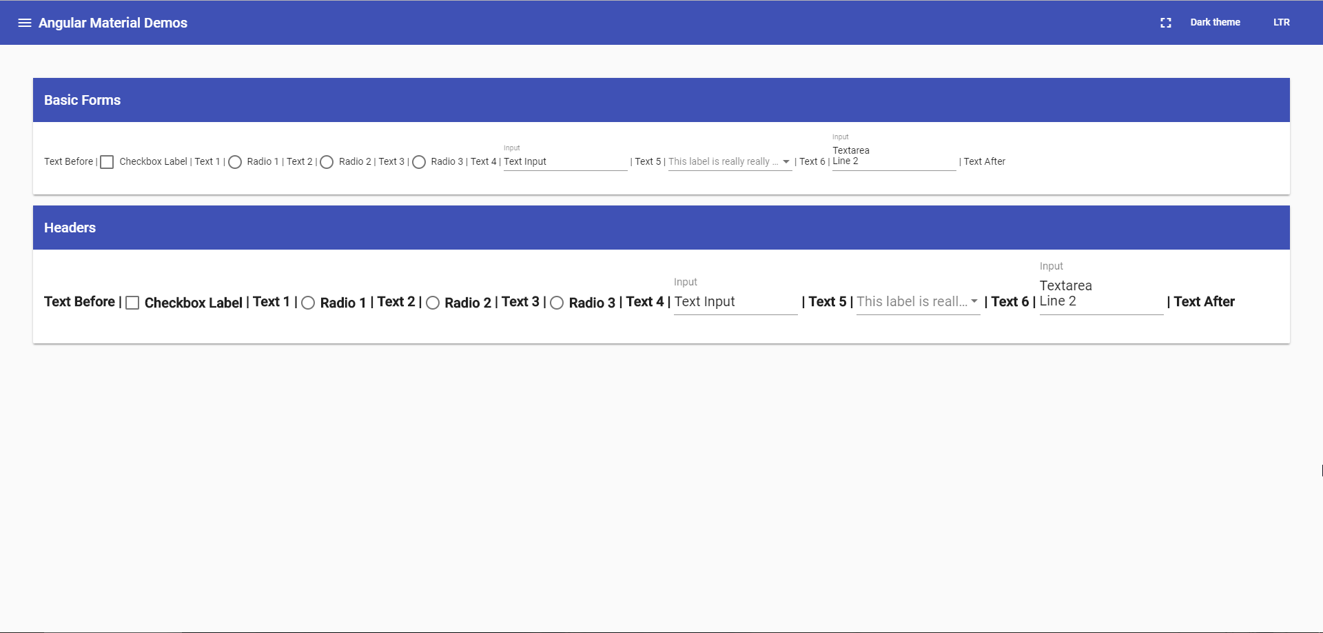
Fixes the input not working correctly in high contrast mode by:
* Using a margin instead of a border to do the spacing inside the input. Windows renders all borders in high contrast mode, even if they're transparent, which caused the input to have a 5px top border.
* Using a border to render the underline, instead of a background color.
* Hiding the ripple, because it was causing the underline to blend in with the background.

Also gets rid of an unused method.

Relates to angular#6257.
892ed03 to
2bd4249
Compare
|
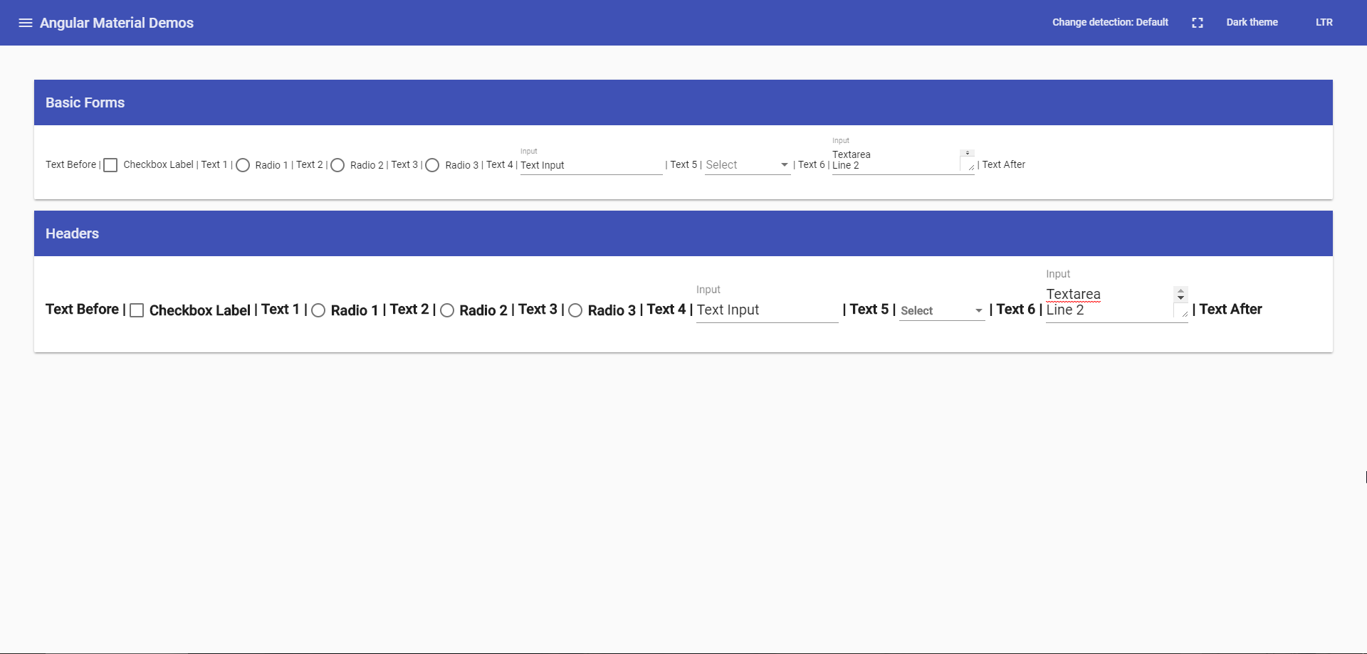
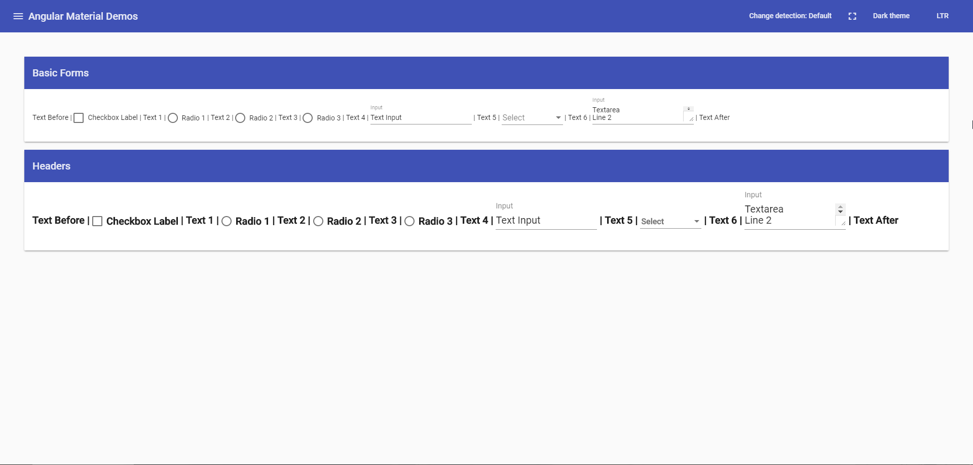
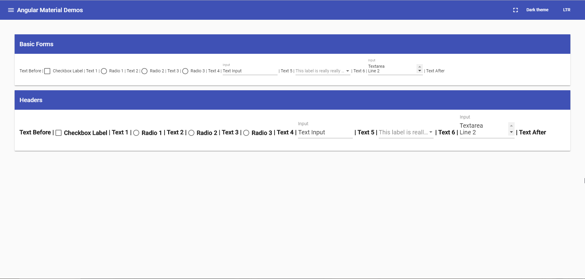
I'm not sure that it really threw anything off. There's ~1px difference (most likely because of the border changes), but if anything it got the input and select to align, in master there's a 1px offset. Here are a couple of comparisons, the first one is with these changes, the second one is master. It'll probably be easier to compare if you open in new tabs and switch between the two:
|
|
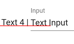
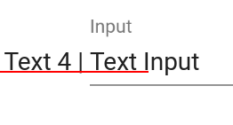
Don't worry about the select, it's the odd one out and going to change very soon. This change causes the This PR: |
|
@jelbourn it definitely is, but we haven't been able to find a way to handle this without throwing off the baseline slightly. We may end up having to have a slightly-off baseline in high contrast mode. |
|
I'll leave this to you and @mmalerba, then |
|
I'll try playing with this after my form field variant changes and see if those changes help with this at all |
|
@crisbeto I'm not 100% sure what changed, but I tried converting that border to a margin just now and the baseline seems to be fine (at least on chrome) so may be worth rebasing and checking if this works now |
|
@mmalerba I did a quick check by converting the border to a margin (I didn't do the other border change that's in this PR) and it still seems like the baseline is being thrown off. |
|
@crisbeto interesting, I have both versions up side-by-side and I see no difference flipping between them. We're both talking about this border right? https://github.com/angular/material2/blob/master/src/lib/form-field/_form-field-theme.scss#L175 Edit: ah, I don't see any difference in Chrome, but Firefox it still seems to throw it off. Chrome must have changed something because I used to see the difference in Chrome too |
|
Here's what I've got. The top one is master and the bottom is only the border being changed to a magin. A couple of things I noticed though:
|
|
That must be the difference, I just changed it in the devtools. I'll see if I can switch it to margin or padding on a different element when I get a chance |
|
Closing in favor of #11736. |
|
This issue has been automatically locked due to inactivity. Read more about our automatic conversation locking policy. This action has been performed automatically by a bot. |
Fixes the input not working correctly in high contrast mode by:
Also gets rid of an unused method.
Relates to #6257.