Now, it's time to put into practice what you've learned about flexbox CSS.
Clone the practice from the starter.
Once you've in VS Code, you can drag the index.html file into your browser to view the webpage, or use the File Explorer to open it in your browser. The only file you will need to edit for this practice is main.css.
Remember to save the CSS file and refresh the page in the browser whenever you make changes.
To complete this practice, you only need to modify main.css by adding
flexbox-related CSS at the places marked with /* // Your code here */.
Hint: You can refer to the readings or A Complete Guide to Flexbox as needed.
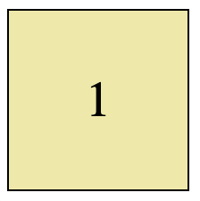
In main.css, you'll find the CSS selector for .example1. Your goal is to
add the appropriate display, align-items and justify-content styles in
order to center the number, both horizontally and vertically, inside the
yellow box.
In main.css, you'll find the CSS selector for .example1. Please add the
appropriate CSS styles to set the flexbox so that...
- The div is the width of the content, not the page.
- The space between the items is
8px. - All 3 items are centered vertically.
Hint: An
inlinediv will adjust to the width of its contents by default.
In main.css, you'll find the CSS selector .example3 which is already set
to a flex display as a row. Please edit the CSS selector for the items
contained in the div for example 3 (specifically, .example3 > div), in order
to make them each fill 1/3 of the flexbox area.
HINT: You need to resize the width of your browser to confirm the boxes look good at their smallest size (
min-width) as well as their largest size (max-width) which have already been included in main.css (under the.example3selector).
Next, please also set the layout and alignment of the items so the name of the person who said the quote is in the bottom right of each purple box.
Hint: A flexible layout with the appropriate direction, alignment and justification is all you need (
display,flex-direction,align-items,justify-content). The best way to figure this out is experimentation!
Finally, find the .example4 and .sidebar css selectors in main.css.
Then add the appropriate flexbox CSS to each to set
You have used a number of Flexbox-related CSS styles including
display: flexanddisplay: inline-flexto trigger flexbox layoutsalign-itemsandjustify-contentwith different settingsflex-directionandgapfor rows vs. columns and spacing between itemsflexto control the stretching of specific items inside a flexible layout


