Exploratory Data Analysis Tutorial with code samples in Python
This is a tutorial on how to do simple exploratory data analysis with Python. The dataset that has been used in this project is called Student Academics Performance Data Set and I took it from UCI Machine Learning Repository, here is the citation for it
Hussain S. (2018). Student Academics Performance Data Set [https://archive.ics.uci.edu/ml/datasets/Student+Academics+Performance]. Dibrugarh University, Dibrugarh, Assam, India.
and here is another citation from the same dataset
Hussain S, Dahan N.A, Ba-Alwi F.M, Ribata N. Educational Data Mining and Analysis of Students’ Academic Performance Using WEKA. Indonesian Journal of Electrical Engineering and Computer Science. 2018; Vol. 9, No. 2. February. pp. 447~459
- Convert & Load the dataset
- Get an Overview about the data e.g. samples, columns, mean and others
- data cleaning (if required), check for missing values or delete unwated columns
- Factorizing the data using Pandas
- Data Visualization, show correlation matrix or factorplot between multiple columns
- Train & Test split using SKlearn (Not Implemented Yet)
- Running bunch of ML models and observe the results (Not Implemented Yet)
Furthermore, I will keep updating this repo, when I've time, however, if you have any idea and would like to apply it, I will be happy to support that.
I strongly encourage you to install Anaconda, if you want to work with Data Science, since Anaconda comes with a set of powerful Python packages for DS. You can download it from here - Anaconda Distribution
However, if you want to download packages individually you will have to install the following packages for this tutorial
- numpy
- pandas
- seaborn
- matplotlib
import numpy as np
import pandas as pd
import seaborn as sns
import matplotlib.pyplot as plt
dataframe = pd.read_csv(dataPath, sep=',', header=0)
print('#### Header ####')
print(dataframe.head())

#### Header ####
  ge   cst   tnp   twp iap   esp arr         ms ls    as   ...     fq  mq        fo         mo       nf       sh       ss   me       tt      atd
0  F     G  Good  Good  Vg  Good   Y  Unmarried  V  Paid   ...     Um  10    Farmer  Housewife    Large     Poor     Govt  Asm    Small     Good
1  M   OBC    Vg    Vg  Vg    Vg   N  Unmarried  V  Paid   ...     Um  Il   Service    Service    Small     Poor     Govt  Asm  Average  Average
2  F   OBC  Good  Good  Vg  Good   N  Unmarried  V  Paid   ...     12  10   Service  Housewife  Average  Average     Govt  Asm    Large     Good
3  M  MOBC  Pass  Good  Vg  Good   N  Unmarried  V  Paid   ...     12  Um  Business   Business    Large     Poor     Govt  Asm  Average  Average
4  M     G  Good  Good  Vg    Vg   N  Unmarried  V  Paid   ...     10  12   Service  Housewife    Large     Poor  Private  Asm    Small     Good
[5 rows x 22 columns]
print('#### Columns Information ####')
print(dataframe.info())

#### Columns Information ####
<class 'pandas.core.frame.DataFrame'>
RangeIndex: 131 entries, 0 to 130
Data columns (total 22 columns):
ge     131 non-null object
cst    131 non-null object
tnp    131 non-null object
twp    131 non-null object
iap    131 non-null object
esp    131 non-null object
arr    131 non-null object
ms     131 non-null object
ls     131 non-null object
as     131 non-null object
fmi    131 non-null object
fs     131 non-null object
fq     131 non-null object
mq     131 non-null object
fo     131 non-null object
mo     131 non-null object
nf     131 non-null object
sh     131 non-null object
ss     131 non-null object
me     131 non-null object
tt     131 non-null object
atd    131 non-null object
dtypes: object(22)
memory usage: 22.6+ KB
None
print('#### Description ####')
print(dataframe.describe())

#### Description ####
         ge  cst   tnp   twp  iap   esp  arr         ms  ...        fo         mo     nf       sh    ss   me     tt   atd
count   131  131   131   131  131   131  131        131  ...       131        131    131      131   131  131    131   131
unique    2    5     4     4    4     4    2          1  ...         5          5      3        3     2    4      3     3
top       M  OBC  Good  Good   Vg  Good    N  Unmarried  ...   Service  Housewife  Large  Average  Govt  Eng  Small  Good
freq     72   57    59    65   63    54   78        131  ...        38        115     58       59    91   62     78    56

[4 rows x 22 columns]
After getting info about the dataset, we can now perform some actions. First, lets drop the ms column since it has single value, we can do that by this line of code
data.drop('ms', axis=1, inplace=True)
This dataset originally provided with acronyms, you can find each column real name and how it calculated in the cited paper above, however, I will rename some columns to their original names for better understaing in visualization. SH column stands for 'Study Hours' and esp stands for 'End Semester Percentage'. This can be done via 'rename' function as follows
data = data.rename(columns={'sh': 'Study Hours', 'esp' : 'End Semester Percentage'})
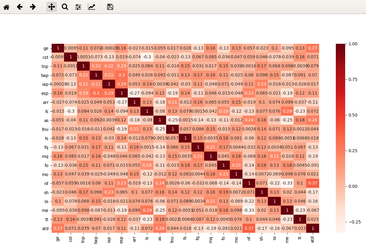
First to get the big pitcure about the data you may visulaized it based on Coefficient Correlation, to do that seaborn packages provide us with heatmap
# get the correlation from the dataframe, then plug it to heatmap function and show it
corr = data.corr()
sns.heatmap(corr, annot=True, cmap=plt.cm.Reds)
plt.show()
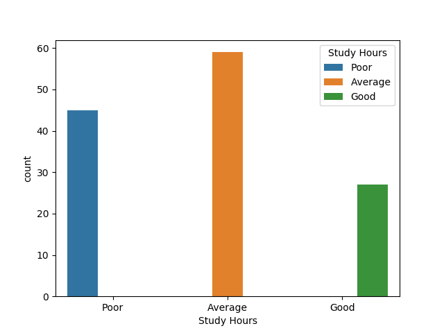
Here we show the count for each value in the 'Study Hours' column. Note: Study Hours values comes from this
>= 6 hours Good >= 4 hours Average < 2 hours Poor
sns.countplot(x='Study Hours', data=data, hue='Study Hours')
output
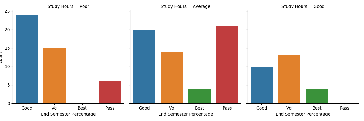
With factorplot we can show the relationship between numerical and categorical value. Here I will show relation between [Study Hours] and [End Semester Percentage]. Percentage is calculated based on the following
if percentage >=80 then Best
If percentage >= 60 but less than 80 then Very Good
If percentage >= 45 but less than 60 then Good
If Percentage >= 30 but less than 45 then Pass
If Percentage < 30 then Fail
factorplot usage
sns.factorplot(x='End Semester Percentage', col='Study Hours', kind='count', data=data)
output
This plot shows relation in numbers between Study Hours & Final Percentage. If you go back to Coefficient Correlation you will find that Semester Percentage & Study Hours don't have high correlation in the first place. However, there is somthing interesting, the heighest grade ("Best") has strong relation with the time students spend on study. When the time Good the percentage was the Best, while nobody got over 80% (Best grade) when they spent less than 2 hour studying.
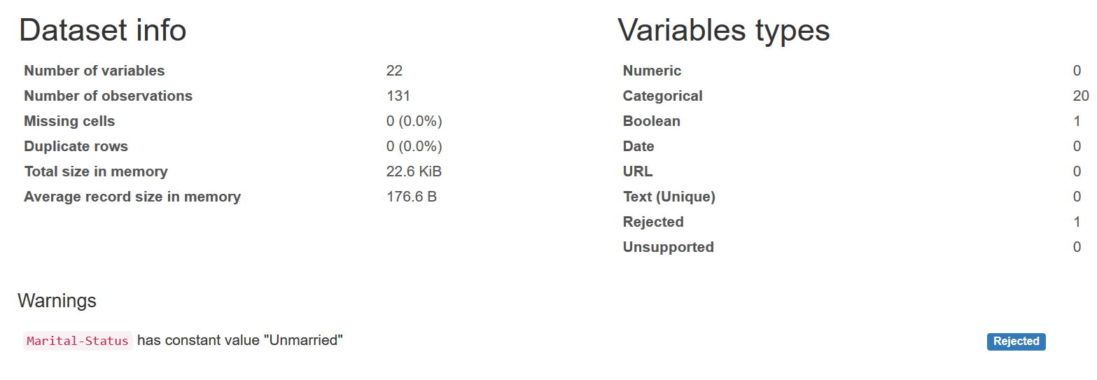
If you notice the majority of our previous work is about getting general overview from the dataset, for that I found a beautiful Python Package called Pandas Profiling, the main advantage from it is to give an HTML report for your dataset which contain quick analysis. I have generated an HTML report for this dataset, please click on the image below to access it.
For the dataset, please go to the dataset source "mentioned above" and check their license and/or requirements. Regarding this project, it's under the MIT License.


