5.0.0
New features
Delivering on accessibility #311
The objective of react-beautiful-dnd:
Beautiful, accessible drag and drop for lists with React.js
In this release we truely deliver on our core goal of being accessible. We now ship with great screen reader support. We have decided to be accessible by default: we ship with english screen reader messaging out of the box 📦. So if you are just getting started you can rest knowing that your lists are highly accessible without you needing to do anything! We also provide total control of all of the messaging to enable you to tailor the screen reader messaging for your use case as well as to power internationalisation. We have put together a screen reader guide to assist you with crafting your own screen reader announcements if you would like to do so.
By combining our amazing keyboard support and impressive screen reader support we now provide an incredible drag and drop experience for users with visual (or other) impairments ❤️
An example
This feature was made during an Atlassian shipit. We placed 5th in the Sydney office 😎
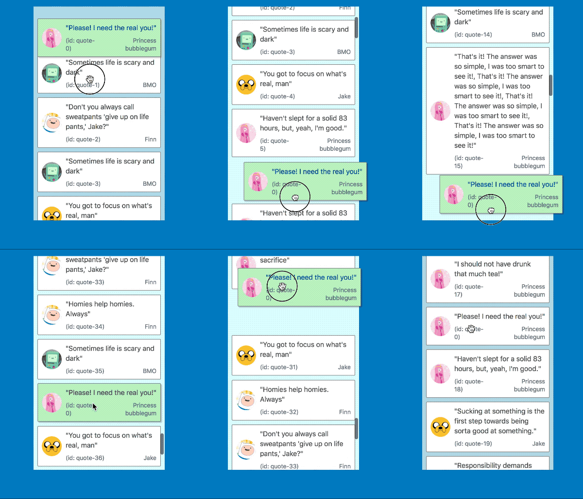
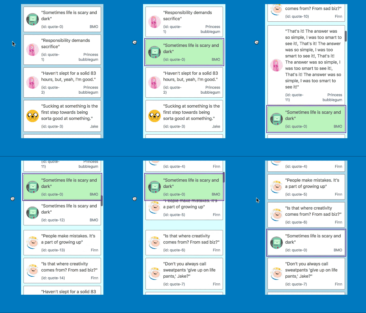
Auto scrolling #27
When a user drags a Draggable near the edge of a Droppable or the window we automatically scroll the container as we are able to in order make room for the Draggable.
We have poured a lot of effort into this experience to make it feel great. You can have a read of our new auto scrolling section in the docs to find out more information.
| Mouse and touch | Keyboard |
|---|---|
 |
 |
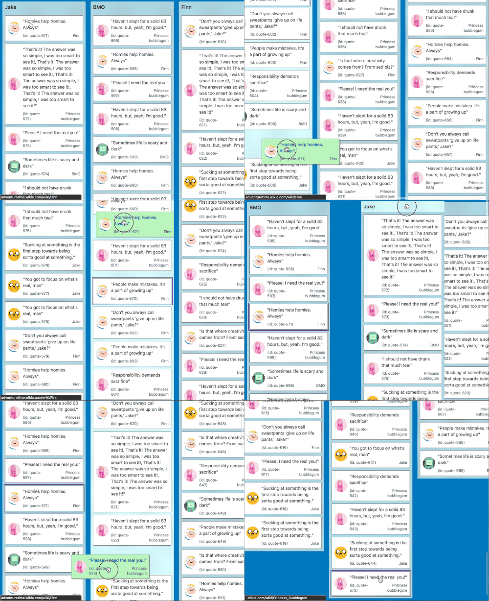
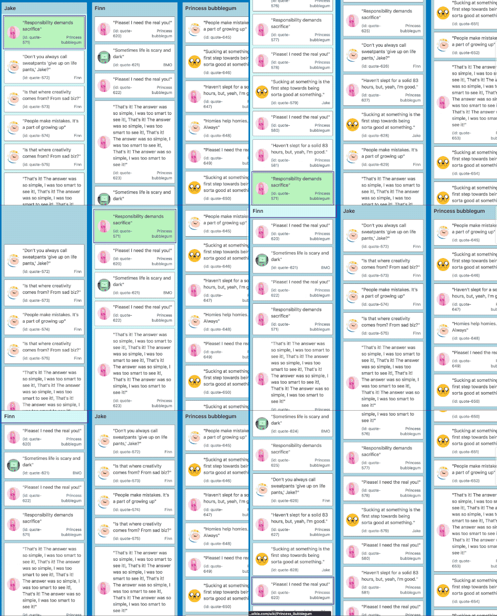
It also works in multi list configurations with all input types
| Mouse and touch | Keyboard |
|---|---|
 |
 |
New hook: onDragUpdate #298 #311
We now provide a new optional DragDropContext hook to notify you when something changes in a drag: onDragUpdate.
type OnDragUpdateHook = (update: DragUpdate, provided: HookProvided) => void;This hook is called whenever something changes during a drag. The possible changes are:
- The index of the
Draggablehas changed - The
Draggableis now over a differentDroppable - The
Draggableis now over noDroppable
Increased information in state snapshots #298
We have added some extra information to DraggableStateSnapshot and DroppableStateSnapshot to assist you with creating even more meaningful experiences for users while dragging.
type DraggableStateSnapshot = {|
  isDragging: boolean,
+ // What Droppable (if any) the Draggable is currently over
+  draggingOver: ?DroppableId,
|}
type DroppableStateSnapshot = {|
isDraggingOver: boolean,
+ // The id of the Draggable that is currently dragging over the Droppable
+ draggingOverWith: ?DraggableId,
|}Improvements
- You are now able to distinguish between drops in the home location and drops on no
Droppable#336. - Now stripping
console.*messages from production builds #309. Thanks @ajaymathur! - Moving from
babel-preset-es2015tobabel-preset-env#325. Thanks @alirezavalizade! - Add notes about supporting table layouts in the docs #311. Thanks @jesstelford!
- Improving the docs #340. Thanks @Blasz!
- Improved logic for container clipping #321
Fixes
Changes
HookProvided
All of the Hook functions now have a second argument: HookProvided. This is currently used to optionally control the screen reader messaging through the announce function. You can read more about announce in our screen reader guide
+ type HookProvided = {|
+   announce: Announce,
+ |}

+ type Announce = (message: string) => void;
- type OnDragStartHook = (start: DragStart) => void;
+ type OnDragStartHook = (start: DragStart, provided: HookProvided) => void;
- type OnDragEndHook = (result: DropResult) => void;
+ type OnDragEndHook = (result: DropResult, provided: HookProvided) => void;
// this hook is new!
+ export type OnDragUpdateHook = (update: DragUpdate, provided: HookProvided) => void;
export type Hooks = {|
onDragStart?: OnDragStartHook,
+ onDragUpdate?: OnDragUpdateHook,
// always required
onDragEnd: OnDragEndHook,
|}This resulted in a minor version change
New hook: onDragUpdate
+ type OnDragUpdateHook = (update: DragUpdate, provided: HookProvided) => void

+ type DragUpdate = {|
+  ...DragStart,
+  // may not have any destination (drag to nowhere)
+  destination: ?DraggableLocation,
|}

// existing type that is used for onDragStart
type DragStart = {|
  draggableId: DraggableId,
  type: TypeId,
  source: DraggableLocation,
|}
This resulted in a minor version change
Adding reason to DropResult
We now provide a reason for the drag ending: either the drag was cancelled or the user dropped the draggable.
- type DropResult = {|
-  ...DragStart,
-  destination: ?DraggableLocation,
- |}

// Now DropResult extends DragUpdate rather than DragStart. However, the properties of DropResult remain unchanged from the last release except for the addition of `reason`

+ type DropResult = {|
+  ...DragUpdate,
+  reason: DropReason,
+ |}

+ type DropReason = 'DROP' | 'CANCEL';
This resulted in a minor version change
Adding droppableProps to DroppableProvided
Similarly to Draggables and drag handles we know require some props to be spread onto a Droppable. We currently just use this to apply a data attribute to the Droppable in order to fix incorrect scroll updates when dropping #290. However, we may use this to apply other required non-visible styles in the future.
<Droppable droppableId="droppable-1">
  {(provided: DroppableProvided, snapshot: DroppableStateSnapshot) => (
    <div
      ref={provided.innerRef}
      style={{ backgroundColor: snapshot.isDraggingOver ? 'blue' : 'grey' }}
+      {...provided.droppableProps}
    >
      <h2>I am a droppable!</h2>
      {provided.placeholder}
    </div>
  )}
</Droppable>
type DroppableProvided = {|
innerRef: (?HTMLElement) => void,
placeholder: ?Node,
+ droppableProps: DroppableProps,
|}
+ type DroppableProps = {|
+ // used for shared global styles
+ 'data-react-beautiful-dnd-droppable': string,
+ |}This is a breaking change 💥. It is arguable that this is not a breaking change given that not applying this change attribute would simply result in a bug not being fixed. However, we may add attributes to
DroppablePropsin the future which really are required and so we might break people at that point. To avoid unintentional breakages in the future we thought it best just to list this as a breaking change now.
Credits
People
A lot of people assisted with this release even if they did not directly contribute code. The quality of this release would not have been possible without:
- @jaredcrowe: always pushing for a more refined user experience. The quality of this release would have been no where as high without his critical thinking and review.
- @seancurtis: an accessibility master
- @j-fan: for her work on improving our auto scrolling behaviour (thresholds, speed and acceleration)
- Karen Bywater: Greatly assisted in crafting our screen reader messaging experience and guides
- Raja Bellebon: Thrashing the changes to find bugs
- @petegleeson: for his assistance in white boarding some touch keyboard problems
- @svinkle: for proactively getting involved in improving our screen reader story
- The rest of my Atlassian colleagues for their encouragement
Projects
This release stands on the shoulders of giants. A big thank you to the following projects and blogs and their authors and maintainers. It was super helpful to have prior art to learn from.
