Interpreting the figure
The resulting quickstart.pdf file from the quick start should look like the following figure.
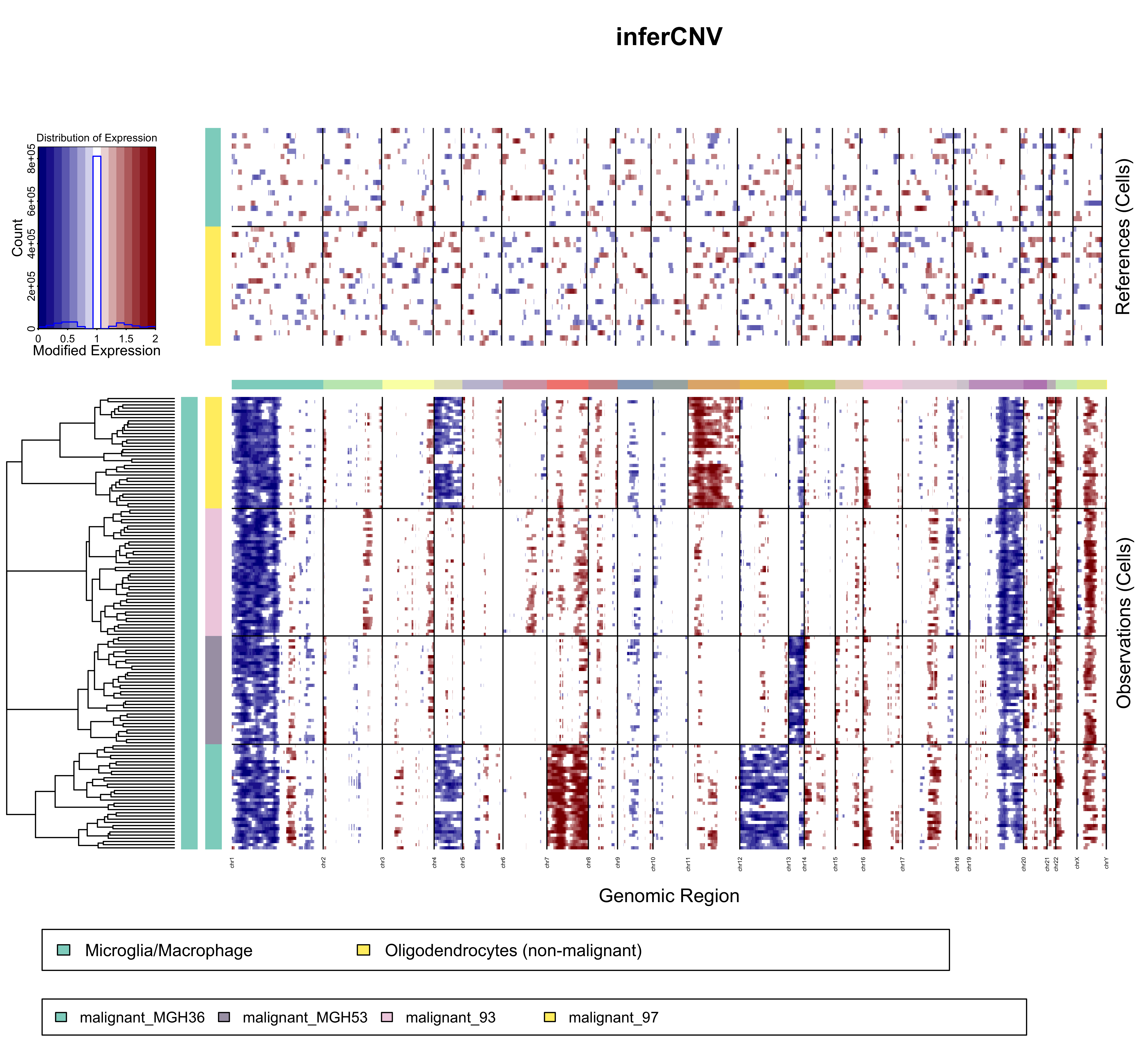
The expression values for normal cells are plotted in the top heatmap and the tumor cells are plotted in the bottom heatmap, with genes ordered from left to right across the chromosomes. The normal cell expression data is effectively subtracted from the tumor cell expression data to yield differences, where chromosomal region amplification shows up as blocks of red, and chromsomal region deletions show up as blue blocks.
More precise details are provided below:
The rows of the both heat maps correspond to the cells.
The heat maps are separated horizontally between reference and non-reference cells (or observations) with a central color bar indicating different chromosome regions (by color change). The very top heat map is comprised of reference observations. The lower heat map contains non-reference cells (observations) ordered using hierarchical clustering (euclidean distance, average linkage).
The ordering and grouping of cells is determined by specified clustering algorithm and grouping according to the cell annotations file. Depending on whether the group_by_cluster option is used or not, there are a few differences:
- If group_by_cluster=FALSE, the dendrogram on the left is a hierarchical clustering of all non-reference cells. The first color column indicates the subdivisions of the dendrogram by cutting it in k_obs_groups groups. The second color column indicates the annotation matching to each cell from the input provided.
- If group_by_cluster=TRUE, the dendrogram on the left is a 'linear concatenation' of the dendrograms for each type of non-reference cells (the root of the dendrogram is linked to the root of each type's dendrogram, which leads to having all of them on the same level). The first color column is of a single color as k_obs_groups is not used when clustering by annotation. The second color column indicates the annotation matching to each cell from the input provided, and there should not be any mix since the cells have been clustered by the same annotation.
The columns of the figure are genes, ordered by chromosome position.
Black vertical lines separate contigs/chromosomes. The horizontal color bar between the two heat maps also indicates contigs/chromosomes by color change. Contigs/chromosomes are defined in and ordered by the Genomic Position File.
The color intensities of the heatmap correspond to the residual expression values after performing a series of data transformations and effectively subtracting the normal cell expression data from the tumor cell expression data. Full details are provided here.
The normal cells in the top heatmap define baseline expression for genes in normal cells. This baseline distribution of normal gene expression is subtracted from both the normal cells from which was defined as well as the tumor cells. Afterwards, the normal cell expression heatmap should be largely devoid of signal, with the exception of certain outlier gene expression values in certain cells. Removing this baseline of normal expression signal from the tumor cells should reveal those chromosomal regions that have significantly more or less expression than the normal cells, highlighting likely amplified or deleted whole chromosomes or large chromosomal regions.