Fork changes:
- Removed opinionated paddings
- Fixed animation (no flicker if bottomHeight != 100)
- Fixed drawing order so clicks aren't obstructed by invisible animation object
Number of commits summarized by this: 3 (check if accurate).
Original project doesn't seem to be maintained anymore:
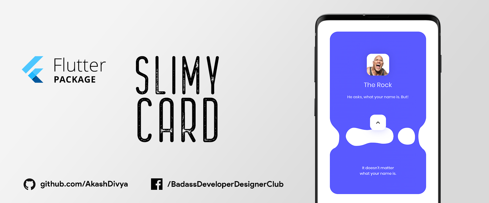
SlimyCard provides a beautiful slime-like animation of a Card that separates into two different Cards, one at the top and the another at bottom. It is possible to put any custom widget in these two separate cards.
-
1. Depend on it
Add this to your flutter app's pubspec.yaml file:
dependencies: slimy_card: ^1.0.4 -
2. Install it
You can install packages from the command line:
with Flutter:
$ flutter pub getAlternatively, your editor might support flutter pub get. Check the docs for your editor to learn more.
-
1. Import it
In your Dart code, import the package as mentioned below:
import 'package:slimy_card/slimy_card.dart'; -
2. Use It
Create a ListView, and in its children use SlimyCard()
ListView( children: <Widget>[ SlimyCard(), ], ); -
3. Customize It
You can customize SlimyCard as per need, by using the following parameters:
ListView(
  children: <Widget>[
    SlimyCard(
      color: Colors.red,
      width: 200,
      topCardHeight: 400,
      bottomCardHeight: 200,
      borderRadius: 15,
      topCardWidget: myWidget01(),
      bottomCardWidget: myWidget02(),
      slimeEnabled: true,
    ),
  ],
),
myWidget01 & myWidget02 are your custom widget which you can display in Top Card & Bottom Card respectively.
You can get the real-time status of this Package by wrapping the SlimeyCard in StreamBuilder as below:
StreamBuilder(
  initialData: false,
  stream: slimyCard.stream, //Stream of SlimyCard
  builder: ((BuildContext context, AsyncSnapshot snapshot) {
    return ListView(
      children: <Widget>[
        SlimyCard(
          color: Colors.red,
          width: 200,
          topCardHeight: 400,
          bottomCardHeight: 200,
          borderRadius: 15,
          topCardWidget: myWidget01(),
          bottomCardWidget: myWidget02(),
          slimeEnabled: true,
        ),
      ],
    );
  }),
),
snapshot.data will contain the real-time
SlimeyCard also supports changing of state, check the code below:
SlimyCard(
  topCardWidget: topCardWidget((snapshot.data)
      ? 'assets/images/rock_aggresive.jpg'
      : 'assets/images/rock_calm.jpg'),
),
In the code above, snapshot.data contains status of SlimeyCard and have two states according to it & hence updates UI according to it.
Cooming Soon...
Hi! my name is Akash Divya.
I'm a veteran Designer/Animator with 10+ years of experience. I always hated the excuses Developers gave me when they fail to implement my Design. One day, when I found about Flutter I said no more & started learning it.
Email: akash.apd@gmail.com
Now go out there and do what you Love.

.gif)
.gif)
.gif)
