Sky Nav logo feels too large on small screens #1514
Description
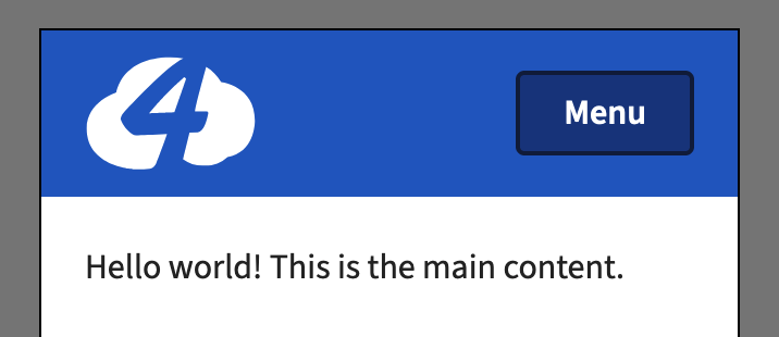
On large screens, the Sky Nav logo feels nicely balanced (IMO):

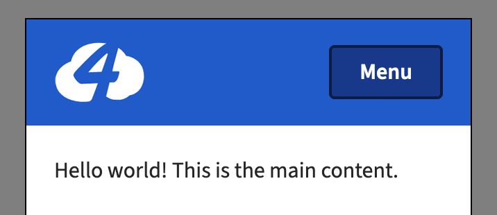
But on smaller screens, it feels a bit confined:
Ideally it'd be a bit more balanced with the size of the button (this is just a quick mockup):
This issue is labeled design because it involves design thinking but dev because I believe the adjustment can be made directly to the Sky Nav component without a separate prototyping step.