Add new alert modifiers and new alert variation prototype #1557
Conversation
🦋 Changeset detectedLatest commit: 4152711 The changes in this PR will be included in the next version bump. This PR includes changesets to release 1 package
Not sure what this means? Click here to learn what changesets are. Click here if you're a maintainer who wants to add another changeset to this PR |
|
✔️ Deploy Preview for cloudfour-patterns ready! 🔨 Explore the source changes: 4152711 🔍 Inspect the deploy log: https://app.netlify.com/sites/cloudfour-patterns/deploys/6195919f3454900007c37535 😎 Browse the preview: https://deploy-preview-1557--cloudfour-patterns.netlify.app |
There was a problem hiding this comment.
This is looking great, and I think the list of future issues is spot on.
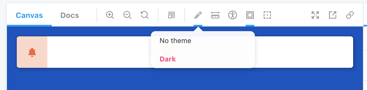
I left some comments inline. I also notice that when I apply the dark theme to the story, the text disappears.
You may want to consider theming the alert for light and dark containing themes, but then supporting adding a theme class (such as t-light) directly so you'll get the text, link and background colors where desired.
Co-authored-by: Tyler Sticka <tyler@cloudfour.com>
Co-authored-by: Tyler Sticka <tyler@cloudfour.com>
Co-authored-by: Tyler Sticka <tyler@cloudfour.com>
…ur/cloudfour.com-patterns into patterns/alert-variation
…ur/cloudfour.com-patterns into patterns/alert-variation
|
@tylersticka I'm picking up where Arianna left off with this PR. It looks like she addressed almost all the feedback. I resolved a couple merge conflicts and addressed a small piece of feedback that looked like it hadn't been updated yet. Would you mind taking a look again? |
There was a problem hiding this comment.
Something looks amiss when the alert is full-width at very wide sizes: https://deploy-preview-1557--cloudfour-patterns.netlify.app/?path=/story/components-alert--icon

@tylersticka
|

@dromo77 I like that idea, it feels the most flexible and responsive. It might look even more purposeful and "on-brand" if the container became a circle past that max-width size? |
src/assets/icons/offline.svg
Outdated
| l0.5-0.5c3.9-3.9,10.3-3.9,14.2,0l0.5,0.5c0.1,0.1,0.3,0.2,0.4,0.2s0.3-0.1,0.4-0.2l0.5-0.5C21.3,10.1,21.3,9.7,21,9.5z"/> | ||
| <path d="M12,23c6.1,0,11-4.9,11-11S18.1,1,12,1S1,5.9,1,12S5.9,23,12,23z M19.8,5.1l-16,13.7" fill="none" stroke-width="2"/> | ||
| </svg> | ||
|
|
There was a problem hiding this comment.
This icon feels like it could be more consistent with other elements of our patterns.
I think this is especially clear if you compare it to the way our bell icon looks inside of a slashed button:

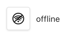
When searching the Noun Project for "offline," I notice that a common visual is a cloud with a slash through it. Have we missed an opportunity to use a cloud where it makes symbolic sense? 🤔
There was a problem hiding this comment.
I like the idea of using a cloud. What do you think of this @tylersticka?
There was a problem hiding this comment.
I like that better. Is it possible to make the cloud larger in relation to the slash?
There was a problem hiding this comment.
It's subtle, but here's an update version with the cloud a little larger in proportion to the slash.
There was a problem hiding this comment.
I like that better!
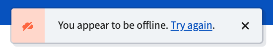
Can the icon itself be larger within its container? I think I'm reacting to its size relative to the capital "Y" in "You"
There was a problem hiding this comment.
Here it is a little bigger:
There was a problem hiding this comment.
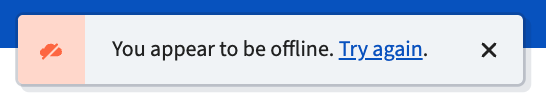
I like that! How do you feel about it?
There was a problem hiding this comment.
Something I just noticed: In general, we want to name our icons based on what they are, not what they're for. So instead of offline, we might name it cloud-slash.
That might seem silly, but in other projects we've run into issues where we name an icon after one feature, it ends up being used for something else, and then later we stop using it for the original feature, so it's sort of in limbo. Better to just name it what it is.
Otherwise, this is great!
Overview
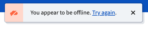
This PR adds two new modifiers for the alert pattern: Adding an icon and adding a floating style.
There's also an alert added to a prototype to get a feel for the intended use of the offline alert.
A couple of other issues can come from this:
Screenshots
Icon modifier:
Floating modifier:
Alert in practice:
Testing