Pin input component for React
To get started, install and save in your package.json dependencies, run:
npm i @kevincuadros/react-codeor
yarn add @kevincuadros/react-code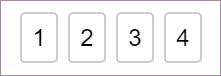
You can use the following two ways to import module.
import { PinCode } from '@kevincuadros/react-code'import { PinCode } from '@kevincuadros/react-code';
const App = () => {
const [value, setValue] = React.useState('');
return (
<PinCode
length={4}
onChange={setValue}
/>
);
};PinCode expects a number for the length prop. The number of input fields rendered is equal to the length of the array.
By default, PinCode moves focus automatically to the next input once a field is filled. It also transfers focus to a previous input when Backspace is pressed with focus on an empty input.
PinCode offers a way let it focus from the start. Simply set autoFocus prop to true to focus the first input upon initial mounting of the component.
By default, PinCode placeholder is (''), you can change that if you want.
By default valueToValidate is (''), when all the fields are completed the value will be validated
PinCode Props
| Name(*required) | Type | Default | Description |
|---|---|---|---|
| length(*) | number | Number of rendered elements. | |
| autoFocus | boolean | false | If true the input will be focused on the first mount. |
| valueToValidate | string | "" | Value to compare |
| invalidBorderColor | string | rgb(220,53,69) | Let you customize border color when the input is invalid. |
| validBorderColor | string | rgb(220,53,69) | Let you customize border color when the input is valid. |
| onChange | Dispatch<React.SetStateAction> | Called when input value is changed. | |
| placeholder | string | "" | Displayed when the pin code is not entered yet. |
| inputStyle | object | {} | Lets you customize input element. |
MIT