Add mobile friendly table of content #564
Conversation
Codecov Report
@@           Coverage Diff           @@
##           master     #564   +/-   ##
=======================================
  Coverage   93.73%   93.73%
=======================================
  Files         189      189
  Lines        2906     2906
  Branches      952      952
=======================================
  Hits         2724     2724
  Misses        182      182
Continue to review full report at Codecov.
|

|
@rvsia nice |
|
@Hyperkid123 Yeah, I am thinking the same. However, do you have any idea? icon, make it bold? It should be visible, but not so much. :D |
|
Well, the next question is. Do we even need that in the mobile view? Should we just hide the whole thing? Usually, this kind of navigation is stacked on top before the content or just hidden. I think it adds too much complexity. In our case, sometimes we have a lot of sections and the content can get pretty long. I would just hide it on mobile... |
|
I think it's a nice feature to have - especially on pages with a lot sections. Users can quickly scan the whole content to find if the page contains what they are searching for. And having it as a small button does not disrupt the look and the feel of the page. |
|
All right let's try to find something that also looks good. |
|
What about? (not pushed yet) |
|
Maybe with pushing it to the right side |
|
I agree it should be on the right side |
|
|
|
|
||
| <Grid container item> | ||
|
|
||
| <ListOfContentsMobile file="mappers/blueprint-component-mapper" /> |
There was a problem hiding this comment.
I don't exactly like that we need a special component.
We can use smart layout and reverse the column/row order on small screens. And make this a part of the normal content component.
It should work since we have a different grid item for the actual content and the content navigation.
There was a problem hiding this comment.
I would like to make a common layout component in the next PR and refactor all pages to use it. I could include this change in it.
import DocPage from '@docs/doc-page'

<DocPage file="bla/bla">
  ...content...
</DocPage>
instead of defining Grids and contents in every page.
There was a problem hiding this comment.
Yep, that is exactly what should happen. Can you add a task to the docs project?
There was a problem hiding this comment.
Done! 🖖 you can find the task in the issues. I will start working on it right after this is merged.
|
🎉 This PR is included in version 2.5.2 🎉 The release is available on Demo can be found here! |
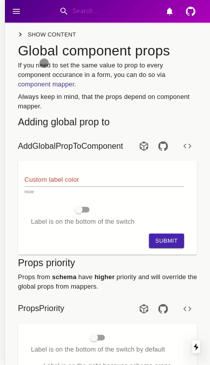
On mobile phone the content is put to the end of pages and it's not very useful (especially on long screens):
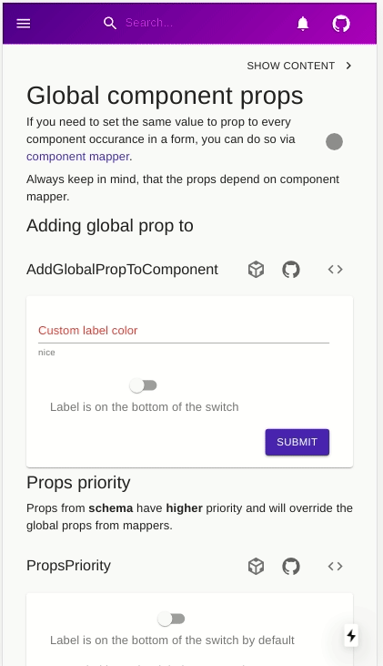
This PR hides this list on smaller screen and puts a menu to the top of the page: