This application takes text data from multiple sources, and visualises that data in a way which shows how the words and documents are related. It was originally designed to analyse conference papers, but can also be used for books, articles, blogs, reviews... basically anything that's text!
There are 2 ways you can visualise data with this app:
-
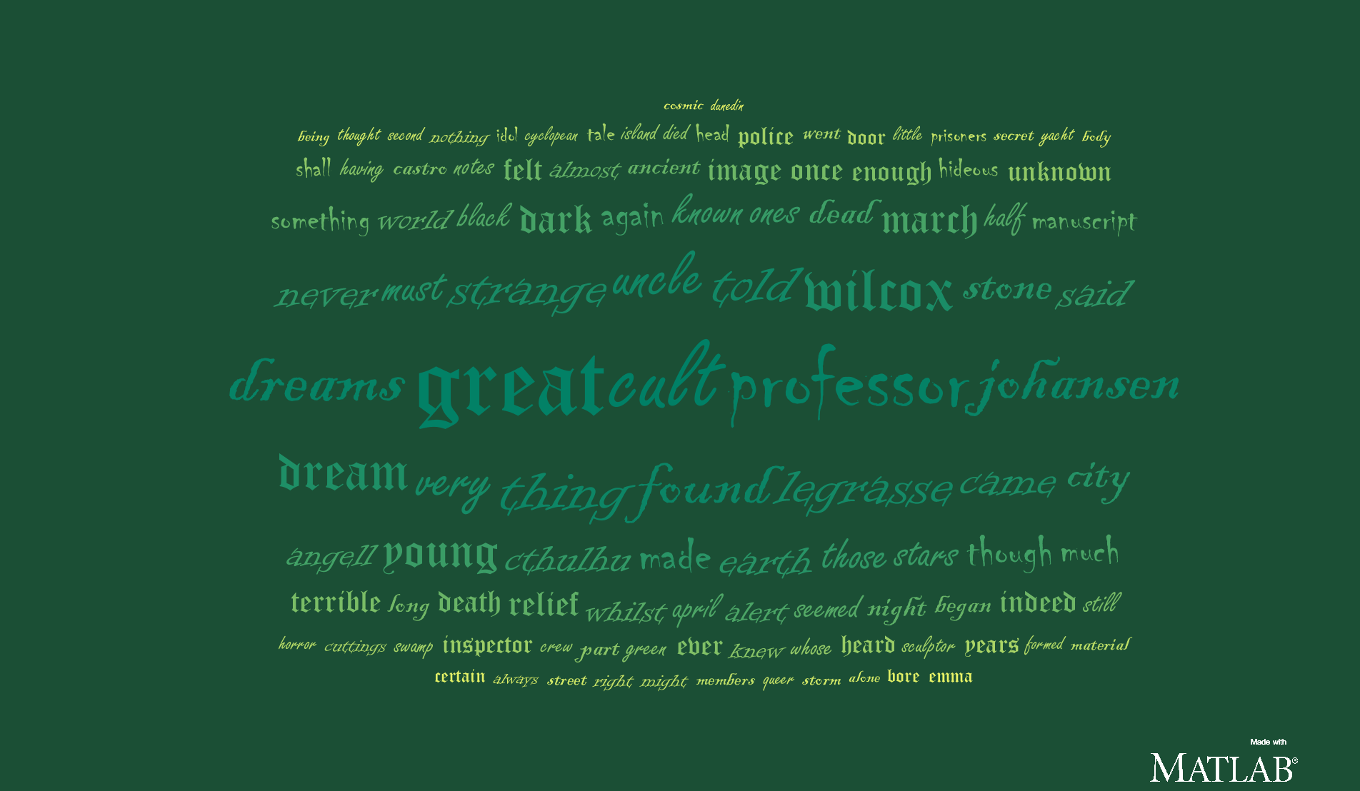
Word Cloud: The size of the word indicates how much it appears across all the documents. Words are grouped into clusters according to how frequently they are mentioned together.
-
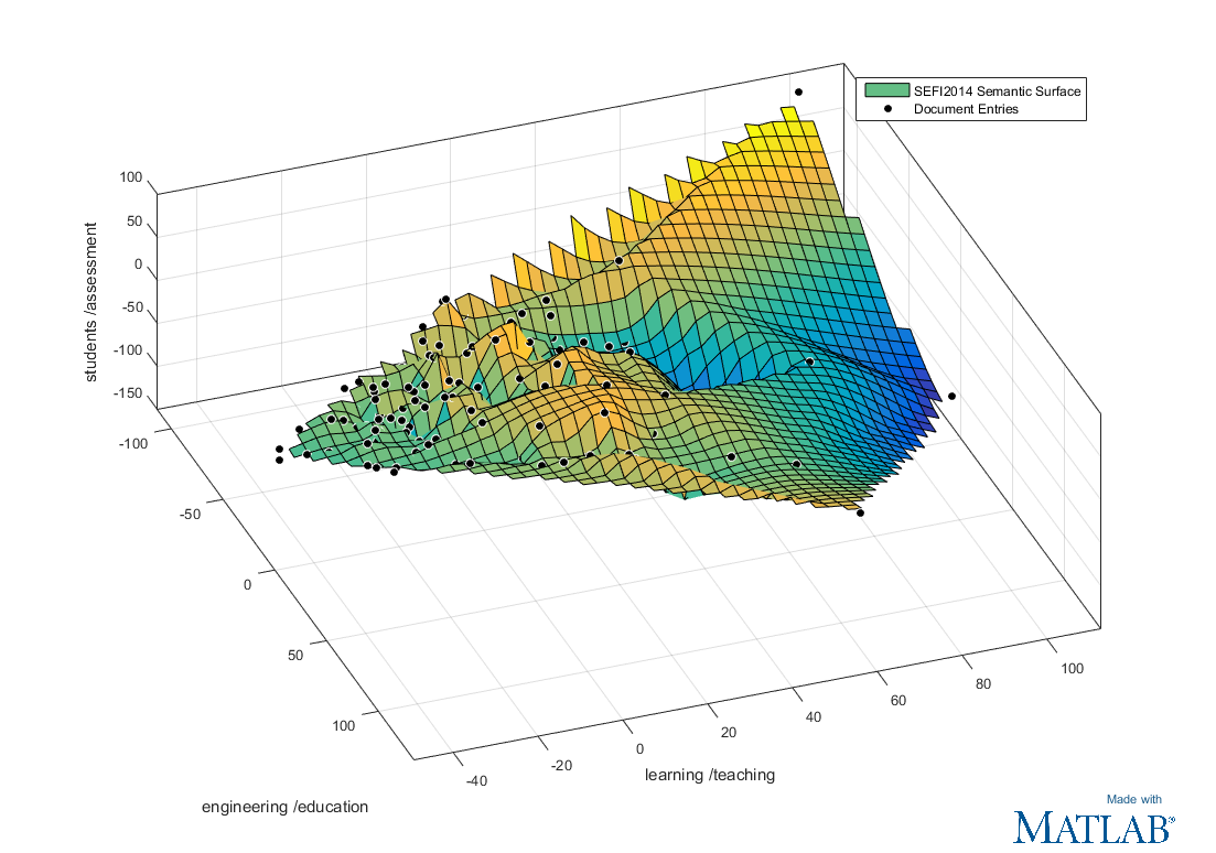
Semantic Surface Scatter plot showing each separate document as a point in a 3D space. Documents that are close to each other in the plot are similar to each other. This gives you a view of how the documents are related in the project. Clicking on a point will show the document title.
Copyright 2015 The MathWorks Inc.
To get started, run the function GetFilesUI. This will open up the user interface
for selecting the files to read. From there you can create word clouds or a semantic surface.
This app can also be downloaded from MATLAB File Exchange here:
http://uk.mathworks.com/matlabcentral/fileexchange/51793-word-data-visualisation
This relies on the updated MATLAB graphics system which was introduced in R2014b. Earlier versions of MATLAB will not be able to reliably run this code.
This toolbox is used to do the statistical analysis of comparing files with each other. The code should work without the statistics toolbox installed, however you can only create word clouds (without clustering) and not the Semantic Surface.
For the semantic surface plot, having this toolbox will allow MATLAB to generate a surface of best fit. Otherwise only a scatter plot is shown.
To be able to read PDFs you need to install the free Xpdf utility from http://www.foolabs.com/xpdf/download.html
Reading doc or docx files is only possible on Windows operating systems, and requires Microsoft Word installed.
- Get list of files to parse from user using GetFilesUI.
- MAP: For each file get a list of words and count number of times a word occurs.
- PDF, doc and docx files are converted to txt files and stored in the temporary directory.
- The txt file is read in using TEXTSCAN, which converts the entire file to a cell array with one cell per word.
- The cell array is converted to the CATEGORICAL data type. This automatically generates a list of the unique words in the cell array (the "categories"), and the COUNTCATS function can then be used to quickly count the number of occurrences of each unique word.
- The categorical array is saved to mat file in the project directory. If you try to rescan the file again later, it will open the saved data instead.
- REDUCE: Collate list of all words used across all files, and recalculate word counts for each paper based on new list.
- Now we have a set of categorical arrays containing all the words from all the files this is combined into one categorical
completeWordList - The categories from
completeWordListare taken to get a complete list of ALL unique words used in the set of files. This is reordered so that the most common word comes at index 1 and the least common word at theendposition. - To get each file's new word count we recategorise the saved data from the mapping phase to use the
completeWordListcategories instead. Then use theCOUNTCATSfunction to get the word counts.
Words are clustered by how commonly they occur together. The word size indicates how frequently the word is mentioned in total. If only one file is provided in the project there will be no clustering because there are not enough separate files to compare word occurrences.
Clustering is calculated using MATLAB's hierarchical clustering algorithms from the Statistics and Machine Learning Toolbox:
The correlation between the words is used as a distance measure, so words that are perfectly positively correlated will have zero distance, and perfectly negatively correlated words have a very large distance.
The "linkage" clustering algorithm then:
- Steps through the words, and pairs words that are closest together (i.e. the words most postively correlated with each other).
- The pairs can then be combined with other words or pairs which are close to each other.
- The process of pairing words or pairs repeats until we have the number of groups required for the Word Cloud.
- Each group of words is rendered as a cluster in the WordCloud.
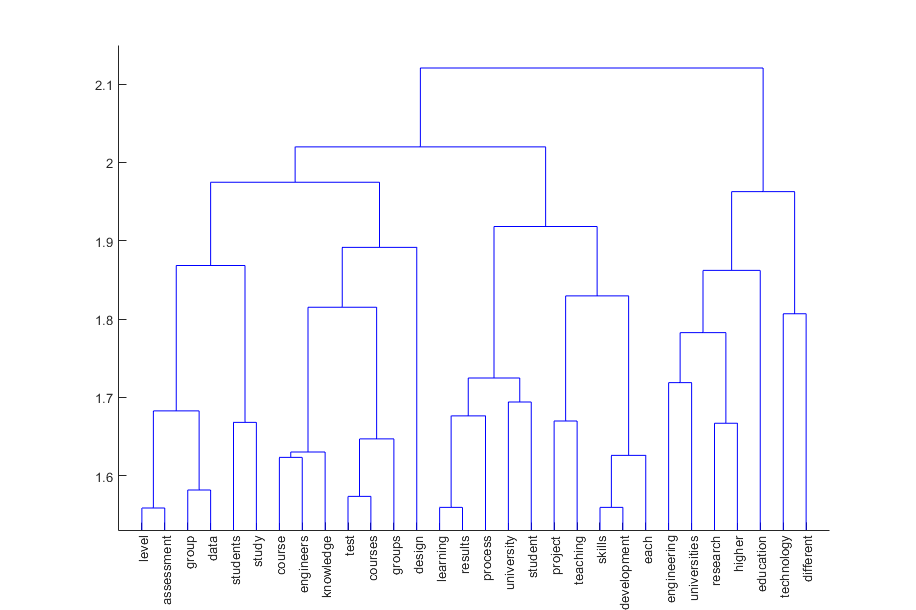
This pairing tree is usually shown in a diagram called a dendrogram. It shows how words have been paired and the height of the link shows how close the two words being linked are.
This an example of a MATLAB dendrogram for some test files:
This is the resulting WordCloud when separated into 8 clusters:
Say there are N unique words observed across all the documents. Each document can be represented as a point in an N dimensional space, where its position on the Xth axis is the number of times the Xth word appears in the document.
The Semantic surface visualisation uses a statistical technique called "Principal Component Analysis" (PCA) to reduce this data down from N dimensions to just 3.
PCA works by rotating the axes of the N dimensional data, redefining their directions so that there is the most possible variation along the first axis, then as much variation as possible along the second axis, and so on.
For example, say the we have a set of documents with 3 unique words: 'alpha', 'bravo' and 'charlie'.
Normally, we orient the axes so that each dimension corresponds to only one variable.
So, with the example of just 3 words:
X.alpha = 1;  X.bravo = 0;  X.charlie = 0;
Y.alpha = 0;  Y.bravo = 1;  Y.charlie = 0;
Z.alpha = 0; Z.bravo = 0; Z.charlie = 1;X, Y and Z are the dimensions of the axes,
X.alpha is how much the X dimension represents the word 'alpha',
X.bravo is how much the X dimension represents the word 'bravo' and so on.
The PCA algorithm looks at the data set, and maybe finds that the data varies the most along the vector:
alpha = 0.53; bravo = 0.07; charlie = 0.4;The first axis X is redefined to be this new vector.
Next the PCA algorithm looks at the data set again to find a vector orthogonal to X
which has the most possible variation. So maybe it finds that this vector
is the one with most variance across the data:
alpha = 0.17; bravo = 1.28; charlie = -0.45;The algorithm sets Y to be this vector. Finally, since the data only has 3 dimensions, Z
is set to the remaining orthogonal vector.
A full explanation of how Principal Component Analysis works can be found in MATLAB's feature transformation documentation.
Although the data is multi-dimensional, we can only visualise up to 3 dimensions at a time. The first axes the PCA algorithm produces have the most variation across the data, so we only plot the data on the first 3 axes and ignore all the higher dimensionality information.
This does however mean that axes no longer map to one single word but a combination of words, so labelling the axes becomes slightly trickier. We take the two words that have the strongest weighting for the axis as a label.
From the earlier example, the axis X was rotated to be this vector:
alpha = 0.53; bravo = 0.07; charlie = 0.4;The weightings for the words alpha (0.53) and charlie (0.4) are the strongest,
so axis X would be labelled 'alpha / charlie'.
This is a simplification of what the axis actually represents, because it is a multi-dimensional vector and consequently influenced by all words in the dataset. However, it does give a decent summary of what the axis represents and which words are the most divisive.
Finally, after all the data is plotted, we use the Curve Fitting Toolbox function FIT to fit a surface to the data points, so that we have a surface of best fit.


