-
-
Notifications
You must be signed in to change notification settings - Fork 61
New issue
Have a question about this project? Sign up for a free GitHub account to open an issue and contact its maintainers and the community.
By clicking “Sign up for GitHub”, you agree to our terms of service and privacy statement. We’ll occasionally send you account related emails.
Already on GitHub? Sign in to your account
Add a Palette API #122
Add a Palette API #122
Conversation
|
Edited: :-) @Philip-Scott Taking cues from android and @donadigo Adam:-) . This might make some apps even more pleasant |
|
@harisvsulaiman or rather, me ;) |
…ors; create generate_sync and generate_async methods; make properties public settable for further use; declare constants for max colors and quality properties
|
Because this has come up several times, I want to document the times/places accent colors have been brought up and when they make sense versus other color/blur utils: UsesTinting for background protection@danrabbit usually brings up that blur would probably work better. I think it's more an aesthetic choice; the tint is more subtle and is used in on other platforms like Android for a super subtle way to let the wallpaper affect the rest of the OS without the heavy-weight (and potentially disorienting) blur.
So far I don't know if we have explicit examples of where we would use this, especially with the new Greeter design. Providing content-based fill@danrabbit again usually brings up that blur would probably work better. In this case I think he is correct. An example is in a header for a music app, or as a way to fill a different size/aspect ratio without stretching an image. I will say that if we had an accent color available to us, being able to factor in a tint in addition to/instead of blur might be interesting. iTunes, Android, and other places in macOS and iOS do this effectively in my opinion. See https://panic.com/blog/itunes-11-and-colors/ for some examples.
Twitter also does this for its fullscreen image viewer, though I'm not sure how effective it is (or how good their algorithm is):
UI accent colorsThis is the most effective use of this API in my opinion. Sometimes a developer wants to provide more vibrant color in their UI (whether it's heading text, card backgrounds, etc.), and simply blurring out some piece of content doesn't make sense. This is where Android and Material design put this on display effectively.
Pocket Casts is my favorite example of this because it's subtle but effective. Their UI is super monotone, but all content-related accent colors are picked from the artwork.
Moving forwardI think a palette API would be awesome and useful to app developers. However! Like any of our Granite APIs, they have to be proven in use before we adopt them—app developers, this is your chance to do some interesting things and see how they go to potentially affect a feature in elementary OS! @Philip-Scott if this API would be useful, implement it in Spice-Up and see how it goes, what its limitations are, etc. If we find genuinely useful places to use it in an elementary project, let's implement it in that codebase! If we have more than one place, then let's look at pulling it into Granite. |
|
Is there anything preventing this from being merged? I would like to see this as part of elementary |
|
@harisvsulaiman it has conflicts and the API isn't even fininished yet. |
|
|
@danrabbit Is this something you would like to see completed? It seems to have been abandoned but the initial reaction seemed positive. |
|
@jeremypw the issue is that this is implementation-first instead of design-first. We're using a similar algorithm directly in Gala, I believe, to set the system accent color but I don't know anywhere else we've wanted to use a content-based accent color. Like anything else in Granite, we should work to implement it in the places we need it first and only accept it into Granite once we have multiple places we want to use it. |
|
@cassidyjames Maybe an element of "chick and egg" here. More likely to be used if easily available in Granite? But I understand your pov. How do we monitor/count the places where it might be used? |
|
I think this can be closed now - it seems thoroughly abandoned - at least until the API has been designed/implemented in one project. |


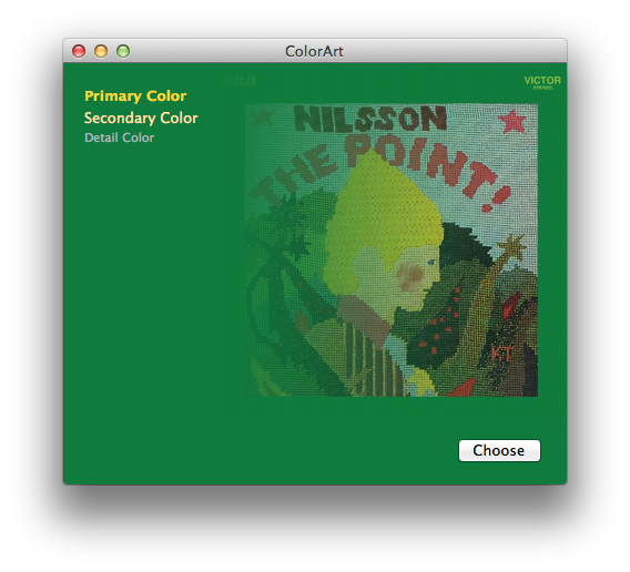
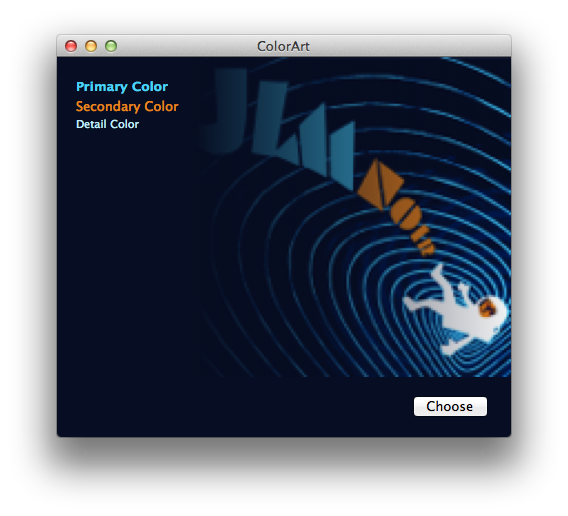
The Palette class is used to extract most dominant colors from an image
Demo:
You drag & drop an image, and it will analyze it
TODO: