This is not a completed UI/UX design; it is just a template that you can use to enhance your game.
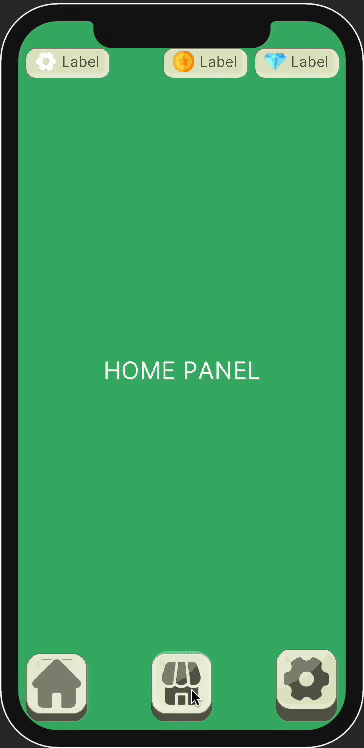
Provides a tab system for main panels(settings, shop, home vs.)
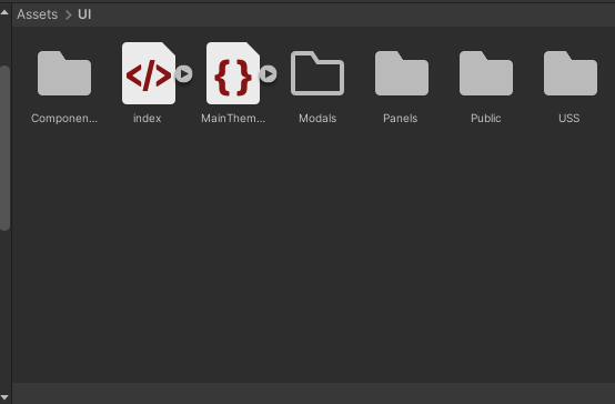
All icons and images will be placed into "Public" Folder.
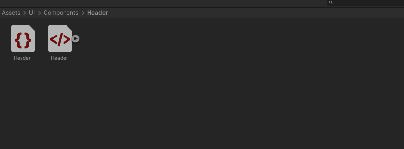
Components like Buttons, Labels or Header Footer eg will be placed in "Components".
Panels like Settings, Shop, Home ... will be placed into "Panels" folder.
General uss file like the uss codes to effect everywhere of uı will be placed in USS, otherwise, custom uss files like only for Header component will take place in its own folder in Components folder(for example: Header component has labels inside it and has coin icon on one of that labels. So, in Header.uss we have a line of code to place that icon to there.)
Colors and general configs are available to customize as you wish (of course you should keep consistent )
:root{
    --text-color-base: var(--primary-dark-60);

    --radius-base: 32px;
    --radius-large: 48px;
    --border-width-small: 3px;
    --border-width-base: 6px;
    --border-width-large: 16px;

    --margin-base: 24px;
    --margin-large: 32px;

    --padding-small: 12px;
    --padding-base: 24px;
    --padding-large: 32px;

    --button-pressed-transition: 0.1s;
    --button-square-base: 200px;
    --icon-square-base: 160px;

    --icon-width-base: 160px;
    --icon-width-small: 100px;
    --icon-width-large: 200px;

    /*these 2 variable will be set when you decide how much your header and footer has height as pixels it is automaticly added to each main tab menu content. eg SettingsPanel, HomePanel, ShopPanel... to not to overlay these panels' content over the header or footer.*/
    --top-offset: 264px;
    --bottom-offset: 300px;
}:root {
--primary: #e1e6c5;
--primary-dark-40: #878a76;
--primary-dark-60: #5a5c4f;
--primary-light-30: #eaeed6;
--primary-light-40: #edf0dc;
--primary-light-60: #f3f5e8;
--primary-light-80: #f9faf3;
--secondary: #e6c5d5;
--secondary-dark-40: #8a7680;
--secondary-dark-60: #5c4f55;
--secondary-light-30: #eed6e2;
--secondary-light-40: #f0dce6;
--secondary-light-60: #f5e8ee;
--secondary-light-80: #faf3f7;
--red: #b33d3d;
--red-dark-40: #6b2525;
--red-dark-60: #481818;
--red-light-30: #ca7777;
--red-light-40: #d18b8b;
--green: #3db36c;
--green-dark-40: #256b41;
--green-dark-60: #18482b;
--green-light-30: #77ca98;
--green-light-40: #8bd1a7;
--yellow: #b3993d;
--yellow-dark-40: #6b5c25;
--yellow-dark-60: #483d18;
--yellow-light-30: #cab877;
--yellow-light-40: #d1c28b;
--blue: #3d8ab3;
--blue-dark-40: #25536b;
--blue-dark-60: #1f455a;
--blue-light-30: #77adca;
--blue-light-40: #8bb9d1;
--grey: #BAC1CC;
--grey-dark-20: #76859B;
--grey-light-80: #D4D6D8;
--grey-light-85: #EBEDF0;
--grey-light-90: #F6F6F7;
}I used https://maketintsandshades.com/#e1c5c5 to generate color shades
I personally recommend customize colors only!
-
Create a new Label
-
Name it with "...Tab" at the end of it (example: LeaderboardTab)
-
Add "currentlySelectedTab" to newly created Label#LeaderboardTab(label named as LeaderboardTab) only if it will be active on start(as default HomeTab and its content HomeContent will be active on start so Label#HomeTab has "currentlySelectedTab" class)
-
It doesnt matter which element you use(Visual Element or Label etc.), Create a node
-
Name it with "...Content" at the end of it and related tab name as begining (example: LeaderboardContent)
-
Add "unselectedContent" if it is not active as default when app start (as default except HomeContent , all other contents has "unselectedContent" class)