Repository navigation
Feature request : zoom out the timeline #10

Replies: 4 comments 2 replies

|
@ChazyChaxxx thanks, we are on it. Today the pinch only changes the number of columns, and the scrubber on the right maps the whole library to the height of the screen, which is why one millimetre jumps months on a large library. What we plan: a zoom level beyond the smallest tiles that switches the timeline to a month view (one block per month, a few tiny thumbnails and the count), and one pinch further a year view (one block per year), with a tap on a month or a year opening it at the usual zoom; a scrubber that shows the year and the month under your finger and slows down while you hold it; the same on a computer with Ctrl and the mouse wheel. It comes in the build after 32, first on phones and tablets, then on the computer and the TV. I will post here when a test build is ready. |
|
@ChazyChaxxx the month and year views are in test build 33: build 33 for Android (the universal APK, or the arm64-v8a one on most phones; if Android refuses it over the Google Play version, uninstall that one first) and desktop build 14 for a computer. Pinch out past the smallest tiles for the months, once more for the years, and pinch in to come back. A tap on a month or a year opens it at your usual zoom, and Back returns to the grid. Hold your finger still on the scrubber for a moment and it slows down, with the year and the month under your finger. On a computer, Ctrl and the mouse wheel. Your feedback decides the tuning of the pinch thresholds: tell me if the months and the years come too early or too late on your library, and how the slow scrubber feels. |

|
OMG, thank you very much. It is EXACTLY what I needed. Navigation through years is now much easier. |

|
I noticed a minor UX quirk : when tapping a year in the lowest zoom level ('years view' / level 1), it skips level 2 (months view) and jumps straight to level 3. Pinch-to-zoom transitions smoothly from level 1 to level 2, but tapping bypasses the month view entirely. |
|
Regarding my previous comment, please disregard it! I was clicking directly on the year header (which doesn't really make sense). For a moment, I completely forgot that the obvious tap action was on the month thumbnail itself, which actually jumps straight to the month view perfectly as expected. Sorry about the hasty message! As for the pinch-to-zoom sensitivity and the scrubber: honestly, it feels completely natural. It's so intuitive that I don't even notice any friction while using it, which in my opinion means it's tuned just right. I'll keep using the app normally over the next few days and will let you know if I notice anything that could be tweaked, but as of right now, I 100% validate this current build. |

|
@ChazyChaxxx thank you, that is the best news of the week. The thresholds stay as they are then, and the tap on a year header opening the grid at that year is on purpose; if a tap there should rather open that year's months, say so and it is a small change. There is no tip jar: the app is free, and feedback like yours, plus a word about Immuch360 to people who would use it, is what helps the most. Keep the notes coming as you use it. |


Uh oh!
There was an error while loading. Please reload this page.
Description
As personal photo libraries grow year after year, navigating through large timelines becomes increasingly difficult — even with the current "pinch-to-zoom" functionality provided in Immich's mobile app.
Currently, even at the most zoomed-out level, the vertical scroll bar is too sensitive and compressed: moving it by just 1 mm can skip several months of photos, especially on devices with large libraries. This makes precise navigation challenging.
Proposal / Feature Suggestion
Introduce an additional zoom-out level beyond the current minimum zoom, allowing the user to:
See significantly more photos at once — possibly by displaying ultra-small thumbnails.
Navigate the photo timeline more efficiently, even across multiple years.
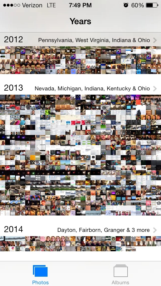
Conceptually allow a zoom hierarchy:
Even if the thumbnails become very small or symbolic, the goal is not to view the image clearly at this level, but to improve large-scale navigation across long timelines.
Why It Matters
Greatly improves usability for users with thousands (or tens of thousands) of images.
Makes immuch360 more scalable as a long-term photo solution.
Aligns with UX practices seen in other gallery apps that support hierarchical time-based navigation.
Tradeoffs / Considerations
Thumbnails may become less visually clear, but this is acceptable at this level of zoom since it's meant for navigation.
Requires UX/UI adaptation to represent time at higher levels (e.g., headers for years/months).
May involve performance optimizations to avoid loading too many tiny images at once.
This is a screenshot of Apple Photo application (found in Google Image "year view timeline photo library"). This is very old but navigation in this 10 years old app is easier than the immich app in 2026.
All reactions