A custom ProgressViewStyle that allows for display of a circular progress bar! The default CircleProgressViewStyle currently only shows an indefinite spinner, so this style allows for tracking actual progress on a cirular bar.
- Is a progress view style, not a separate view, meaning you can easily attach it to any
Progressviews. - Supports both definitive and indefinite view styles.
- Allows for placing the progress label either inside or below the circle. The circle properly scales based on the progress label size.
- Highly configurable:
- Set custom color for both track and fill.
- Define ring line width.
- Define the padding between the inside label and the ring.
- Set the default width for when the progress label is below.
- Define the angle from which the progress counting starts.
This component is distributed as a Swift package.
import SwiftUICircleProgressBar
struct TestView: View {
@State private var progress = 0.0
var body: some View {
VStack(spacing: 40) {
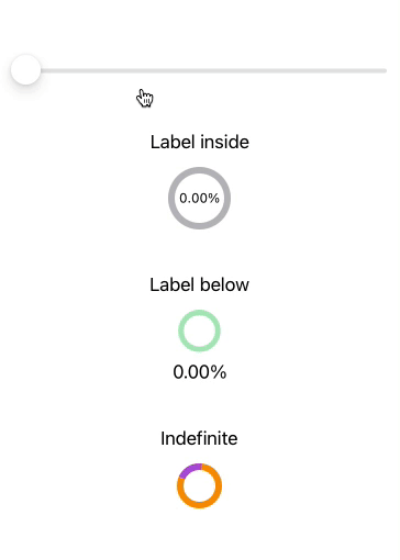
Slider(value: $progress, in: 0.0...1.0) {
Text("Slider")
}
ProgressView(value: progress, total: 1.0) {
Text("Label inside")
} currentValueLabel: {
Text(String(format: "%0.2f%%", progress))
.font(.system(size: 12).monospacedDigit())
}.progressViewStyle(RingProgressViewStyle(progressLabelPosition: .inside))
ProgressView(value: progress, total: 1.0) {
Text("Label below")
} currentValueLabel: {
Text(String(format: "%0.2f%%", progress))
}.progressViewStyle(RingProgressViewStyle(progressLabelPosition: .below,
configuration: .init(trackColor: .green.opacity(0.4),
fillColor: .red,
lineWidth: 5,
startAngle: .degrees(90))))
ProgressView("Indefinite")
.progressViewStyle(RingProgressViewStyle(configuration: .init(trackColor: .orange,
fillColor: .purple)))
}.padding()
}
}Check out SwiftUIRecipes.com for more SwiftUI recipes!