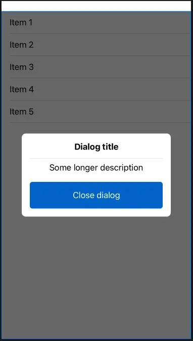
Display a custom dialog in SwiftUI. You can customize the dialog content in any way you want.
The end result can look like this:
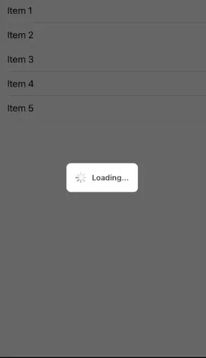
The package also contains a progress dialog / HUD in SwiftUI:
Check out this recipe for in-depth description of the component and its code, as well as this one for the progress dialog. Check out SwiftUIRecipes.com for more SwiftUI recipes!
The dialog is configurable with the following parameters:
isShowing- binding that determines if the dialog is showing or not.cancelOnTapOutside- if the dialog should be cancelled and hidden if the user taps outside of it.cancelAction- optional action that's performed when the dialog is cancelled by tapping outside. Custom implementations can make use of this to, say, reset their chosen value to the original.dialogContent- the view shown in the dialog.
struct DialogTest: View {
  @State private var showDialog = true
  var body: some View {
    List(1..<6) { index in
      Text("Item \(index)")
    }.customDialog(isShowing: $showDialog) { // HERE
      VStack {
        Text("Dialog title")
          .fontWeight(.bold)
        Divider()
        Text("Some longer description")
          .padding(.bottom, 10)
        Button(action: {
          showDialog = false
        }) {
          Text("Close dialog")
            .autocapitalization(.allCharacters)
            .frame(minWidth: 0, maxWidth: .infinity)
            .padding()
        }.buttonStyle(MyButtonStyle())
      }.padding()
    }
  }
}

struct ProgressDialogTest: View {
  @State private var isLoading = false

  var body: some View {
    VStack {
      Text("Content")
    }.progressDialog(isShowing: $isLoading, message: "Loading...")
  }
}This component is distrubuted as a Swift package.