Refactor Create Theme menu in Theme Editor #46808
Conversation
If it only takes 3-4 seconds at most, I'd just display a dialog without any progress reporting. You can do this by calling EditorProgressDialog as usual, but only step once in the beginning. |
9a95969
to
8c55881
Compare
8c55881
to
2698f92
Compare
b2ce17e
to
d723b11
Compare
b172109
to
76b6b1d
Compare
|
I've reworked this PR to reflect discussion in the previous issue. This should be a more complete solution now. As for the slow import when the progress bar is visible, this is related to the Inspector updates, which seem to create a lot of hog on master currently. If you switch the tab to "Node" for example, import goes through almost instanteneously. Regardless, I've adjusted it so the bar is updated only every 10 items. |
6b50241
to
0258aca
Compare
|
Okay, compiler warnings are gone now. Should be good to review. 🤞 |
|
The right-side panel listing items would be probably better with icons Also maybe it could tell you how many elements are selected? 🤔 E.g. "148 Colors (40 selected)". Unless it's difficult to implement. |

I can certainly try that, but I was afraid it may look too cryptic. A series of identical icons may also look more cluttered than a series of identical texts. I have icons ready nonetheless, as I use them for selecting and deselecting all items already.
It's trivial to implement, all selected items are tracked independently from the I do think we can work on some way to represent the number of selected items for some sanity check. One idea I have is to show a confirmation screen before actually starting the import. Such screen can list that you have X colors, Y icons and Z styleboxes ready to be imported. Otherwise, we can indeed display more text in the side panel, especially if we change buttons to use icons. There will then be more space to separately list total, matching and selected number of items. Whether it is actually useful though, I don't know. I've decided to display number in the first place as a warning to users that there is a lot of items of a particular data type. Supposedly after that they should be roughly aware what they've selected. But I'm open to changes. |
But they wouldn't be identical. Also I mean text with icon, so they are easier to distinguish on quick glance. |
|
Oh, you mean icons corresponding to each data type?
Edit: I've pushed it, because, yeah, it's nice like that. I've also noticed and fixed an issue with comparison when restoring checkboxes after the filter is changed. It was right in my clip 🤦 |

0258aca
to
9ca805a
Compare
|
I actually meant something like this |

|
Did a deeper review of functionality.
The first point would be the most important to fix, others are mostly for consideration. Overall the import tab feels a bit overwhelming 🤔 But maybe it's not really possible to make it simpler and we just need a good tutorial? I imagine a complete newbie might just get lost with all the options. |


Filtering does actually expand, but only to the level of the data type. I.e. if you look for
Well, it speaks specifically about "icon data" there. I've actually amended the text from the old version of the PR to make sure it specifically refers to icons. But I can add some separation there. I also though that "X colors" etc can be made bolder or bigger, or maybe we could give them background. Something to highlight that those labels start sections. But I don't have a good reference for such case in our existing UI, so not sure which would be the best.
Not sure how it would be more convenient than a checkbox, but sure, I can do that. There is no other functionality related to the name that we need, so it can be used for selection.
Yes, it's definitely a lot to take in. But IMO what we have now is deceptively simple. My hope is that while it could take some time to learn, it should provide more use once you do. Though I could assume that newbies would want the old behavior more than anything else, which means hitting "Select All" button at the bottom and importing that. And that button is not very prominent. Hmm... Documentation on skinning/theming could definitely be improved. |
The problem arises when you search for a specific element. You get multiple datatypes as a result and you don't know where is your element until you expand them all.
Yeah, the text is clear and all. But if you ignore the text, the warning is mildly confusing at first look. Maybe it's not really a problem though.
Dunno, when I was clicking through the list I somewhat instinctively tried to double-click something to select it. But then again, double-click for expand would make as much sense, which is a Tree problem not related to this PR. |
6b26a4c
to
a3e5873
Compare
|
Okay, some changes to the layout to improve workflow accents and UX.
Right side is more compact and less intimidating. Buttons below the Tree now have labels and not just icons. That puts more attention to them, as they are expected to be the main way to interact with this UI from the standpoint of a new/more casual user. Both icons and texts create some familiarity between icons and actions which helps to make the right side panel more compact by relying on the same icons for similar tasks. Here's how it looks when some data types are empty. I've added a clear button to the filter as requested. Filtering itself now expands to the level of the first match. So if we match the type, it will remain closed. If we don't match the type, but we match items within it, we expand to those items. I think it makes the most sense this way.
|


|
The new tab is much better now. I still think that information on how many items are selected would be useful. Also maaybe some confirmation dialog when you click Close with items selected could be useful too (as closing the dialog clears selection, and can be done accidentally). Similar thing with the Import Selected button - if you don't have anything selected the button does nothing with no feedback. |
a3e5873
to
47a999d
Compare
|
Not sure if it's the best way to display the amount of selected items, but I think it's an okay way. I've aligned it to the right because on the left it blends with the rest of the texts and looks like a mess.
I've also added the confirmation and the warning you've suggested. There is a problem with the confirmation though. You can still close the dialog window using the "X" OS button, and I see no way to capture that. We also don't clear the selection after successfully importing items, so the confirmation will always be there, even if you've already imported what you wanted. Maybe it's a small price to pay for saving other people from misclicks. Here's all of this in action: 2021-05-06_17-45-32.mp4 |

Is there no way to do that? (I mean clear the selection) |
Sure there is, but I think it may be useful if we didn't. I can imagine someone importing, going to the first tab, doing something there, then coming back to the import tab to repeat the same import. This is obviously a speculation, but at least this flow is currently possible. Those who need a reset can already press "Deselect All". |
47a999d
to
912420b
Compare
|
Thanks! |
This PR continues with the enhancements from #46593, after which some options were still left as they were:
First problem with them is that this actions is not about creating a
Themeresource. Instead it's about filling the one you are currently editing with items from anotherThemeresource, be it the default theme or the editor theme. Editor theme also comes with an option to copy all the content from the current editor theme, otherwise only item definitions are copied.This looks like a very limited way to interact with this system, so I propose to make it a more flexible and generalized solution. As a part of the new popup we introduce a new "Import Items" tab that handles importing items from a number of other themes. To the old options for the default and the editor theme we also add a tab for an arbitrary theme that can be selected from a file. Tabs themselves are similar and present a complete list of all available definitions where the user can filter them, select them by type group, data type or individually.
Here's the original layout before some adjustments were made; you can also see it in the clips below.
Users are free to select with high granularity whether to copy only a definition, or items content as well. While granularity is there, I don't expect it to be the main way to interact with this UI. Bulk options should be the prevalent way. Granularity will be helpful for people who want to add only a single item from a type. This feature was temporarily lost in #46593, so this is the way to restore it.
Items then can be imported with a nice progress popup (previously editor was just hanging for a bit as the items were copied).
Here's some of this in action:
2021-04-26_03-39-07.mp4
And here's some filtering:
2021-04-26_03-40-20.mp4
You may notice that the first tab is slightly different now. Outside of some small enhancements the main difference is the omission of the "Add Type from Class" option. Its functionality overlaps with the new tab, but in a very limited way. I believe the new UI provides a more approachable way to achieve the same result, plus it allows to select a type from a theme other than the default one.
This PR was heavily reworked. For posterity, here's the original description:
Old description of this PR
This PR replaces these options 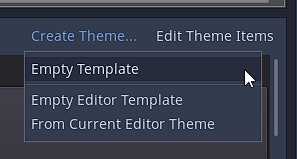With these options
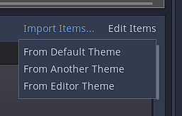
To begin with, this action was never about creating a
Themeresource it was about filling it with items from anotherThemeresource, be it the default theme or the editor theme, with an option to actually copy all definitions and their content from the editor one.Now you pick either the default theme, or the editor theme, or a completely arbitrary theme stored in a file, and you can import it as granularly as you want:
Selecting "include" options will copy definitions of the items, while also selecting "import data" options will copy their content as well. And this can be done with any base
Themeresource, not just with the editor theme.The process now also has a progress bar, as importing some of the bigger themes, such as the editor theme, can hang the editor for some time. Unfortunately, with the progress bar the process of importing takes more time. But at least the UI is not dead in the meantime. If anyone knows a good trick to reduce the number of progress bar updates, so it doesn't wait unnecessary ticks, please advise 🙃
And here's the entire process:
2021-03-09_03-01-30.mp4