可视化算法中译文,译自 Visualizing Algorithms
The power of the unaided mind is highly overrated… The real powers come from devising external aids that enhance cognitive abilities. — Donald Norman
对算法来说可视化是个迷人的应用场景。为了可视化一个算法,我们不仅仅把数据转化成图表。在这里没有主要的数据集,取而代之的是描述行为的逻辑规则。这也许就是为什么算法可视化是如此的不寻常,就好比作家以小说的形式来实验能否与读者进行更好的交流。这就是学习它们的足够的理由。
但是算法也预示着可视化不仅仅是在数据中找到样式的工具。可视化利用人的视觉系统来增强人类的智慧:我们可以利用它来更好的理解重要的抽象过程,兴许还有其他的东西。
在我解释第一个算法之前,我首先需要解释下问题的称呼。
光是电磁辐射,一种连续的信号。它从屏幕中射出, 经过了空气, 聚集在你的晶状体并投射在你的视网膜上。为了感知到光, 我们必须降低光的离散脉冲,通过测量其在不同的点在空间中强度和频率分布的方式。
这种减少的过程叫做采样,并且对视觉来说是必要的。你可以想象一下画家在用离散颜色的画笔在作画。(详见Pointillism 或者 Divisionism)。 更进一步说,采样是计算机图形学的一个核心; 例如,通过光线追踪光栅化一个3D场景,我们必须决定从哪射出光线。甚至改变一个图像的大小也需要采样。
采样会因竞争目标而变得困难。一方面,样本应该被均匀分布使其无间隙。但同时我们也必须避免重复规则图案, 因为会导致 混淆现象. 这就是在相机前你不应该穿规则条纹的衬衫,这些条纹会与相机传感器里面像素网格产生共振,并会导致产生莫尔条纹.
人的视网膜有一个安置在感光细胞上的很漂亮的采样方法。这些细胞密集而均匀的分布在视网膜上 (除了视神经上的盲点), 并且这些细胞的相对位置是不规则的。这被称为泊松圆盘分布,因为它保持单元之间的最小距离,以避免因阻塞而浪费感光体。
不幸的是,产生一个泊松圆盘分布是困难的。因此这里有一个Mitchell 最佳候选的近似算法。
你可以看到,最佳候选采样算法生成了一个优雅的随机分布。尽管这并不是没有缺陷的:有许多样本在一个区域(过采样),也有一些区域样本不足(欠采样)。但它确实不错,更重要的是,它很容易实现。
下面展示它是如何工作的:
对于每个新的样本,最佳候选算法产生一个固定数量的候选,以灰色展示(在这里,这个固定数量是10)。每一个候选都是独立地从采样区域中选出。
颜色为红色最佳候选,是在原先所有被标记黑色的样本中最远的那一个。每个候选到最近的样本的距离用先和圆圈表示:注意到没有其他的样本在灰色的或者红色的圆圈内。在所有的候选产生并且距离被测量后,最佳候选则变成了新的样本,其他的候选则忽略。
以下是代码:
function sample() {
  var bestCandidate, bestDistance = 0;
  for (var i = 0; i < numCandidates; ++i) {
    var c = [Math.random() * width, Math.random() * height],
        d = distance(findClosest(samples, c), c);
    if (d > bestDistance) {
      bestDistance = d;
      bestCandidate = c;
    }
  }
  return bestCandidate;
}
对如上解释算法,我会把代码独立出来。(本文的目的之一是希望你能通过代码学习可视化)。但是我要弄清一些细节:
外部变量numCandidates定义了每个样本所要创造的候选数量。这个参数能让你进行速度与质量的平衡。候选越少,运行越快。反之,越多的候选,采样质量越高。
distance函数是简单的几何计算:
function distance(a, b) {
  var dx = a[0] - b[0],
      dy = a[1] - b[1];
  return Math.sqrt(dx * dx + dy * dy);
}findClosest函数返回当前候选的最近的样本。这可以枚举每个现有的样本,暴力完成。或者你可以利用四叉树加速搜索。暴力搜索很容易实现,但是非常慢(需要平方时间,具体见 大O表示)。加速算法更快,但是需要更多工作来实现。
Speaking of trade-offs: when deciding whether to use an algorithm, we evaluate it not in a vacuum but against other approaches. And as a practical matter it is useful to weigh the complexity of implementation — how long it takes to implement, how difficult it is to maintain — against its performance and quality.
The simplest alternative is uniform random sampling:
function sample() {
  return [random() * width, random() * height];
}
It looks like this:
Uniform random is pretty terrible. There is both severe under- and oversampling: many samples are densely-packed, even overlapping, leading to large empty areas. (Uniform random sampling also represents the lower bound of quality for the best-candidate algorithm, as when the number of candidates per sample is set to one.)
Dots patterns are one way of showing sample pattern quality, but not the only way. For example, we can attempt to simulate vision under different sampling strategies by coloring an image according to the color of the closest sample. This is, in effect, a Voronoi diagram of the samples where each cell is colored by the associated sample.
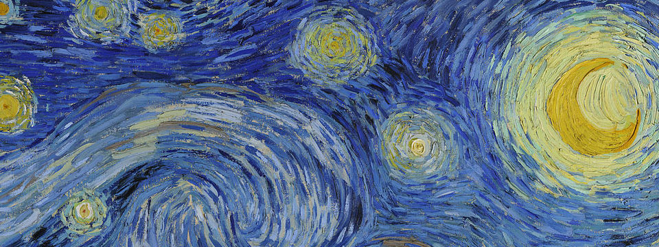
What does The Starry Night look like through 6,667 uniform random samples?
The lackluster quality of this approach is again apparent. The cells vary widely in size, as expected from the uneven sample distribution. Detail has been lost because densely-packed samples (small cells) are underutilized. Meanwhile, sparse samples (large cells) introduce noise by exaggerating rare colors, such as the pink star in the bottom-left.
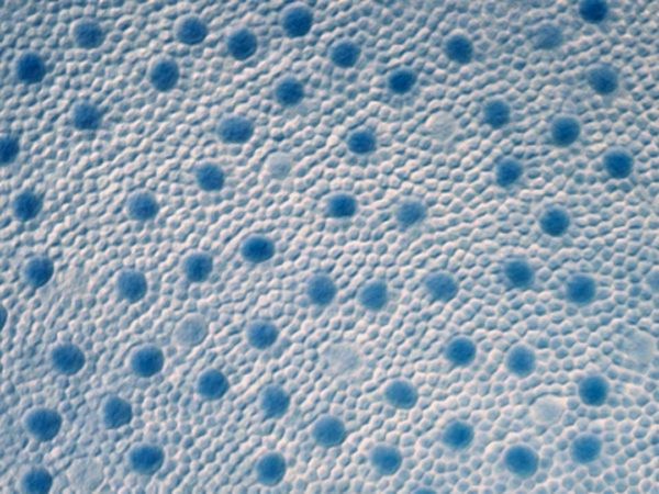
Now observe best-candidate sampling:
Much better! Cells are more consistently sized, though still randomly placed. Despite the quantity of samples (6,667) remaining constant, there is substantially more detail and less noise thanks to their even distribution. If you squint, you can almost make out the original brush strokes.
We can use Voronoi diagrams to study sample distributions more directly by coloring each cell according to its area. Darker cells are larger, indicating sparse sampling; lighter cells are smaller, indicating dense sampling. The optimal pattern has nearly-uniform color while retaining irregular sample positions. (A histogram showing cell area distribution would also be nice, but the Voronoi has the advantage that it shows sample position simultaneously.)
Here are the same 6,667 uniform random samples:
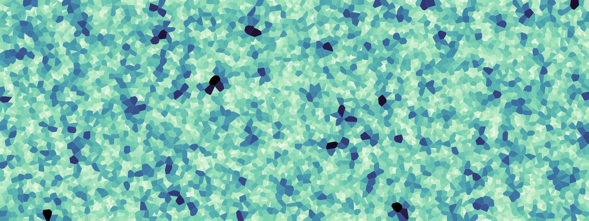
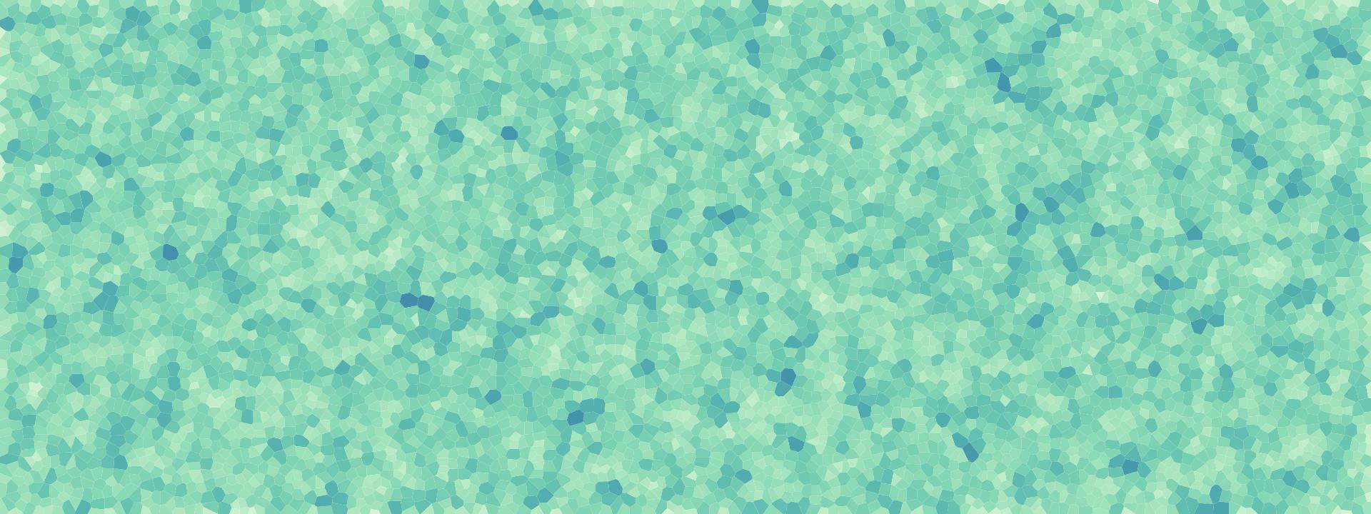
The black spots — large gaps between samples — would be localized deficiencies in vision due to undersampling. The same number of best-candidate samples exhibits much less variation in cell area, and thus more consistent coloration:
Can we do better than best-candidate? Yes! Not only can we produce a better sample distribution with a different algorithm, but this algorithm is faster (linear time). It’s at least as easy to implement as best-candidate. And this algorithm even scales to arbitrary dimensions.
This wonder is called Bridson’s algorithm for Poisson-disc sampling, and it looks like this:
This algorithm functions visibly differently than the other two: it builds incrementally from existing samples, rather than scattering new samples randomly throughout the sample area. This gives its progression a quasi-biological appearance, like cells dividing in a petri dish. Notice, too, that no samples are too close to each other; this is the minimum-distance constraint that defines a Poisson-disc distribution, enforced by the algorithm.
Here’s how it works:
Red dots represent “active” samples. At each iteration, one is selected randomly from the set of all active samples. Then, some number of candidate samples (shown as hollow black dots) are randomly generated within an annulus surrounding the selected sample. The annulus extends from radius r to 2r, where r is the minimum-allowable distance between samples.
Candidate samples within distance r from an existing sample are rejected; this “exclusion zone” is shown in gray, along with a black line connecting the rejected candidate to the nearby existing sample. A grid accelerates the distance check for each candidate. The grid size r/√2 ensures each cell can contain at most one sample, and only a fixed number of neighboring cells need to be checked.
If a candidate is acceptable, it is added as a new sample, and a new active sample is randomly selected. If none of the candidates are acceptable, the selected active sample is marked as inactive (changing from red to black). When no samples remain active, the algorithm terminates.
The area-as-color Voronoi diagram shows Poisson-disc sampling’s improvement over best-candidate, with no dark-blue or light-yellow cells:
The Starry Night under Poisson-disc sampling retains the greatest amount of detail and the least noise. It is reminscent of a beautiful Roman mosaic:
Now that you’ve seen a few examples, let’s briefly consider why to visualize algorithms.
Entertaining - I find watching algorithms endlessly fascinating, even mesmerizing. Particularly so when randomness is involved. And while this may seem a weak justification, don’t underestimate the value of joy! Further, while these visualizations can be engaging even without understanding the underlying algorithm, grasping the importance of the algorithm can give a deeper appreciation.
Teaching - Did you find the code or the animation more helpful? What about pseudocode — that euphemism for code that won’t compile? While formal description has its place in unambiguous documentation, visualization can make intuitive understanding more accessible.
Debugging - Have you ever implemented an algorithm based on formal description? It can be hard! Being able to see what your code is doing can boost productivity. Visualization does not supplant the need for tests, but tests are useful primarily for detecting failure and not explaining it. Visualization can also discover unexpected behavior in your implementation, even when the output looks correct. (See Bret Victor’s Learnable Programming and Inventing on Principle for excellent related work.)
Learning - Even if you just want to learn for yourself, visualization can be a great way to gain deep understanding. Teaching is one of the most effective ways of learning, and implementing a visualization is like teaching yourself. I find it easier to remember an algorithm intuitively, having seen it, than to memorize code where I am bound to forget small but essential details.
Shuffling is the process of rearranging an array of elements randomly. For example, you might shuffle a deck of cards before dealing a poker game. A good shuffling algorithm is unbiased, where every ordering is equally likely.
The Fisher–Yates shuffle is an optimal shuffling algorithm. Not only is it unbiased, but it runs in linear time, uses constant space, and is easy to implement.
function shuffle(array) {
  var n = array.length, t, i;
  while (n) {
    i = Math.random() * n-- | 0; // 0 ≤ i < n
    t = array[n];
    array[n] = array[i];
    array[i] = t;
  }
  return array;
}
Above is the code, and below is a visual explanation:
Each line represents a number. Small numbers lean left and large numbers lean right. (Note that you can shuffle an array of anything — not just numbers — but this visual encoding is useful for showing the order of elements. It is inspired by Robert Sedgwick’s sorting visualizations in Algorithms in C.)
The algorithm splits the array into two parts: the right side of the array (in black) is the shuffled section, while the left side of the array (in gray) contains elements remaining to be shuffled. At each step it picks a random element from the left and moves it to the right, thereby expanding the shuffled section by one. The original order on the left does not need to be preserved, so to make room for the new element in the shuffled section, the algorithm can simply swap the element into place. Eventually all elements are shuffled, and the algorithm terminates.
If Fisher–Yates is a good algorithm, what does a bad algorithm look like? Here’s one:
// DON’T DO THIS!
function shuffle(array) {
  return array.sort(function(a, b) {
    return Math.random() - .5; // ಠ_ಠ
  });
}
This approach uses sorting to shuffle by specifying a random comparator function. A comparator defines the order of elements. It takes arguments a and b — two elements from the array to compare — and returns a value less than zero if a is less than b, a value greater than zero if a is greater than b, or zero if a and b are equal. The comparator is invoked repeatedly during sorting.
If you don’t specify a comparator to array.sort, elements are ordered lexicographically. Here the comparator returns a random number between -.5 and +.5. The assumption is that this defines a random order, so sorting will jumble the elements randomly and perform a good shuffle.
Unfortunately, this assumption is flawed. A random pairwise order (for any two elements) does not establish a random order for a set of elements. A comparator must obey transitivity: if a > b and b > c, then a > c. But the random comparator returns a random value, violating transitivity and causing the behavior of array.sort to be undefined! You might get lucky, or you might not.
How bad is it? We can try to answer this question by visualizing the output:
This may look random, so you might be tempted to conclude that random comparator shuffle is adequate, and dismiss concerns of bias as pedantic. But looks can be misleading! There are many things that appear random to the human eye but are substantially non-random.
This deception demonstrates that visualization is not a magic wand. Showing a single run of the algorithm does not effectively assess the quality of its randomness. We must instead carefully design a visualization that addresses the specific question at hand: what is the algorithm’s bias?
To show bias, we must first define it. One definition is based on the probability that an array element at index i prior to shuffling will be at index j after shuffling. If the algorithm is unbiased, every element has equal probability of ending up at every index, and thus the probability for all i and j is the same: 1/n, where n is the number of elements.
Computing these probabilities analytically is difficult, since it depends on knowing the exact sorting algorithm used. But computing them empirically is easy: we simply shuffle thousands of times and count the number of occurrences of element i at index j. An effective display for this matrix of probabilities is a matrix diagram:
The column (horizontal position) of the matrix represents the index of the element prior to shuffling, while the row (vertical position) represents the index of the element after shuffling. Color encodes probability: green cells indicate positive bias, where the element occurs more frequently than we would expect for an unbiased algorithm; likewise red cells indicate negative bias, where it occurs less frequently than expected.
Random comparator shuffle in Chrome, shown above, is surprisingly mediocre. Parts of the array are only weakly biased. However, it exhibits a strong positive bias below the diagonal, which indicates a tendency to push elements from index i to i+1 or i+2. There is also strange behavior for the first, middle and last row, which might be a consequence of Chrome using median-of-three quicksort.
The unbiased Fisher–Yates algorithm looks like this:
No patterns are visible in this matrix, other than a small amount of noise due to empirical measurement. (That noise could be reduced if desired by taking additional measurements.)
The behavior of random comparator shuffle is heavily dependent on your browser. Different browsers use different sorting algorithms, and different sorting algorithms behave very differently with (broken) random comparators. Here’s random comparator shuffle on Firefox:
This is egregiously biased! The resulting array is often barely shuffled, as shown by the strong green diagonal in this matrix. This does not mean that Chrome’s sort is somehow “better” than Firefox’s; it simply means you should never use random comparator shuffle. Random comparators are fundamentally broken.
Sorting is the inverse of shuffling: it creates order from disorder, rather than vice versa. This makes sorting a harder problem with diverse solutions designed for different trade-offs and constraints.
One of the most well-known sorting algorithms is quicksort.
Quicksort first partitions the array into two parts by picking a pivot. The left part contains all elements less than the pivot, while the right part contains all elements greater than the pivot. After the array is partitioned, quicksort recurses into the left and right parts. When a part contains only a single element, recursion stops.
The partition operation makes a single pass over the active part of the array. Similar to how the Fisher–Yates shuffle incrementally builds the shuffled section by swapping elements, the partition operation builds the lesser (left) and greater (right) parts of the subarray incrementally. As each element is visited, if it is less than the pivot it is swapped into the lesser part; if it is greater than the pivot the partition operation moves on to the next element.
Here’s the code:
function quicksort(array, left, right) {
  if (left < right - 1) {
    var pivot = left + right >> 1;
    pivot = partition(array, left, right, pivot);
    quicksort(array, left, pivot);
    quicksort(array, pivot + 1, right);
  }
}

function partition(array, left, right, pivot) {
  var pivotValue = array[pivot];
  swap(array, pivot, --right);
  for (var i = left; i < right; ++i) {
    if (array[i] < pivotValue) {
      swap(array, i, left++);
    }
  }
  swap(array, left, right);
  return left;
}
There are many variations of quicksort. The one shown above is one of the simplest — and slowest. This variation is useful for teaching, but in practice more elaborate implementations are used for better performance.
A common improvement is “median-of-three” pivot selection, where the median of the first, middle and last elements is used as the pivot. This tends to choose a pivot closer to the true median, resulting in similarly-sized left and right parts and shallower recursion. Another optimization is switching from quicksort to insertion sort for small parts of the array, which can be faster due to the overhead of function calls.
The sort and shuffle animations above have the nice property that time is mapped to time: we can simply watch how the algorithm proceeds. But while intuitive, animation can be frustrating to watch, especially if we want to focus on an occasional weirdness in the algorithm’s behavior. Animations also rely heavily on our memory to observe patterns in behavior. While animations are improved by controls to pause and scrub time, static displays that show everything at once can be even more effective. The eye scans faster than the hand.
A simple way of turning an animation into a static display is to pick key frames from the animation and display those sequentially, like a comic strip. If we then remove redundant information across key frames, we use space more efficiently. A denser display may require more study to understand, but is faster to scan since the eye travels less.
Below, each row shows the state of the array prior to recursion. The first row is the initial state of the array, the second row is the array after the first partition operation, the third row is after the first partition’s left and right parts are again partitioned, etc. In effect, this is breadth-first quicksort, where the partition operation on both left and right proceeds in parallel.
As before, the pivots for each partition operation are highlighted in red. Notice that the pivots turn gray at the next level of recursion: after the partition operation completes, the associated pivot is in its final, sorted position. The total depth of the display — the maximum depth of recursion — gives a sense of how efficiently quicksort performed. It depends heavily on input and pivot choice.
Another static display of quicksort, less dense but perhaps easier to read, represents each element as a colored thread and shows each sequential swap. (This form is inspired by Aldo Cortesi’s sorting visualizations.) Smaller values are lighter, and larger values are darker.
You’ve now seen three different visual representations of the same algorithm: an animation, a dense static display, and a sparse static display. Each form has strengths and weaknesses. Animations are fun to watch, but static visualizations allow close inspection without being rushed. Sparse displays may likely easier to understand, but dense displays show the “macro” view of the algorithm’s behavior in addition to its details.
Before we move on, let’s contrast quicksort with another well-known sorting algorithm: mergesort.
function mergesort(array) {
  var n = array.length, a0 = array, a1 = new Array(n);
  for (var m = 1; m < n; m <<= 1) {
    for (var i = 0; i < n; i += m << 1) {
      var left = i,
          right = Math.min(i + m, n),
          end = Math.min(i + (m << 1), n);
      merge(a0, a1, left, right, end);
    }
    array = a0, a0 = a1, a1 = array;
  }
}

function merge(a0, a1, left, right, end) {
  for (var i0 = left, i1 = right; left < end; ++left) {
    if (i0 < right && (i1 >= end || a0[i0] <= a0[i1])) {
      a1[left] = a0[i0++];
    } else {
      a1[left] = a0[i1++];
    }
  }
}
Again, above is the code and below is an animation:
As you’ve likely surmised from either the code or the animation, mergesort takes a very different approach to sorting than quicksort. Unlike quicksort, which operates in-place by performing swaps, mergesort requires an extra copy of the array. This extra space is used to merge sorted subarrays, combining the elements from pairs of subarrays while preserving order. Since mergesort performs copies instead of swaps, we must modify the animation accordingly (or risk misleading readers).
Mergesort works from the bottom-up. Initially, it merges subarrays of size one, since these are trivially sorted. Each adjacent subarray — at first, just a pair of elements — is merged into a sorted subarray of size two using the extra array. Then, each adjacent sorted subarray of size two is merged into a sorted subarray of size four. After each pass over the whole array, mergesort doubles the size of the sorted subarrays: eight, sixteen, and so on. Eventually, this doubling merges the entire array and the algorithm terminates.
Because mergesort performs repeated passes over the array rather than recursing like quicksort, and because each pass doubles the size of sorted subarrays regardless of input, it is easier to design a static display. We simply show the state of the array after each pass.
Let’s again take a moment to consider what we’ve seen. The goal here is to study the behavior of an algorithm rather than a specific dataset. Yet there is still data, necessarily — the data is derived from the execution of the algorithm. And this means we can use the type of derived data to classify algorithm visualizations.
Level 0 / black box - The simplest class just shows the output. This does not explain the algorithm’s operation, but it can still verify correctness. And by treating the algorithm as a black box, you can more easily compare outputs of different algorithms. Black box visualizations can also be combined with deeper analysis of output, such as the shuffle bias matrix diagram shown above.
Level 1 / gray box - Many algorithms (though not all) build up output incrementally. By visualizing the intermediate output as it develops, we start to see how the algorithm works. This explains more without introducing new abstraction, since the intermediate and final output share the same structure. Yet this type of visualization can raise more questions than it answers, since it offers no explanation as to why the algorithm does what it does.
Level 2 / white box - To answer “why” questions, white box visualizations expose the internal state of the algorithm in addition to its intermediate output. This type has the greatest potential to explain, but also the highest burden on the reader, as the meaning and purpose of internal state must be clearly described. There is a risk that the additional complexity will overwhelm the reader; layering information may make the graphic more accessible. Lastly, since internal state is highly-dependent on the specific algorithm, this type of visualization is often unsuitable for comparing algorithms.
There’s also the practical matter of implementating algorithm visualizations. Typically you can’t just run code as-is; you must instrument it to capture state for visualization. (View source on this page for examples.) You may even need to interleave execution with visualization, which is particularly challenging for recursive algorithms that capture state on the stack. Language parsers such as Esprima may facilitate algorithm visualization through code instrumentation, cleanly separating execution code from visualization code.
The last problem we’ll look at is maze generation. All algorithms in this section generate a spanning tree of a two-dimensional rectangular grid. This means there are no loops and there is a unique path from the root in the bottom-left corner to every other cell in the maze.
I apologize for the esoteric subject — I don’t know enough to say why these algorithms are useful beyond simple games, and possibly something about electrical networks. But even so, they are fascinating from a visualization perspective because they solve the same, highly-constrained problem in wildly-different ways.
And they’re just fun to watch.
The random traversal algorithm initializes the first cell of the maze in the bottom-left corner. The algorithm then tracks all possible ways by which the maze could be extended (shown in red). At each step, one of these possible extensions is picked randomly, and the maze is extended as long as this does not reconnect it with another part of the maze.
Like Bridon’s Poisson-disc sampling algorithm, random traversal maintains a frontier and randomly selects from that frontier to expand. Both algorithms thus appear to grow organically, like a fungus.
Randomized depth-first traversal follows a very different pattern:
Rather than picking a new random passage each time, this algorithm always extends the deepest passage — the one with the longest path back to the root — in a random direction. Thus, randomized depth-first traversal only branches when the current path dead-ends into an earlier part of the maze. To continue, it backtracks until it can start a new branch. This snake-like exploration leads to mazes with significantly fewer branches and much longer, winding passages.
Prim’s algorithm constructs a minimum spanning tree, a spanning tree of a graph with weighted edges with the lowest total weight. This algorithm can be used to construct a random spanning tree by initializing edge weights randomly:
At each step, Prim’s algorithm extends the maze using the lowest-weighted edge (potential direction) connected to the existing maze. If this edge would form a loop, it is discarded and the next-lowest-weighted edge is considered.
Prim’s algorithm is commonly implemented using a heap, which is an efficient data structure for prioritizing elements. When a new cell is added to the maze, connected edges (shown in red) are added to the heap. Despite edges being added in arbitrary order, the heap allows the lowest-weighted edge to be quickly removed.
Lastly, a most unusual specimen:
Wilson’s algorithm uses loop-erased random walks to generate a uniform spanning tree — an unbiased sample of all possible spanning trees. The other maze generation algorithms we have seen lack this beautiful mathematical property.
The algorithm initializes the maze with an arbitrary starting cell. Then, a new cell is added to the maze, initiating a random walk (shown in red). The random walk continues until it reconnects with the existing maze (shown in white). However, if the random walk intersects itself, the resulting loop is erased before the random walk continues.
Initially, the algorithm can be frustratingly slow to watch, as early random walks are unlikely to reconnect with the small existing maze. As the maze grows, random walks become more likely to collide with the maze and the algorithm accelerates dramatically.
These four maze generation algorithms work very differently. And yet, when the animations end, the resulting mazes are difficult to distinguish from each other. The animations are useful for showing how the algorithm works, but fail to reveal the resulting tree structure.
A way to show structure, rather than process, is to flood the maze with color:
Color encodes tree depth — the length of the path back to the root in the bottom-left corner. The color scale cycles as you get deeper into the tree; this is occasionally misleading when a deep path circles back adjacent to a shallow one, but the higher contrast allows better differentiation of local structure. (This is not a convential rainbow color scale, which is nominally considered harmful, but a cubehelix rainbow with improved perceptual properties.)
We can further emphasize the structure of the maze by subtracting the walls, reducing visual noise. Below, each pixel represents a path through the maze. As above, paths are colored by depth and color floods deeper into the maze over time.
Concentric circles of color, like a tie-dye shirt, reveal that random traversal produces many branching paths. Yet the shape of each path is not particularly interesting, as it tends to go in a straight line back to the root. Because random traversal extends the maze by picking randomly from the frontier, paths are never given much freedom to meander — they end up colliding with the growing frontier and terminate due to the restriction on loops.
Randomized depth-first traversal, on the other hand, is all about the meander:
This animation proceeds at fifty times the speed of the previous one. This speed-up is necessary because randomized depth-first traversal mazes are much, much deeper than random traversal mazes due to limited branching. You can see that typically there is only one, and rarely more than a few, active branches at any particular depth.
Now Prim’s algorithm on a random graph:
This is more interesting! The simultaneously-expanding florets of color reveal substantial branching, and there is more complex global structure than random traversal.
Wilson’s algorithm, despite operating very differently, seems to produce very similar results:
Just because they look the same does not mean they are. Despite appearances, Prim’s algorithm on a randomly-weighted graph does not produce a uniform spanning tree (as far as I know — proving this is outside my area of expertise). Visualization can sometimes mislead due to human error. An earlier version of the Prim’s color flood had a bug where the color scale rotated twice as fast as intended; this suggested that Prim’s and Wilson’s algorithms produced very different trees, when in fact they appear much more similar than different.
Since these mazes are spanning trees, we can also use specialized tree visualizations to show structure. To illustrate the duality between maze and tree, here the passages (shown in white) of a maze generated by Wilson’s algorithm are gradually transformed into a tidy tree layout. As with the other animations, it proceeds by depth, starting with the root and descending to the leaves:
For comparison, again we see how randomized depth-first traversal produces trees with long passages and little branching.
Both trees have the same number of nodes (3,239) and are scaled to fit in the same area (960×500 pixels). This hides an important difference: at this size, randomized depth-first traversal typically produces a tree two-to-five times deeper than Wilson’s algorithm. The tree depths above are 244 and 1,375, respectively. In the larger 480,000-node mazes used for color flooding, randomized depth-first traversal produces a tree that is 10-20 times deeper!
This essay has focused on algorithms. Yet the techniques discussed here apply to a broader space of problems: mathematical formulas, dynamical systems, processes, etc. Basically, anywhere there is code that needs understanding.
Shan Carter, Archie Tse and I recently built a new rent vs. buy calculator; powering the calculator is a couple hundred lines of code to compute the total cost of renting or buying a home. It’s a simplistic model, but more complicated than fits in your head. The calculator takes about twenty input parameters (such as purchase price and mortgage rate) and considers opportunity costs on investments, inflation, marginal tax rates, and a variety of other factors.
The goal of the calculator is to help you decide whether you should buy or rent a home. If the total cost of buying is cheaper, you should buy. Otherwise, you should rent.
Except, it’s not that simple.
To output an accurate answer, the calculator needs accurate inputs. While some inputs are well-known (such as the length of your mortgage), others are difficult or impossible to predict. No one can say exactly how the stock market will perform, how much a specific home will appreciate or depreciate, or how the renting market will change over time.
We can make educated guesses at each variable — for example, looking at Case–Shiller data. But if the calculator is a black box, then readers can’t see how sensitive their answer is to small changes.
To fix this, we need to do more than output a single number. We need to show how the underlying system works. The new calculator therefore charts every variable and lets you quickly explore any variable’s effect by adjusting the associated slider.
The slope of the chart shows the associated variable’s importance: the greater the slope, the more the decision depends on that variable. Since variables interact with each other, changing a variable may change the slope of other charts.
This design lets you inspect many aspects of the system. For example, should you make a large down payment? Yes, if the down payment rate slopes down; or no, if the down payment rate slopes up, as with a higher investment return rate. This suggests that the optimal loan size depends on the difference between the opportunity cost on the down payment (money not invested) and the interest cost on the mortgage.
So, why visualize algorithms? Why visualize anything? To leverage the human visual system to improve understanding. Or more simply, to use vision to think.
June 26, 2014 / Mike Bostock